 РУ
РУ EN
EN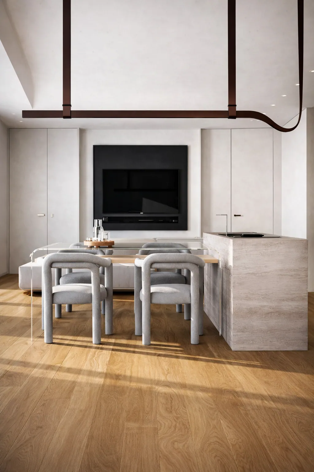
Name of the project
Plastika
Main character
Private client
Setting
Saint Petersburg
Plastika
Overview
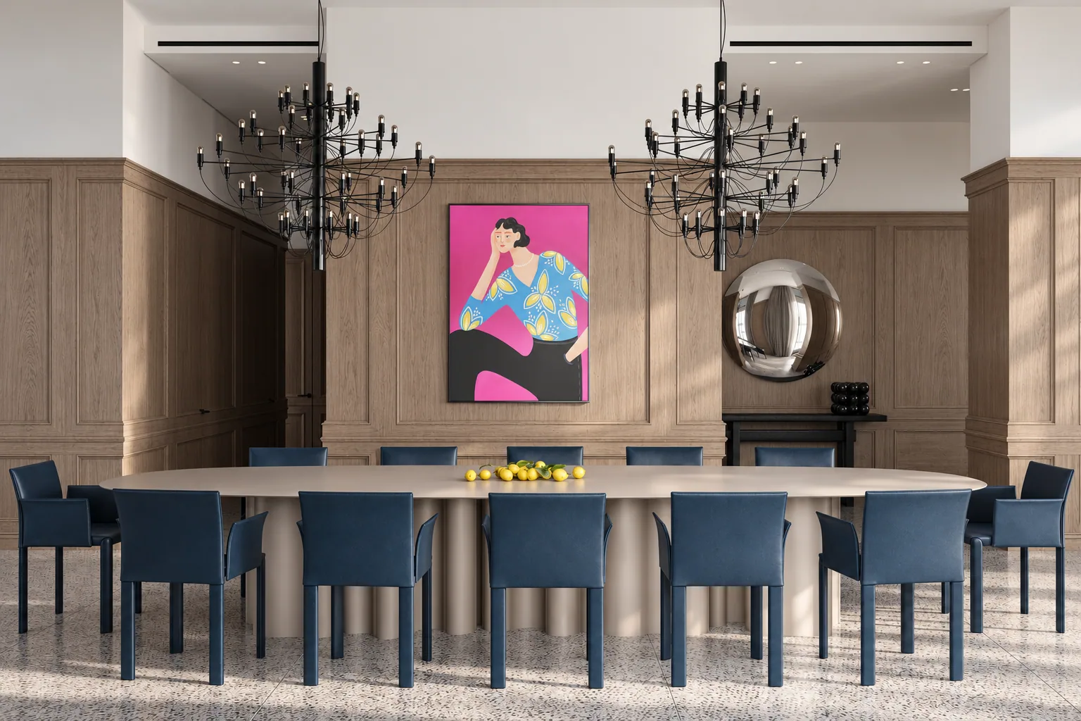
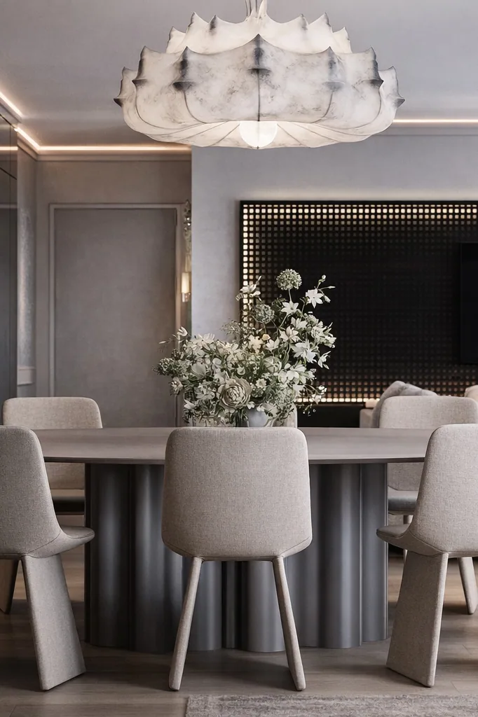
Plastika is an interior built on a subtle balance of form, light, and material. Broad calm planes, soft lines, and precise architectural accents define the space. A pale palette, warm timber, restrained contrasts, and the fluid geometry of the furniture create an environment that feels coherent, quiet, and natural.
The project is driven not by decorative density, but by the expressive power of form. The main living area relies on substantial volumes, a clean composition, and one continuous spatial gesture that connects the rooms in a shared rhythm. The result is restrained without becoming neutral: character emerges through proportion, silhouette, tactile materials, and precision of line.
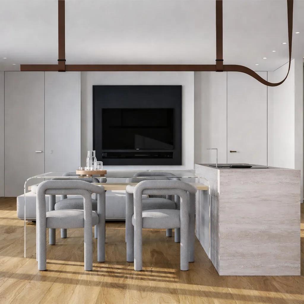
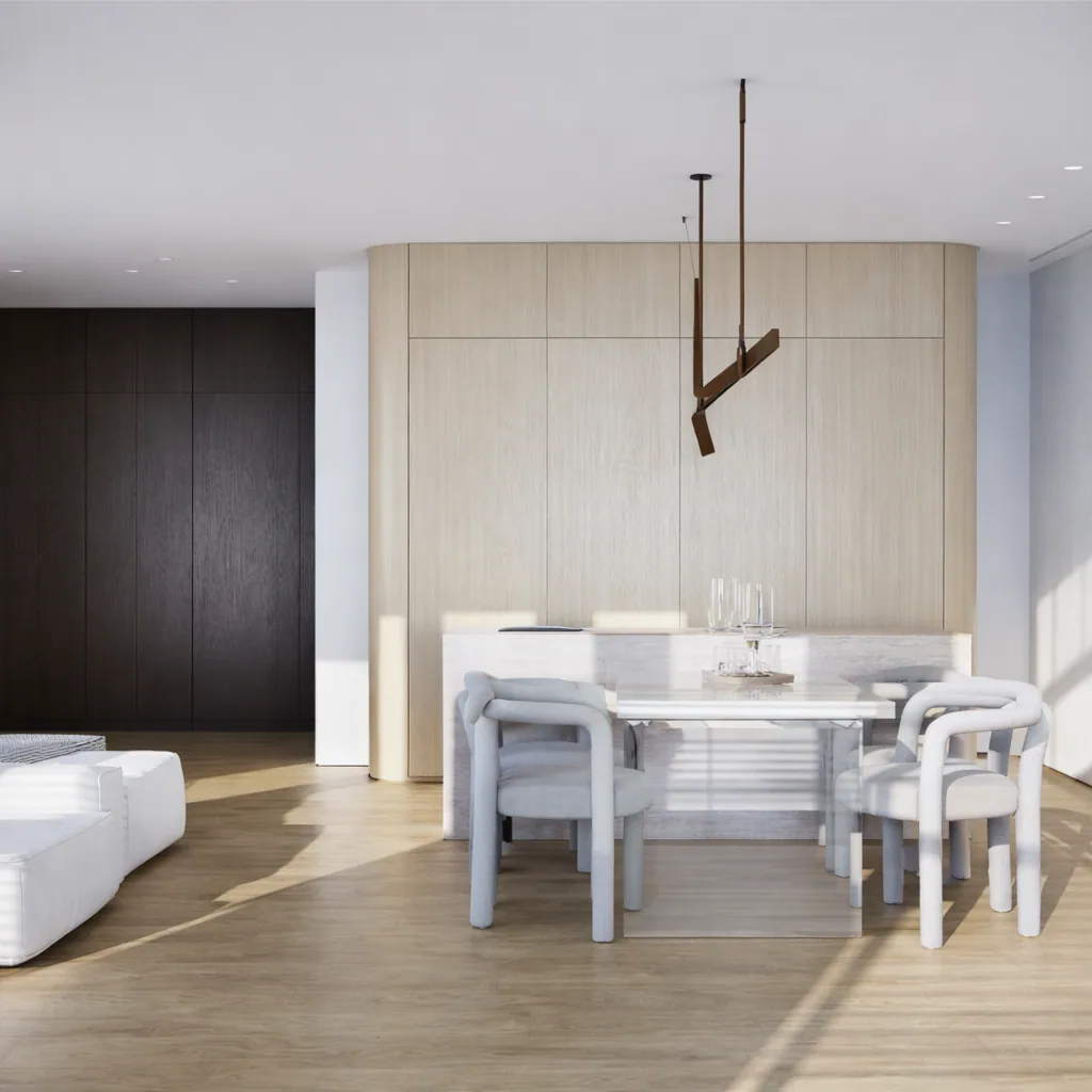
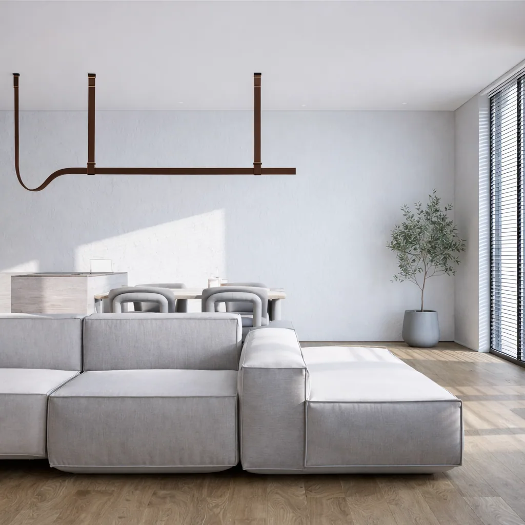
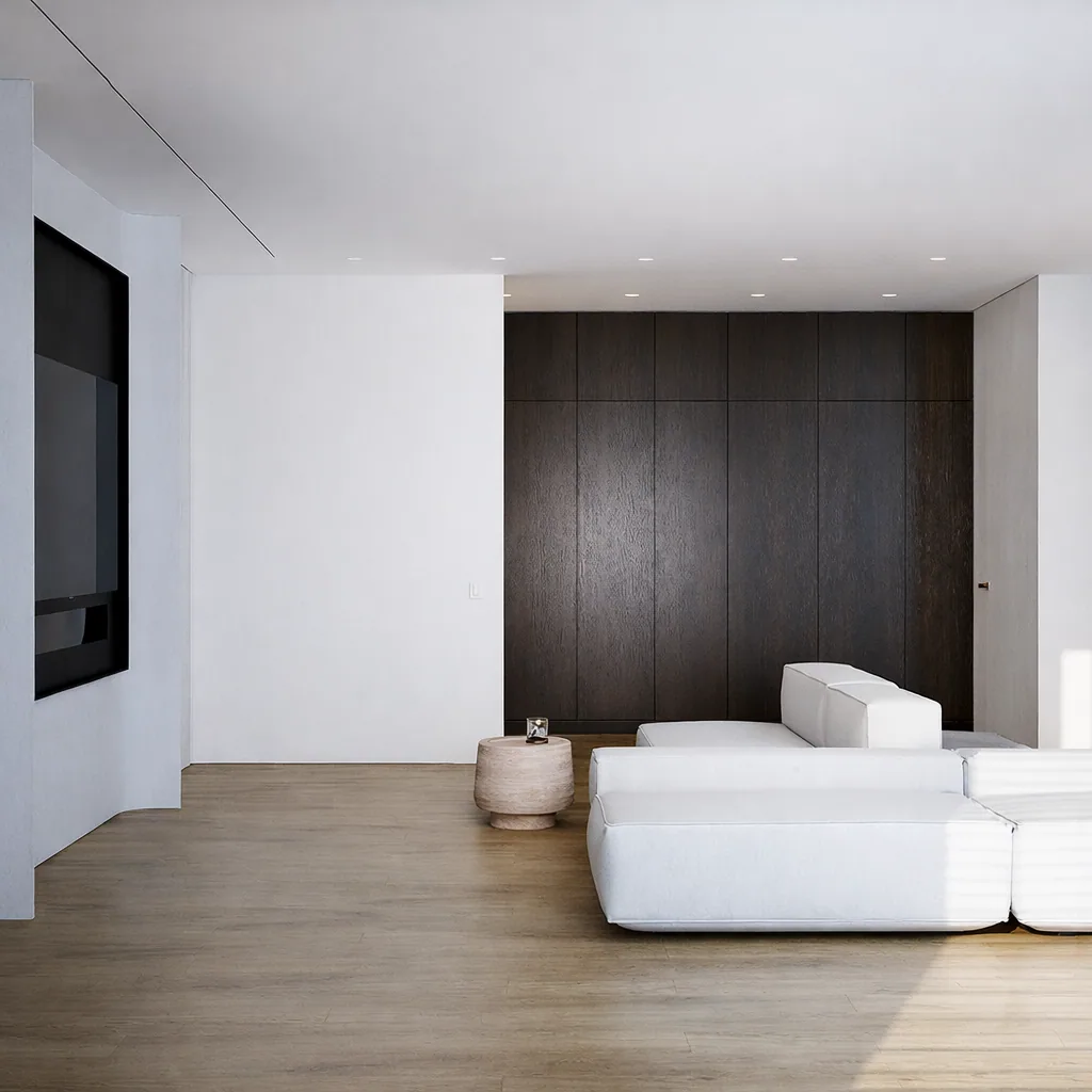
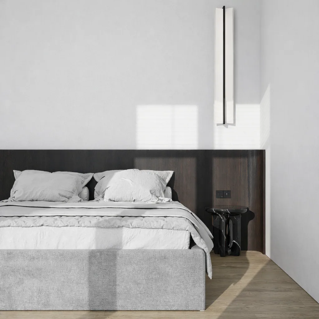
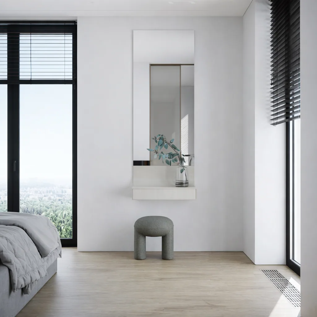
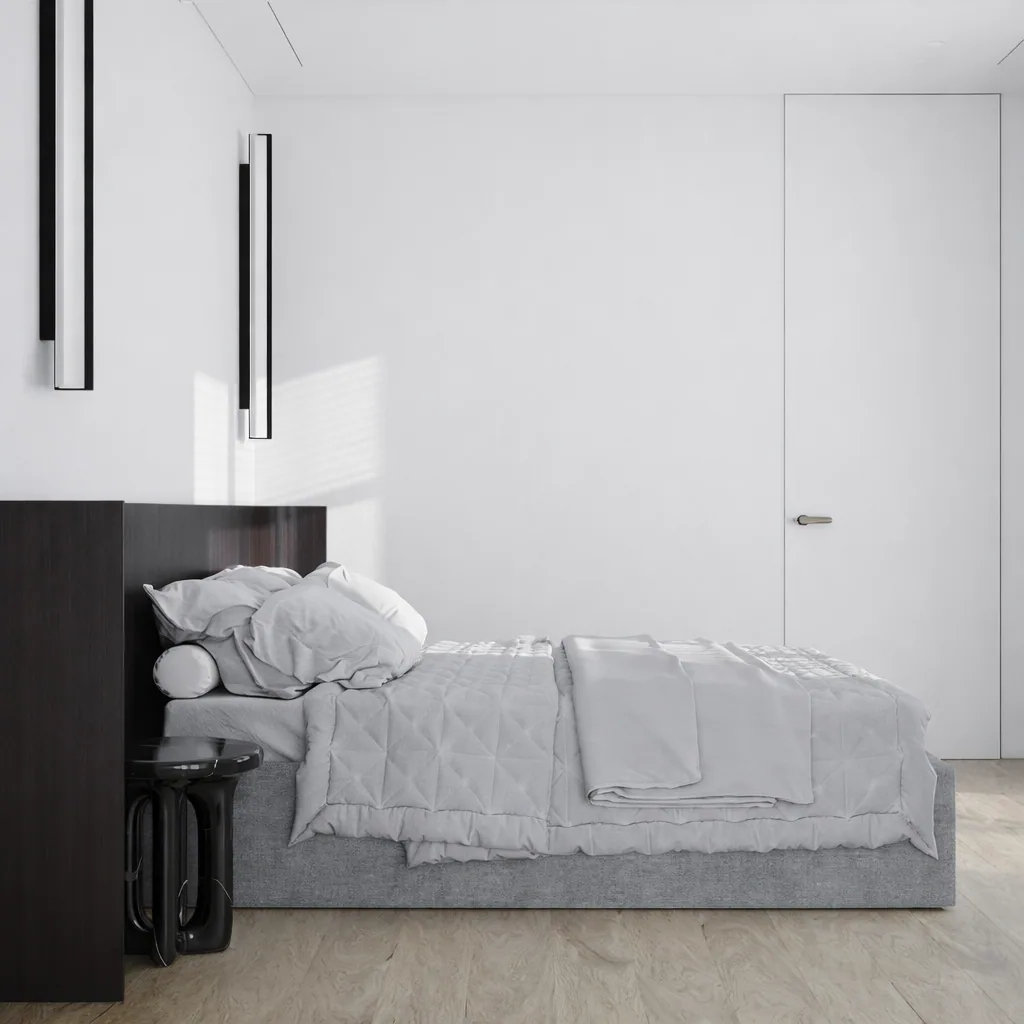
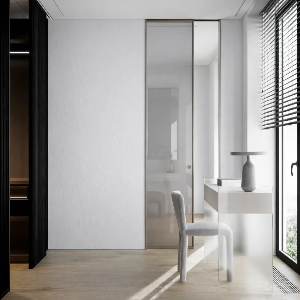
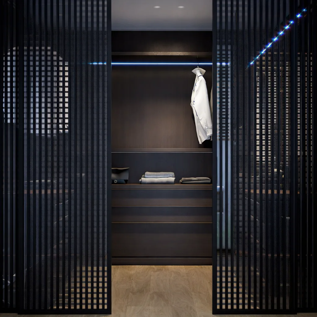
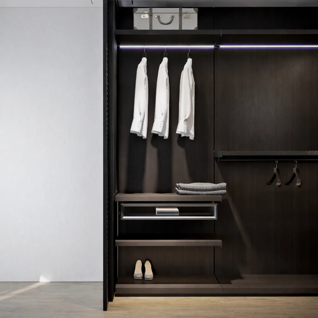
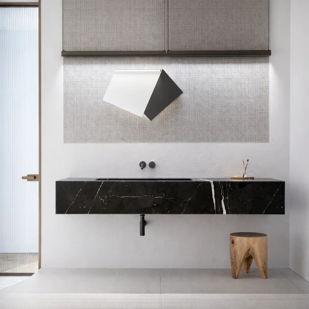
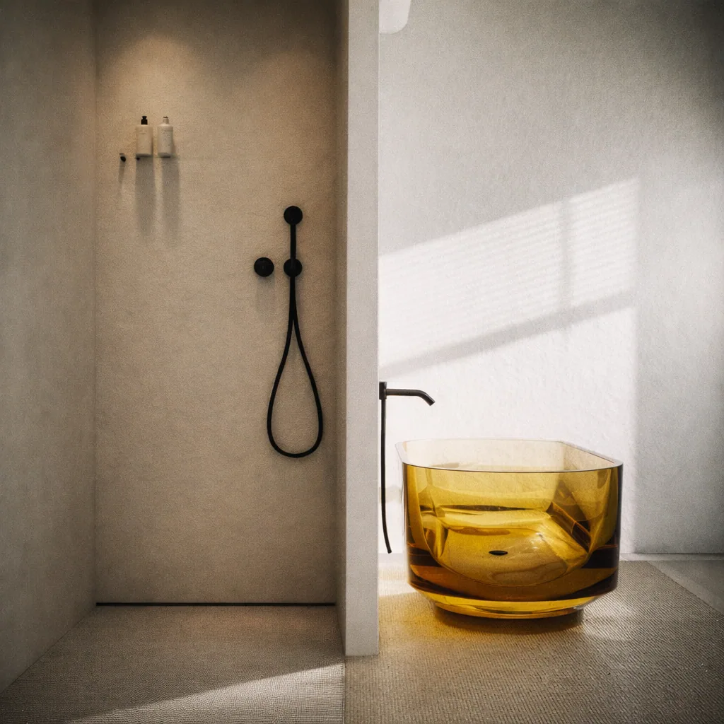
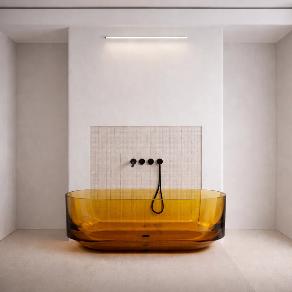
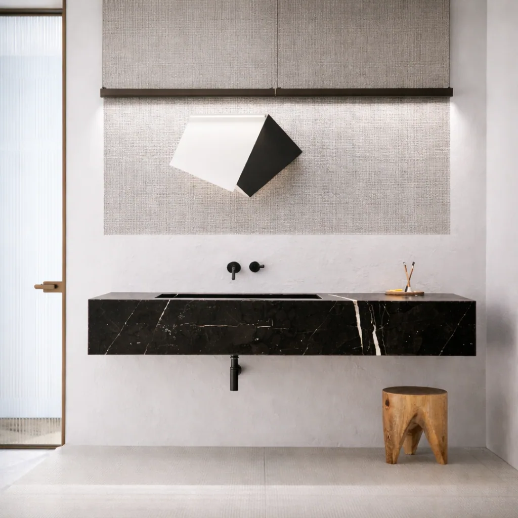
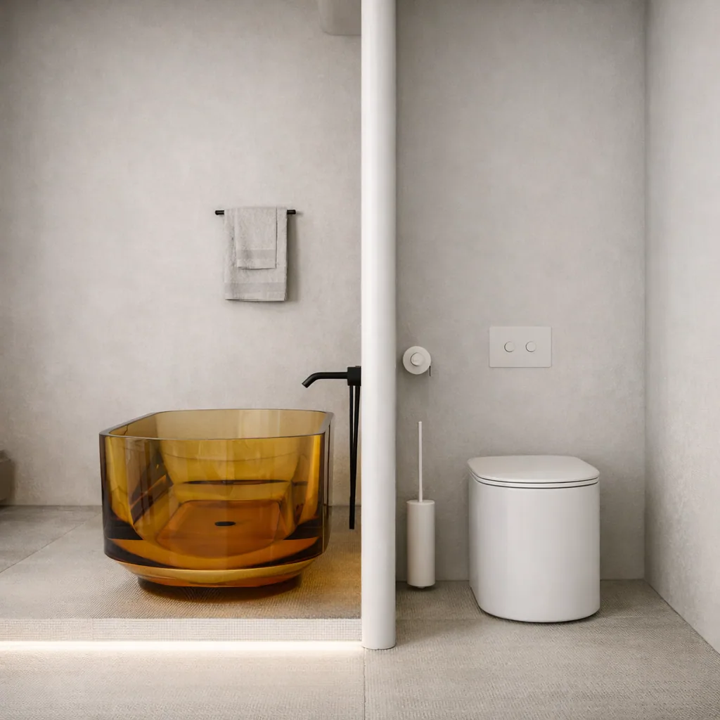
Image 1 of 15
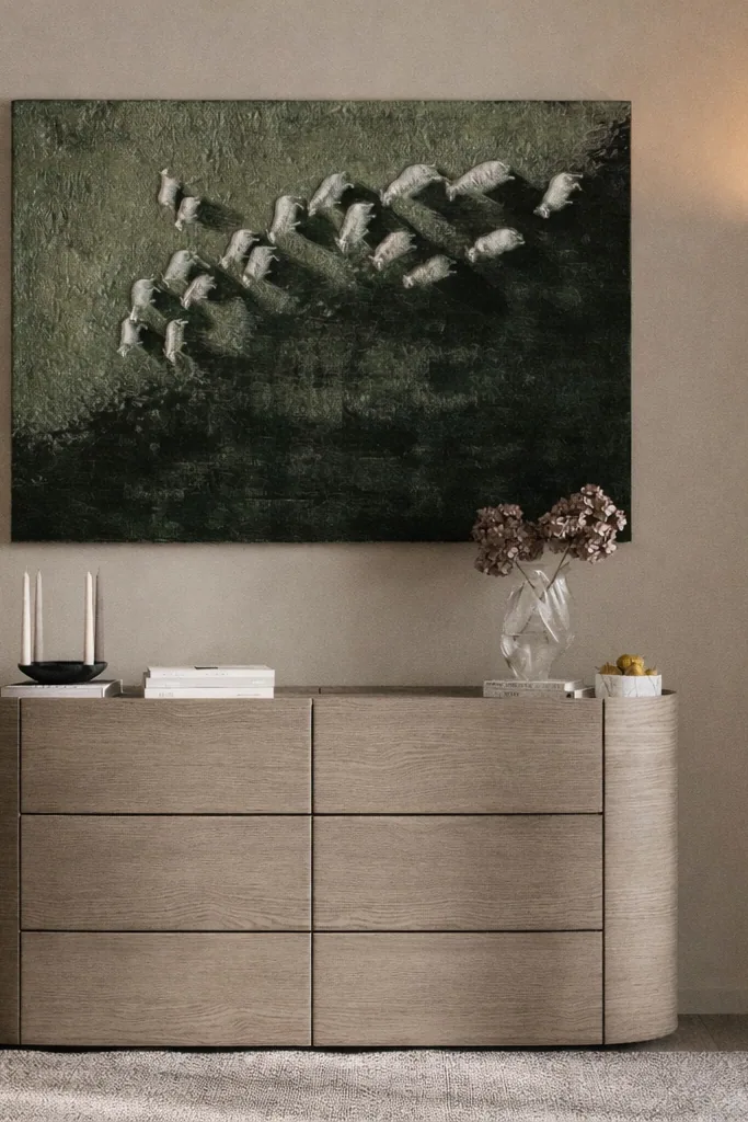
In the private rooms, this language becomes softer and quieter. The space is cleared of distraction, shifting attention towards atmosphere, light, and composure. Even the more contrasting elements are introduced not as effects, but as measured accents that preserve the whole.
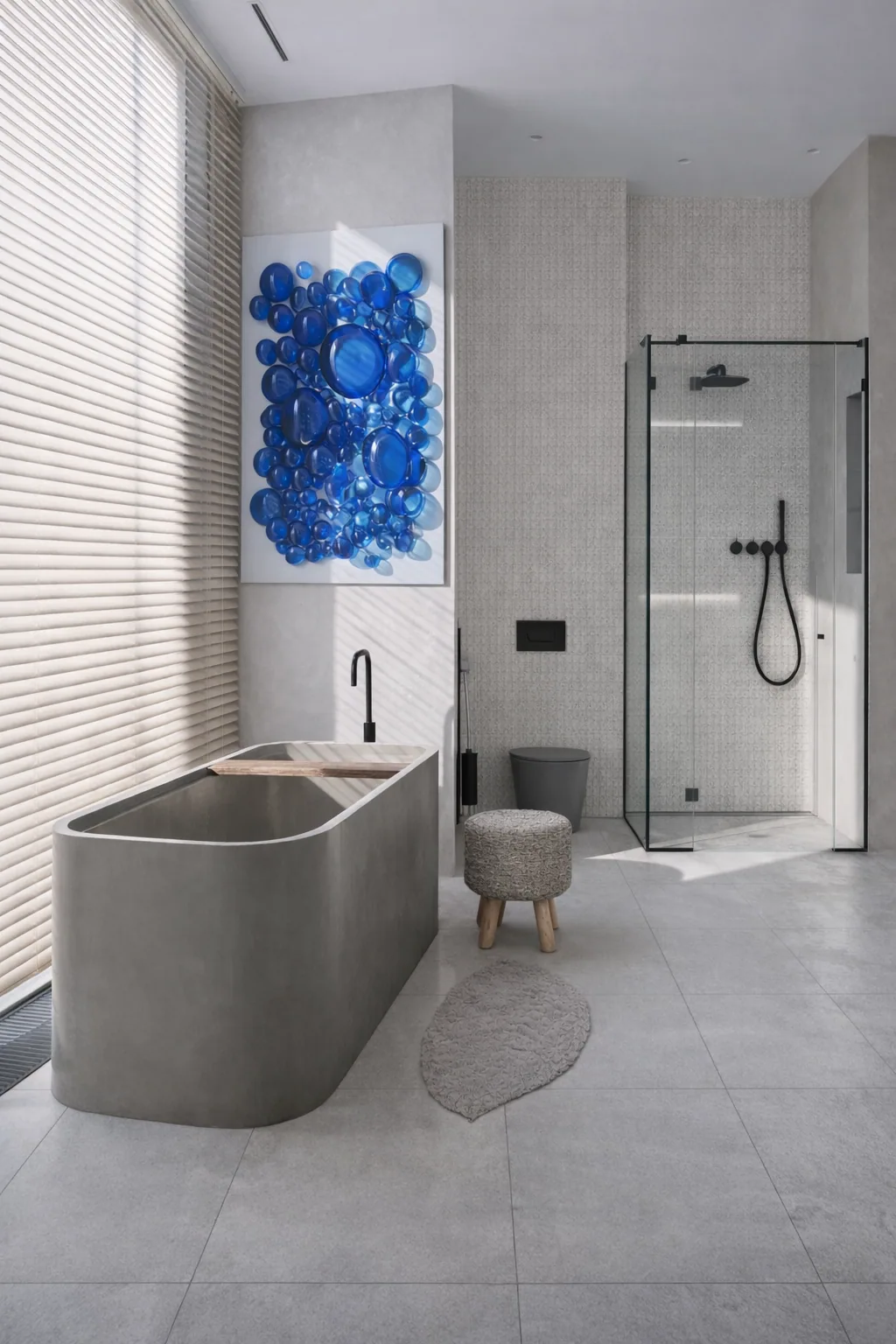
The material palette is concise and precise: engineered timber flooring, high-durability wall paint, microcement in the bathrooms, integrated volumes, and isolated natural textures. Engineering is embedded within the architecture. The apartment has independent supply-and-extract ventilation, ducted air conditioning, and a unified control system. Lighting is local and integrated, with low-glare sources. When required, the kitchen can be closed completely behind pocketing pivot-slide fronts.
Here, plasticity is not a stylistic device, but an inner quality of the space — form does not seek attention; it creates a calm, exact, and natural setting for life.