 РУ
РУ EN
EN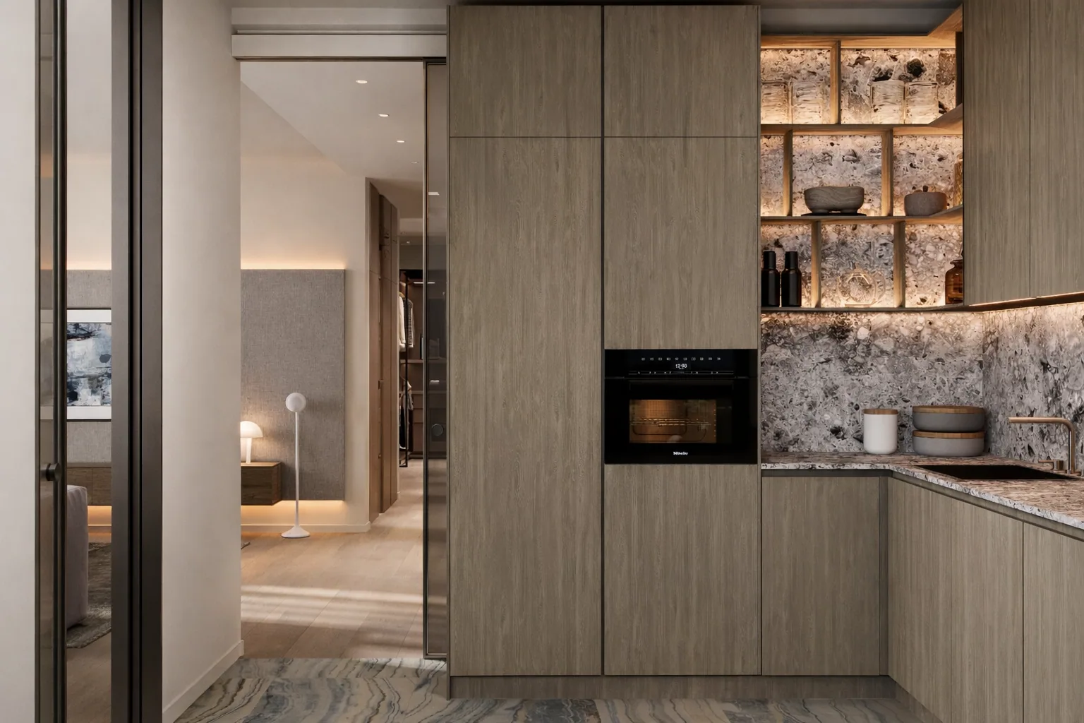
Name of the project
Veneer and Stone
Main character
Private client
Setting
Sosnovy Bor residential complex, Moscow, 2026
Apartment at Sosnovy Bor
Overview
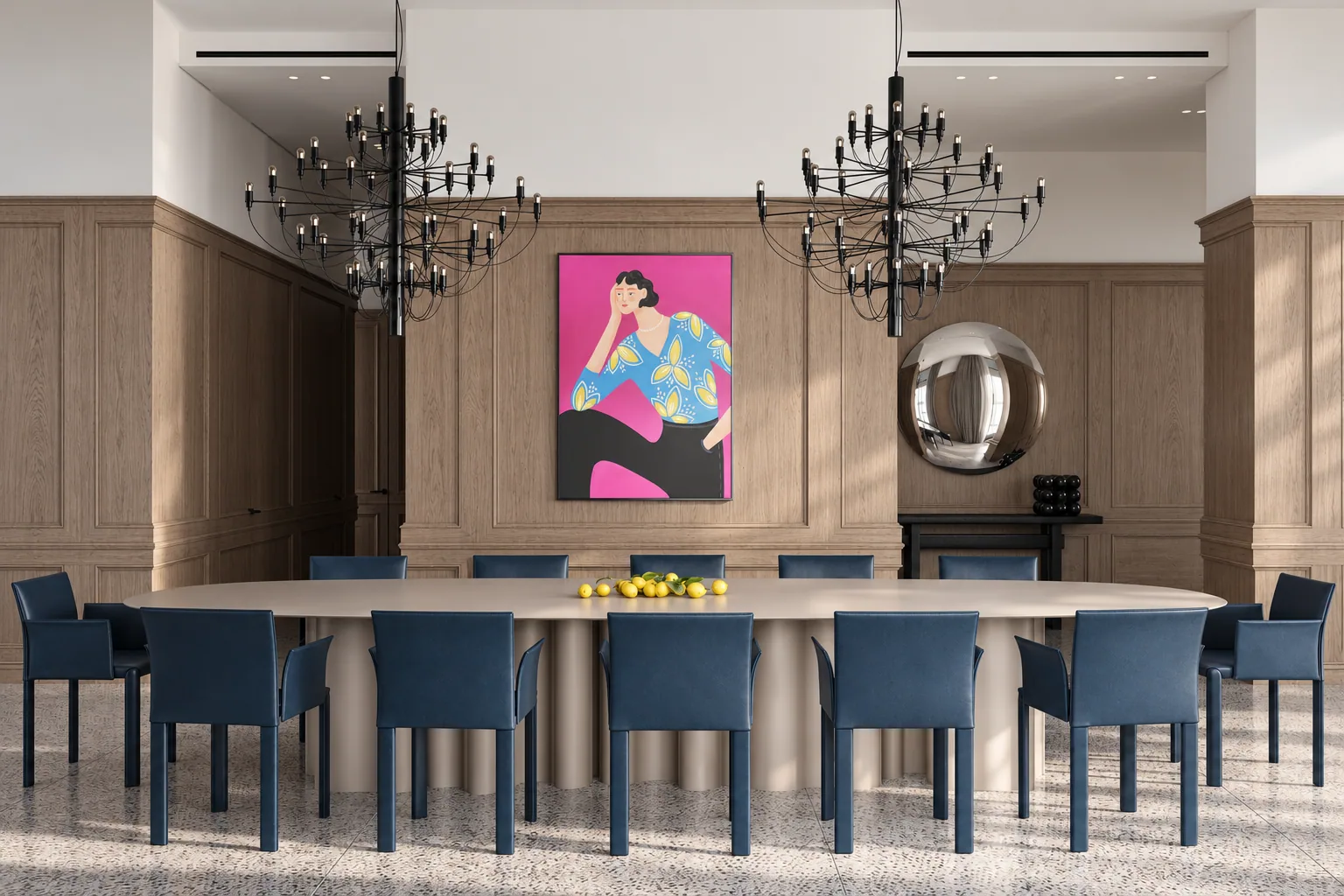
Veneer and Stone is built around calm architectural planes, the warm graphic quality of timber, and the composed texture of natural stone. The project follows a clear logic: the entrance is lined with veneered panels, while the living areas retain a quieter, lighter, and more even background. This division works both visually and in daily use. Materials at the entrance must withstand a more active routine while remaining part of one coherent architectural image.
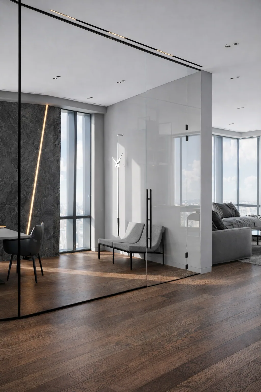
Material transitions are resolved carefully, without fragmenting the space. Junctions are designed so that the interior reads as one continuous sequence, while timber across the panels, doors, and integrated furniture feels like a single family of tones. The apartment therefore retains a sense of composure: its materials do not compete, but reinforce a shared measure.
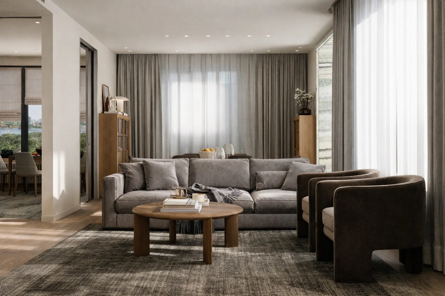
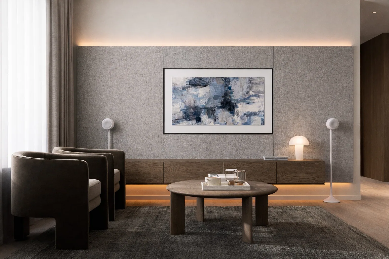
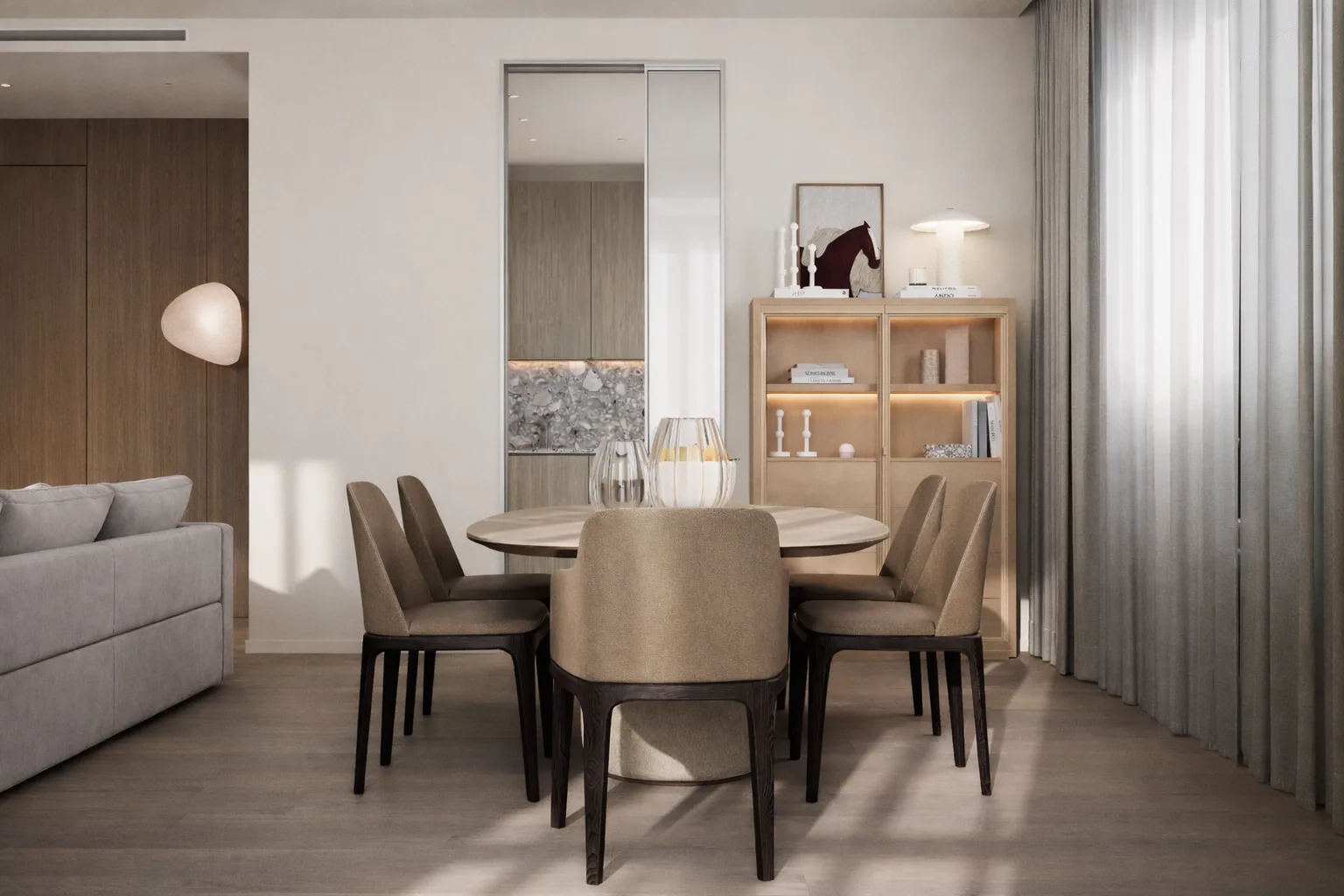
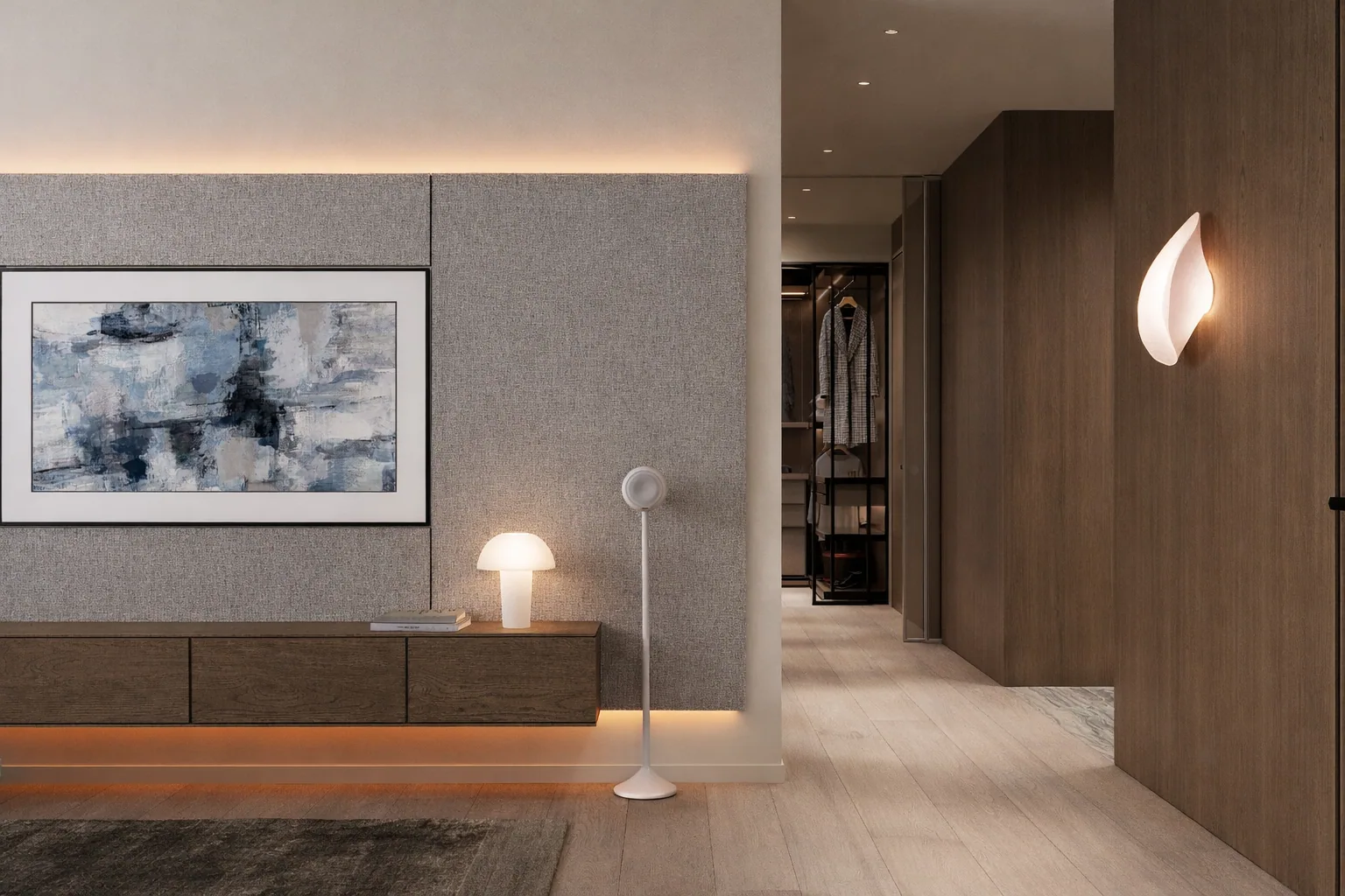
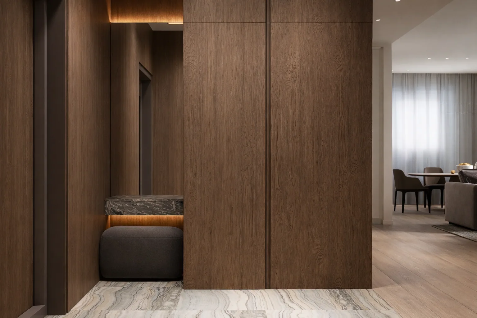
Image 1 of 6
Particular attention is given to controlling visual noise. Glass, open shelving, and integrated lighting are used only where they genuinely add depth and strengthen the composition. Most storage remains concealed, allowing the interior to stay ordered rather than becoming a display of possessions. This principle is especially important in the living room: illuminated showcases provide a light decorative accent, while closed cabinets and drawers support everyday storage.
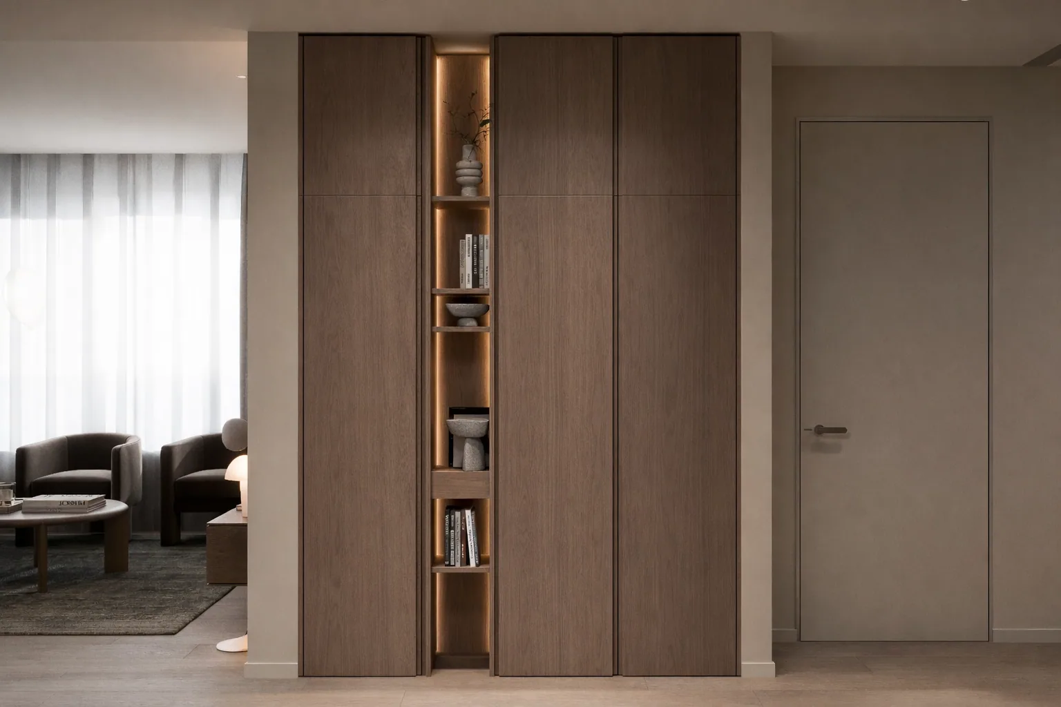
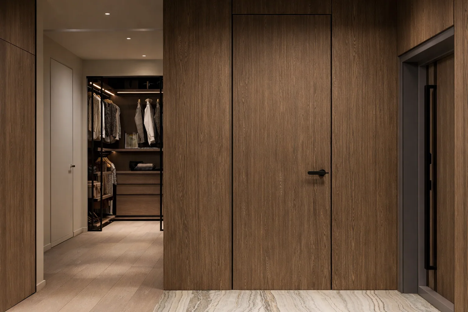
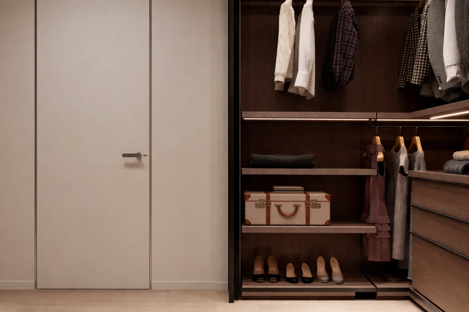
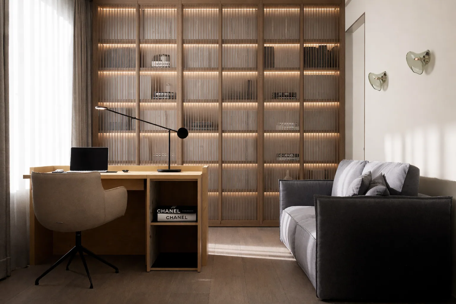
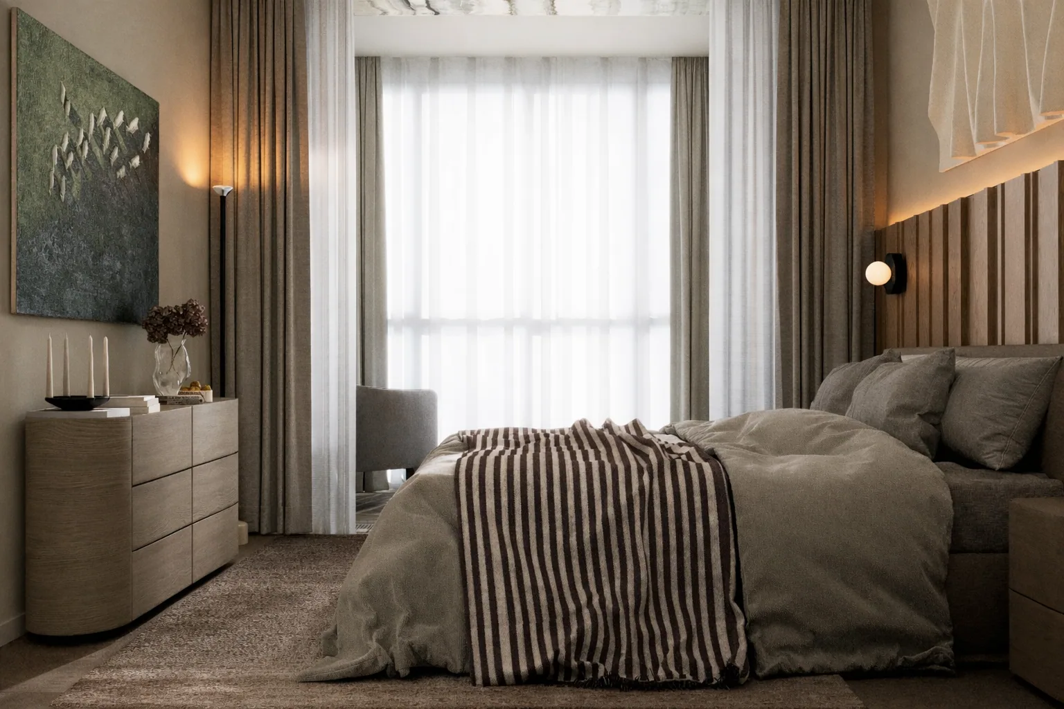
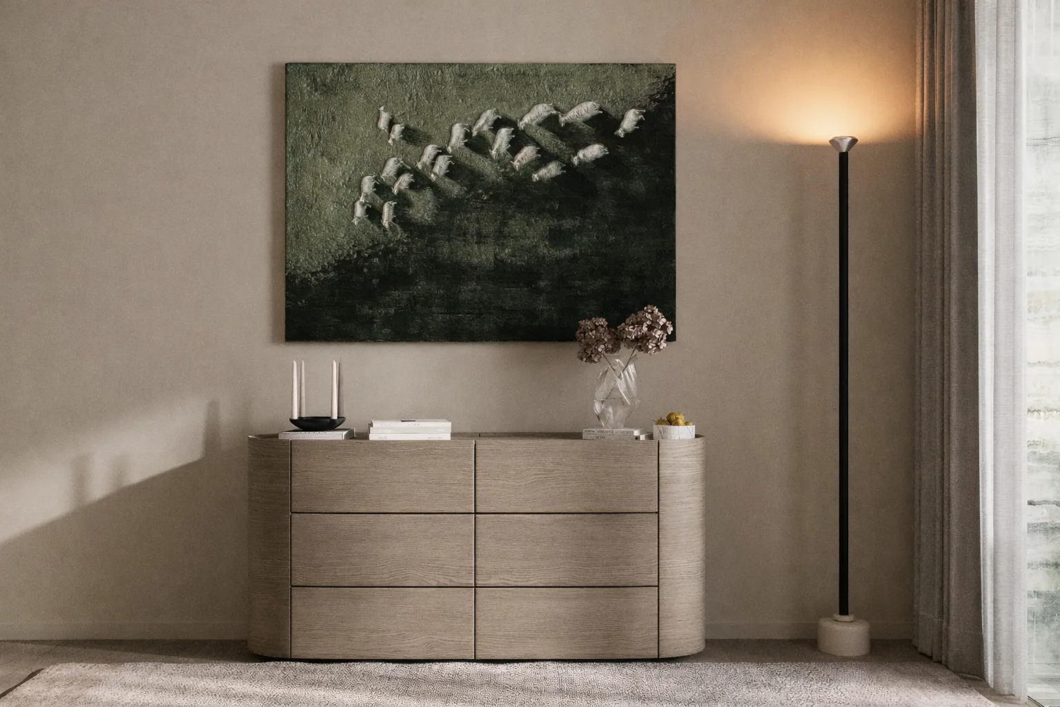
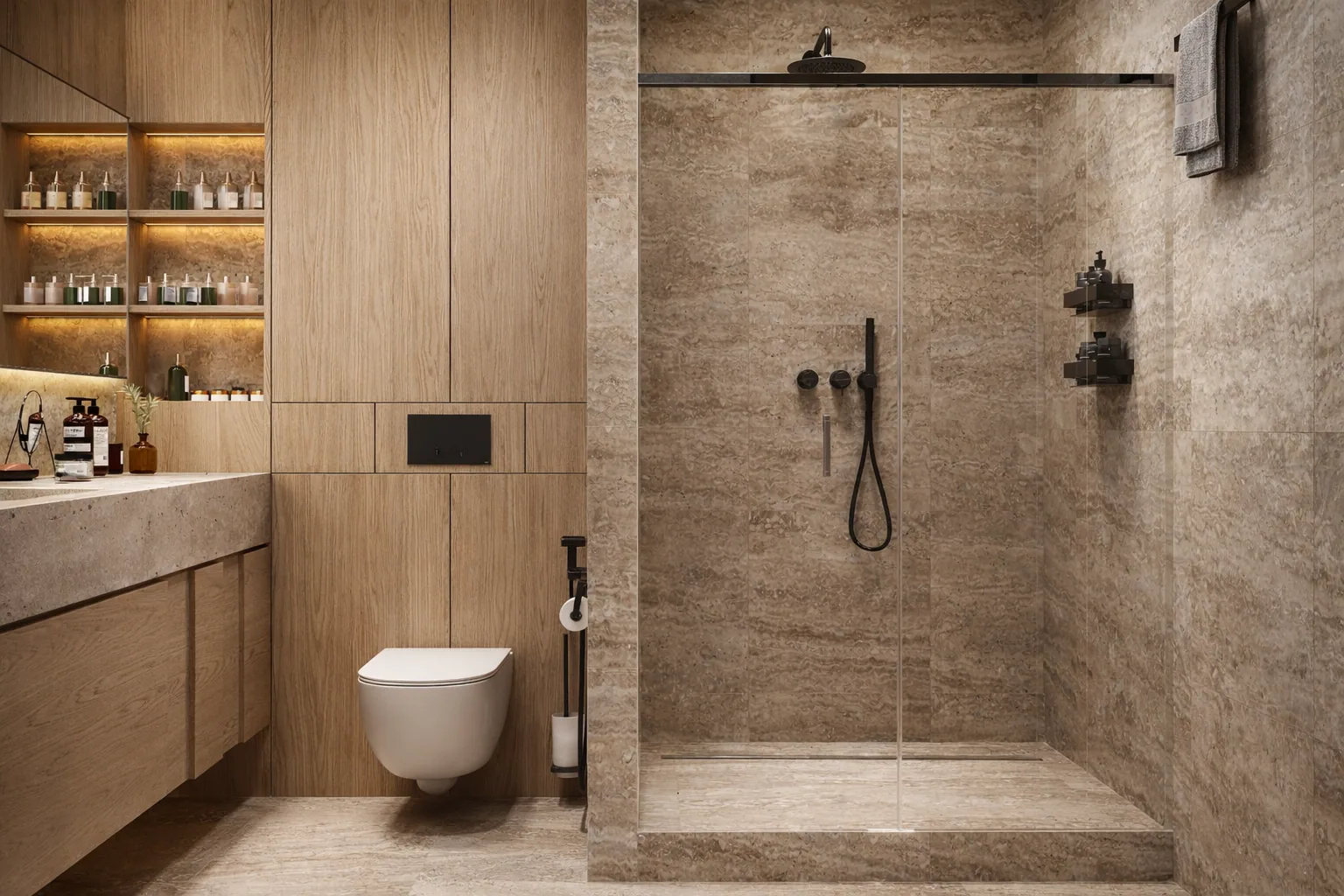
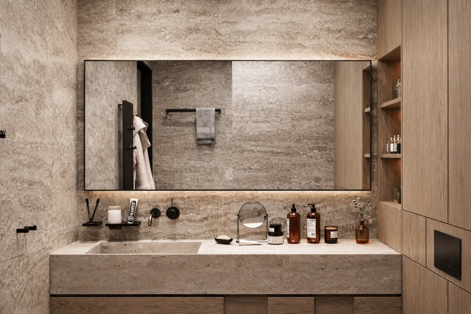
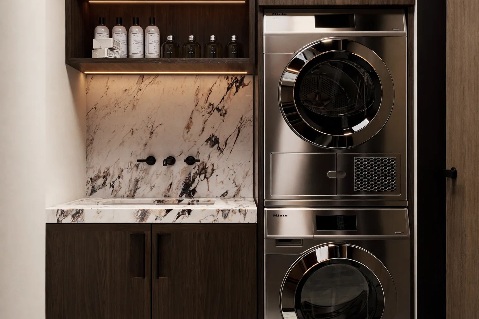
Image 1 of 9
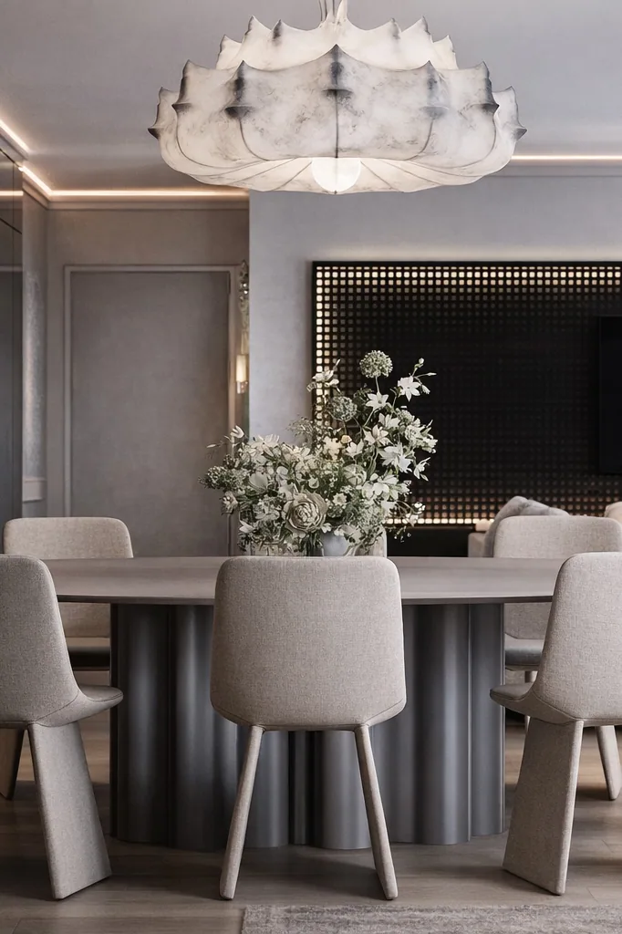
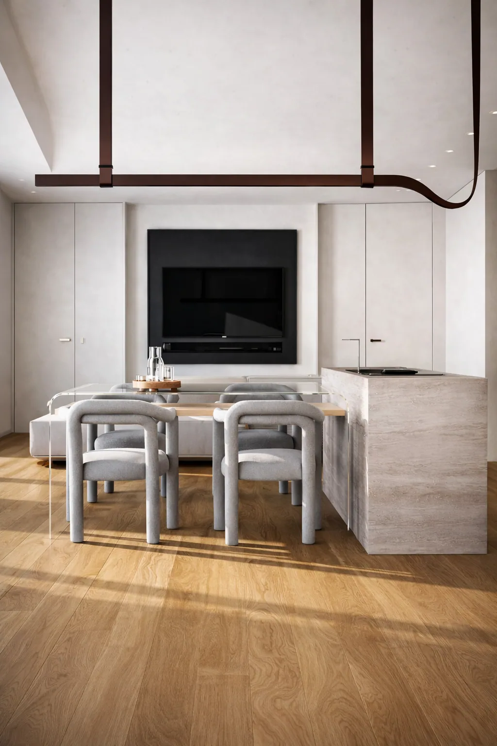
The television zone is absorbed into the main architectural plane rather than allowed to dominate. The screen is recessed into the panel composition, so it reads as part of the architecture instead of a separate technical object. Soft backlighting adds depth and gathers the room into a coherent evening scene. The dining area and kitchen continue the same approach through durable materials, clear storage, calm furniture forms, and two layers of light: one for atmosphere and texture, another for focused work.
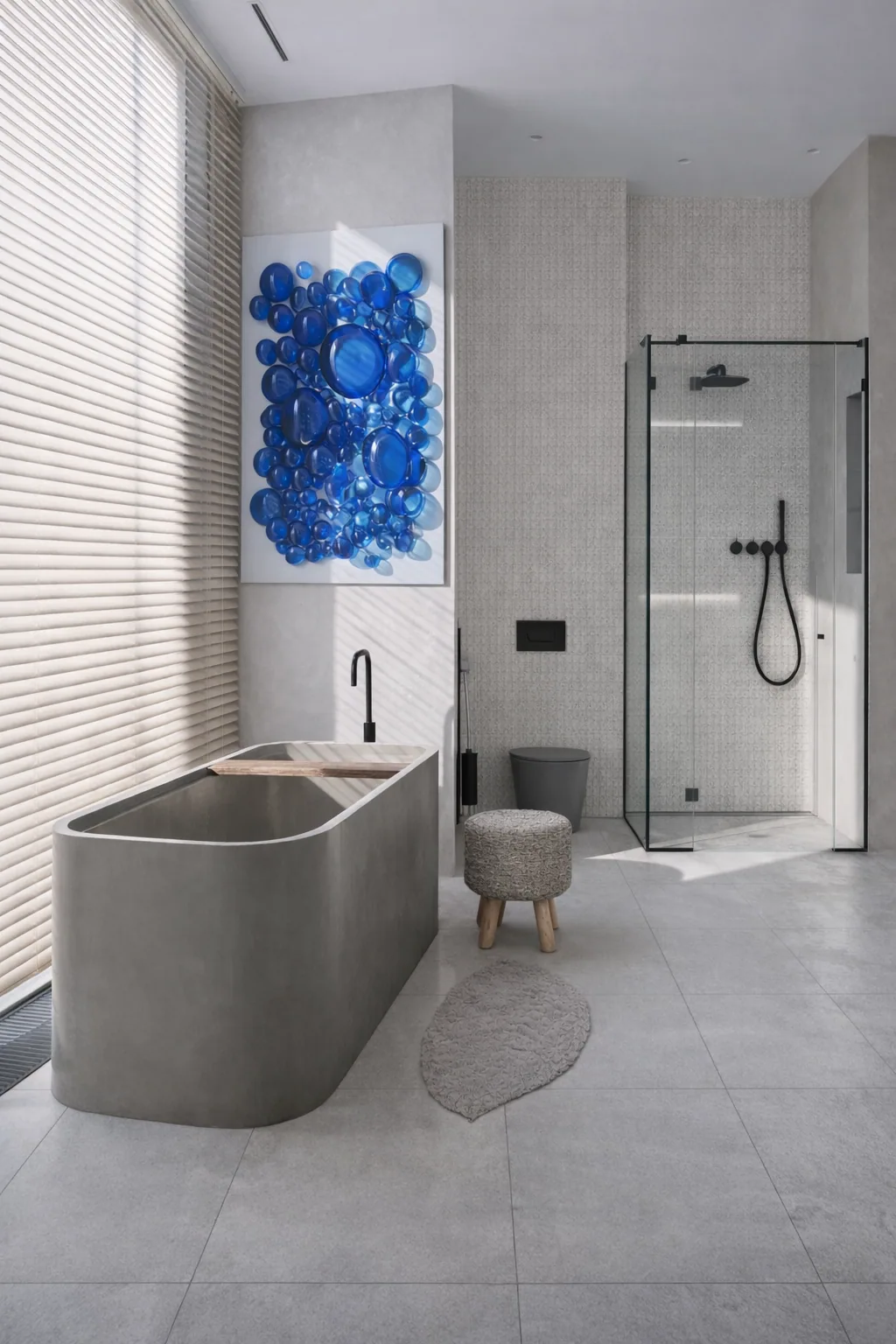
The entrance hall and corridor form a precise, composed episode with generous storage, a mirror, console, and bench. The full-height wardrobe is designed as a complete system, organised around order and everyday ease. In the study, bedroom, bathrooms, and laundry, the same system becomes quieter and more tactile. Timber, stone, calm surfaces, concealed storage, and local light create an environment in which practicality never disrupts architectural coherence.
Engineering supports the same sense of precision. Supply-and-extract ventilation serves both shared and utility areas while minimising its impact on ceiling height in living rooms, with air distributed through linear slots. The lighting design preserves clean ceiling planes through precise recessed fittings and a broad range of local scenes using furniture lighting, wall lights, floor lamps, and table lamps. The result is held together by one clear system — material, luminous, and functional.