 РУ
РУ EN
EN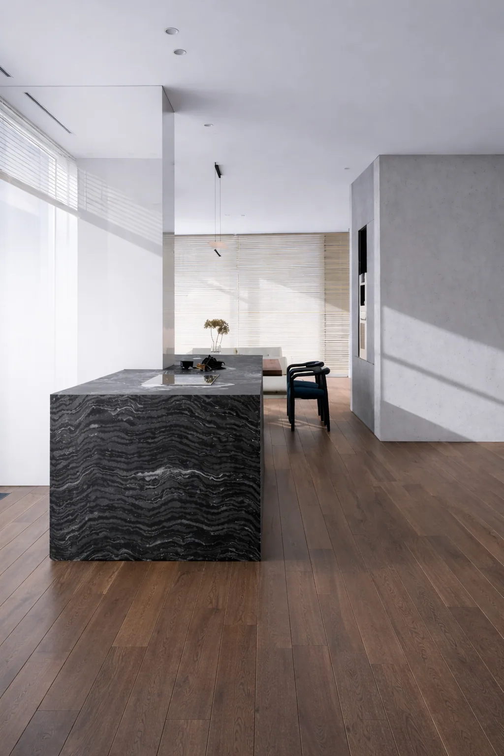
Name of the project
Kamerton
Main character
220 m² apartment
Setting
Krasnopresnenskaya Embankment, Moscow
Kamerton
Overview
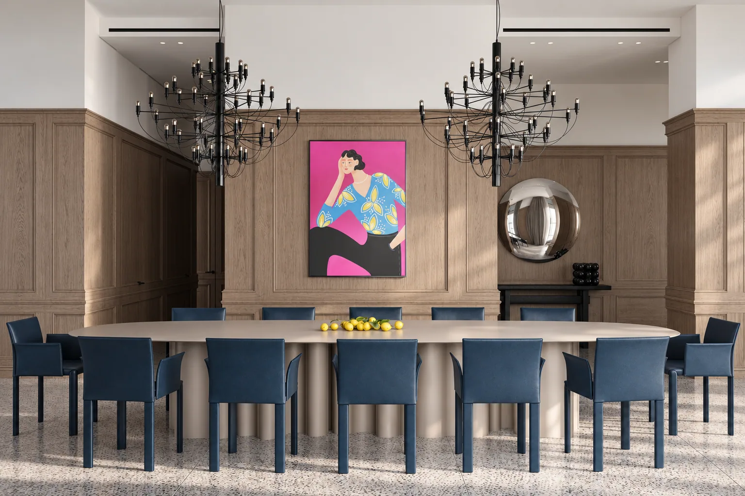
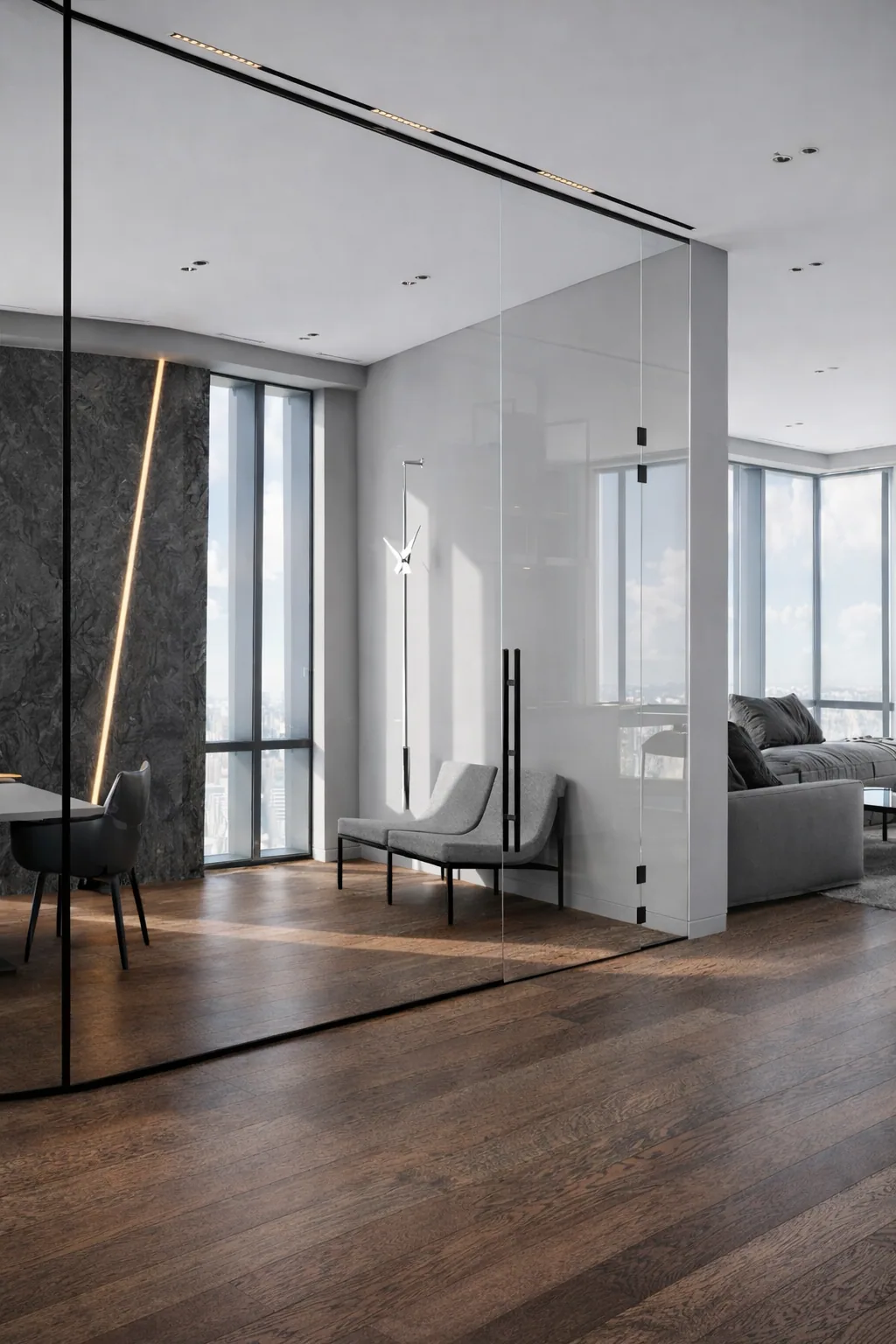
Kamerton treats the apartment not as a collection of rooms, but as a single architectural volume composed around panoramic views of central Moscow. The broad glazed frontage becomes the interior’s principal façade. The city remains present throughout, while every decision — from the low, soft volumes of the furniture to the restrained palette of stone, timber, and textiles — follows one purpose: not to compete with the view, but to work precisely with its rhythm.
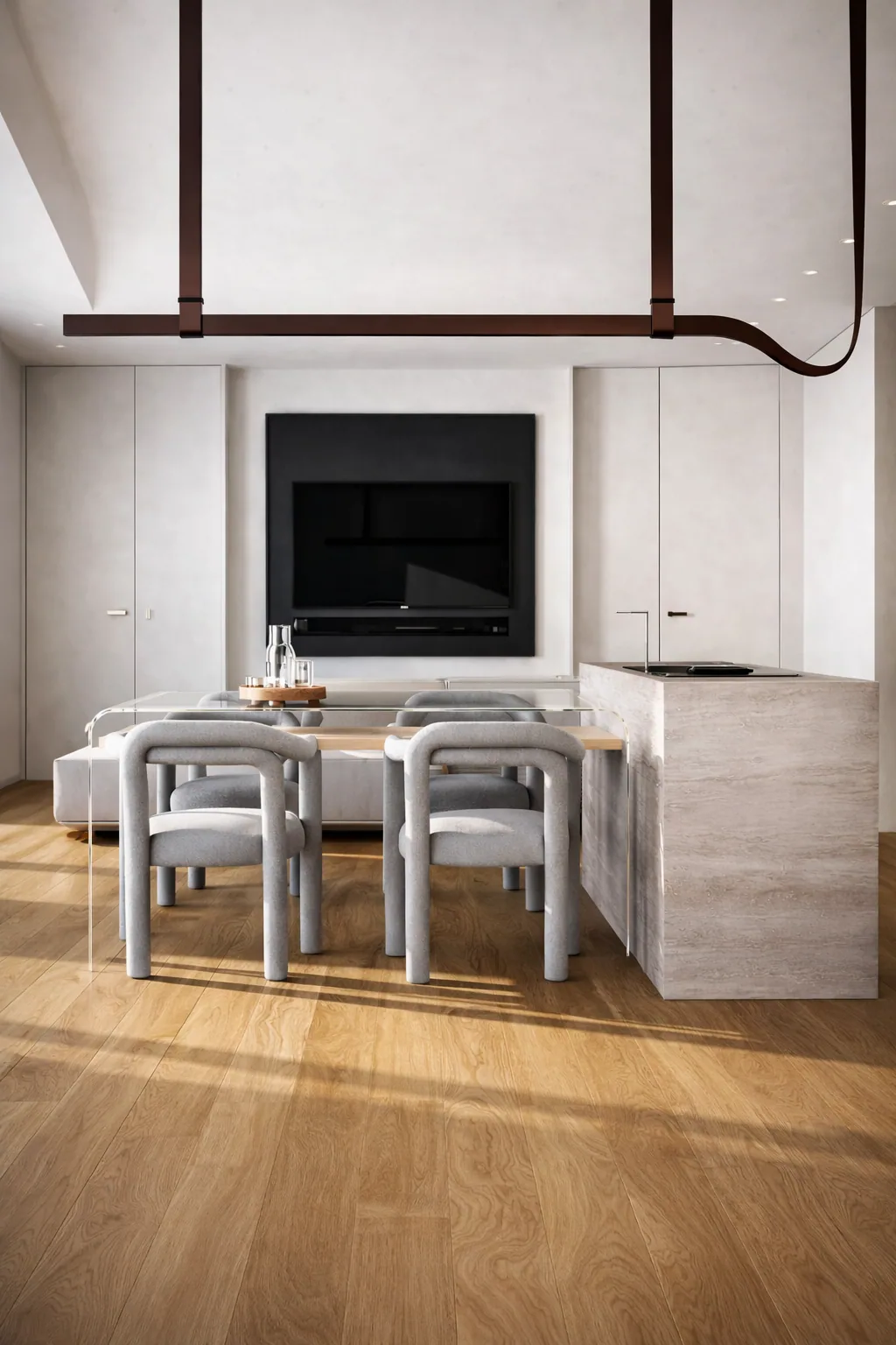
The complete design covered both the shared and private areas. Utility spaces, guest rooms, and bathrooms received the same level of technical precision and coherence. The main living area is assembled from calm, substantial elements: a monolithic dark-stone kitchen island, integrated storage planes, concealed doors, soft textile forms, and fine graphic lighting. The interior relies on proportion, material depth, and clarity of line rather than decoration.
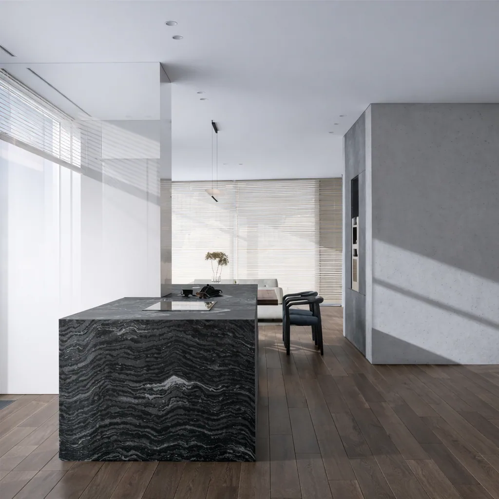
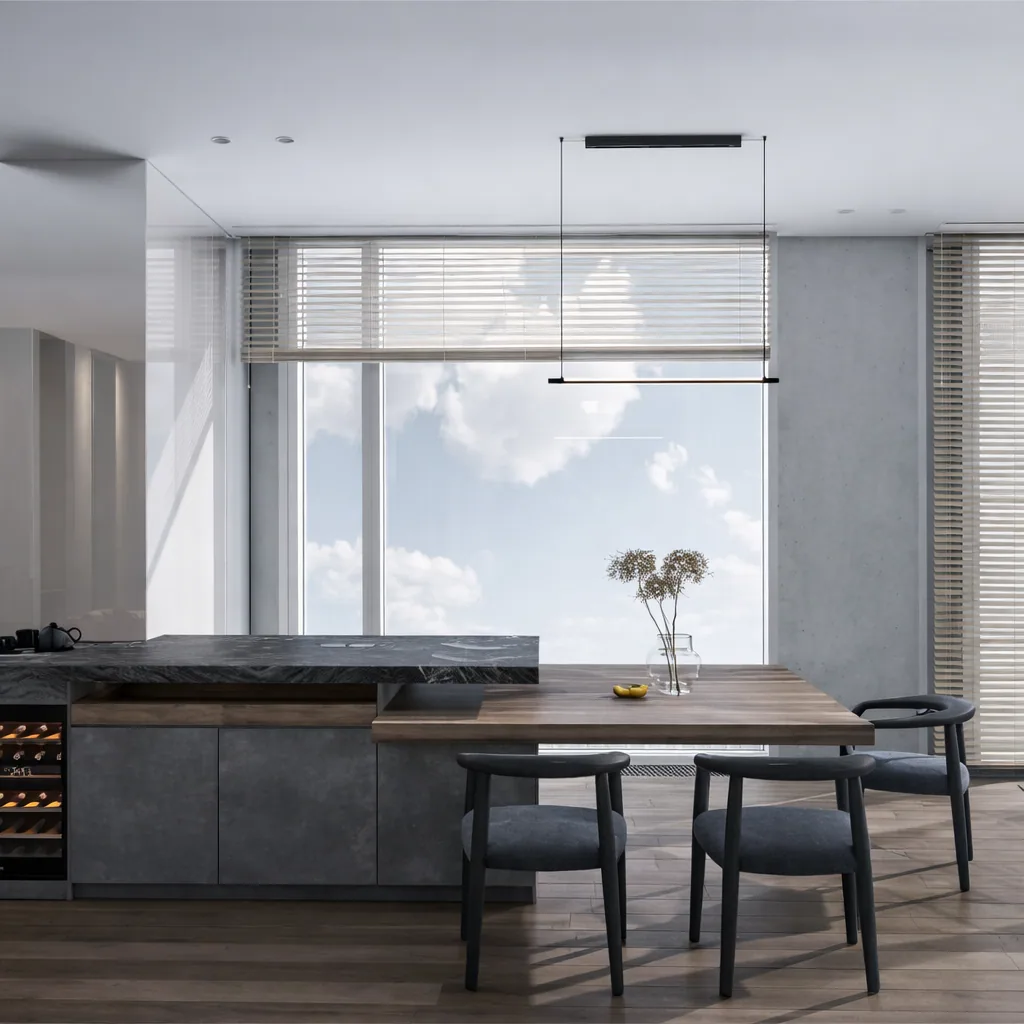
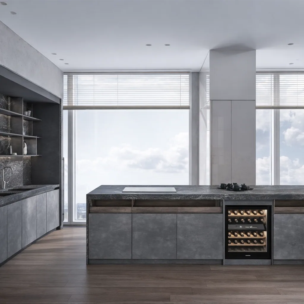
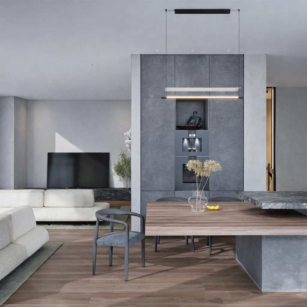
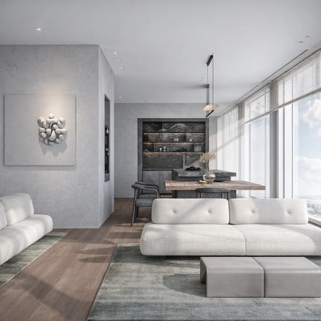
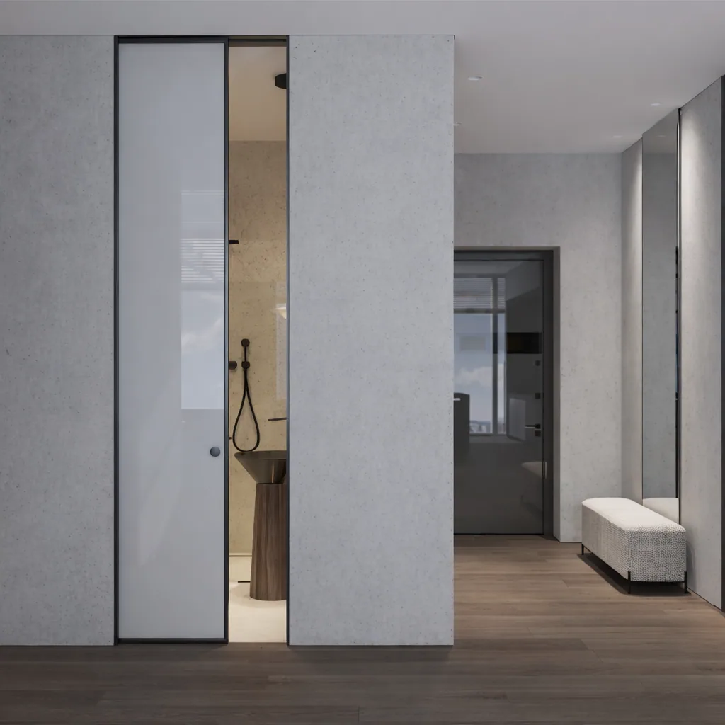
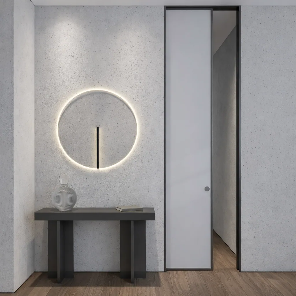
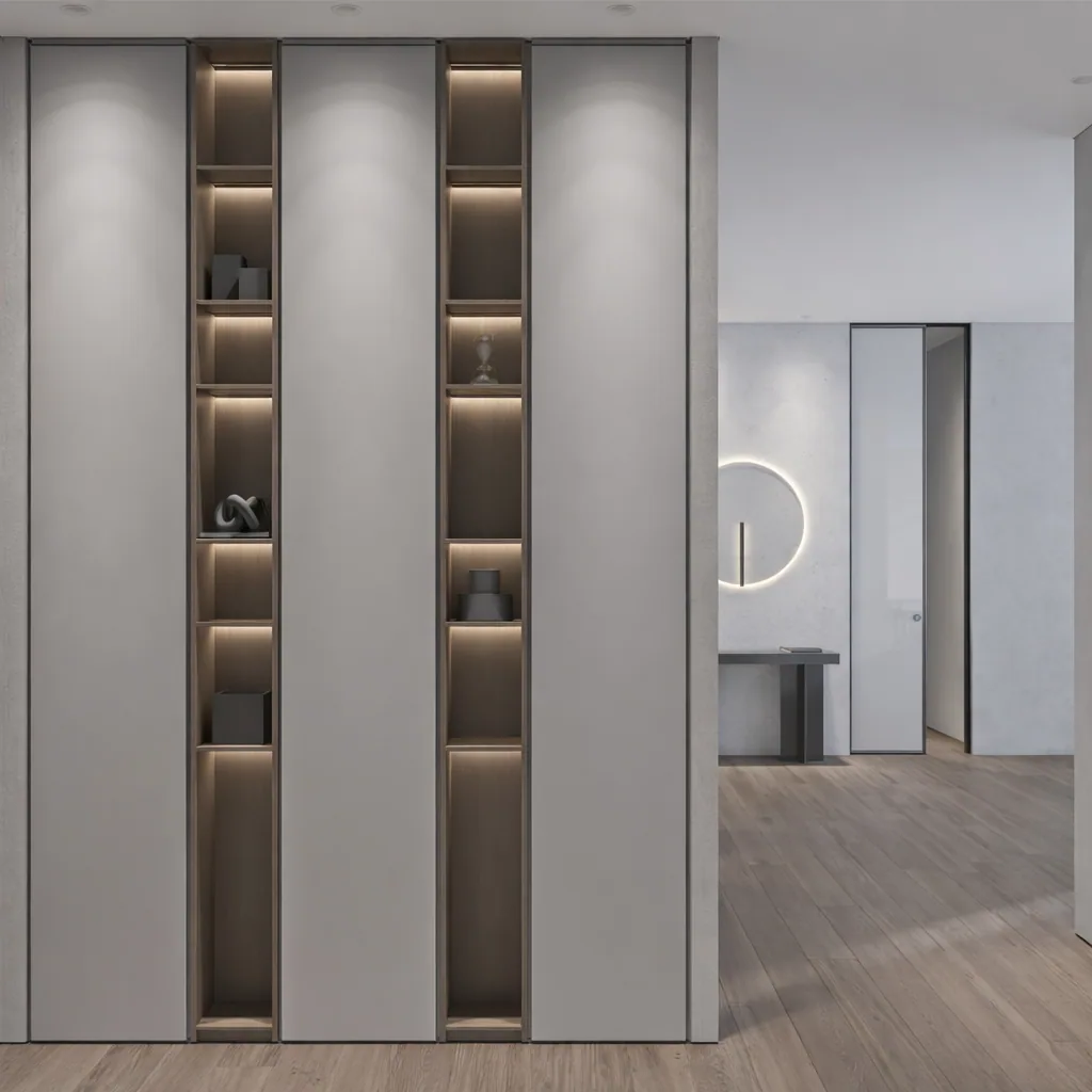
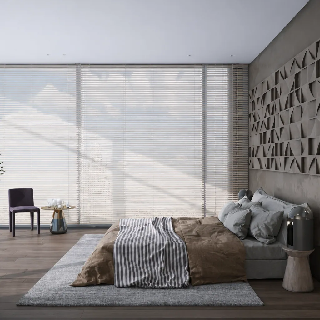
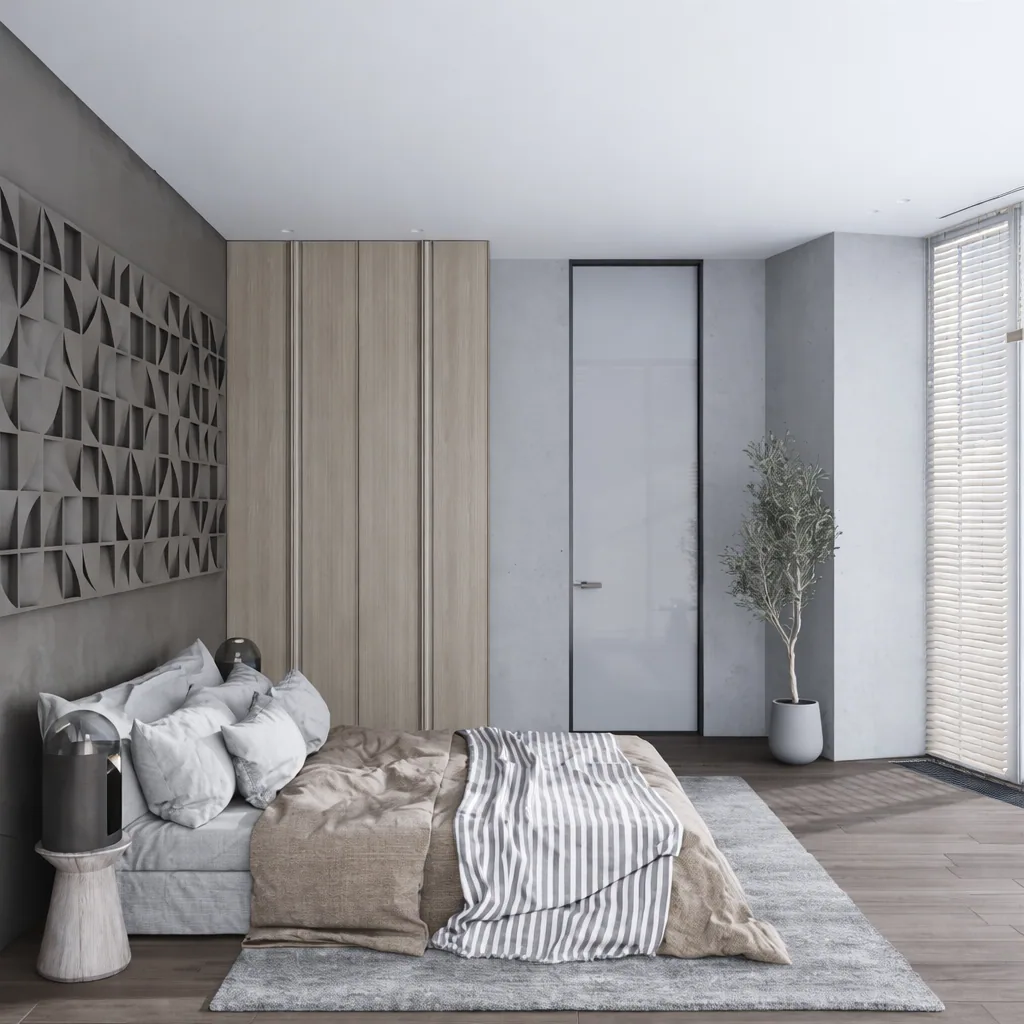
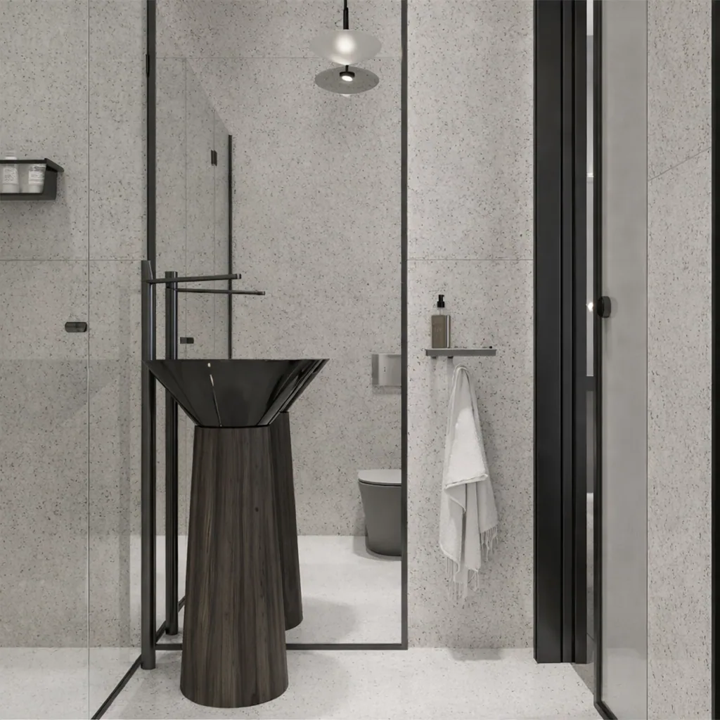
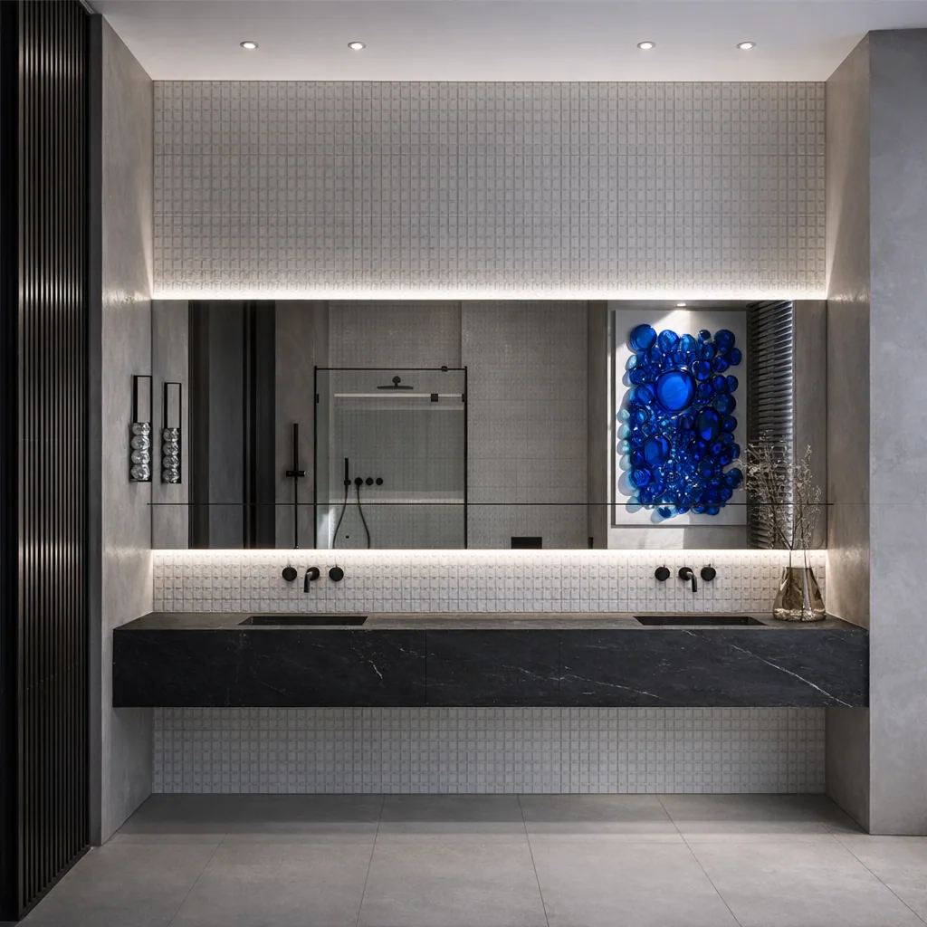
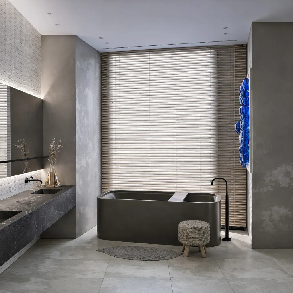
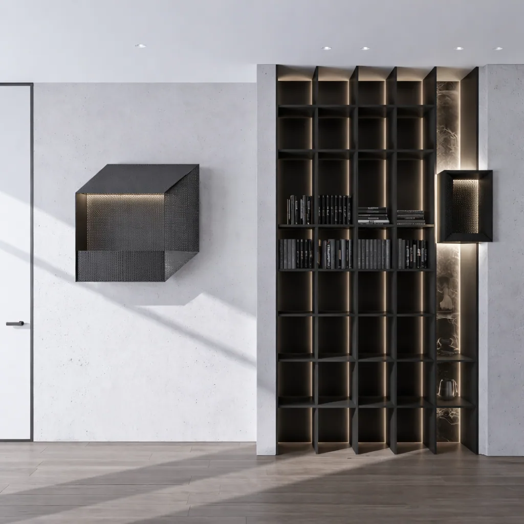
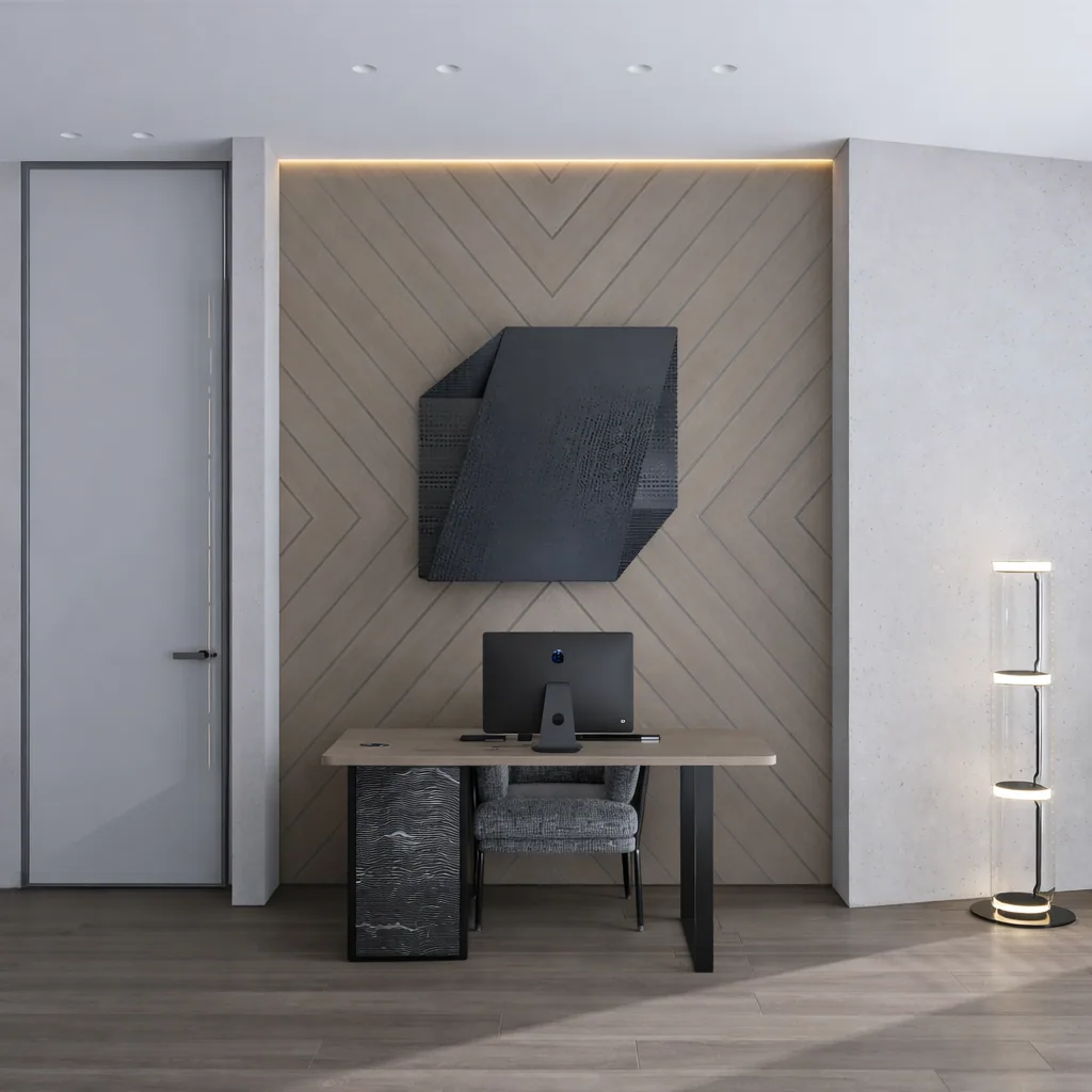
Image 1 of 15
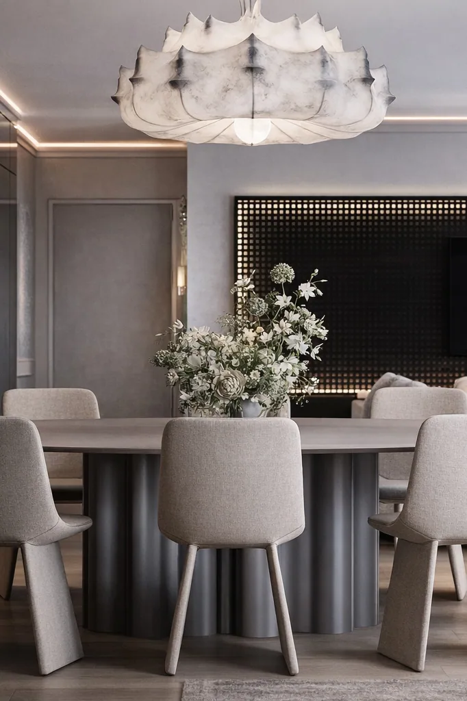
Engineering plays a distinct role as the invisible infrastructure of comfort. Ventilation, ducted air conditioning, adiabatic humidification, water treatment, hydraulic and electrical protection, automation, and lighting control are integrated without adding visual weight. The lighting is particularly precise: localised beams, low glare, and layered scenes reveal the interior’s relief and textures while preserving an intimate atmosphere across the large open volume.
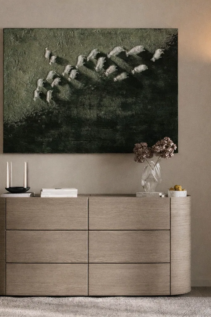
In the private areas, the same logic becomes quieter and more tactile. The bedroom and bathrooms use a muted natural palette in which mineral surfaces, warm timber, glass, metal, and isolated works of art create a sense of stillness, focus, and depth. Here, the city view does not merely accompany the architecture; it becomes an equal part of it.