 РУ
РУ EN
EN
Name of the project
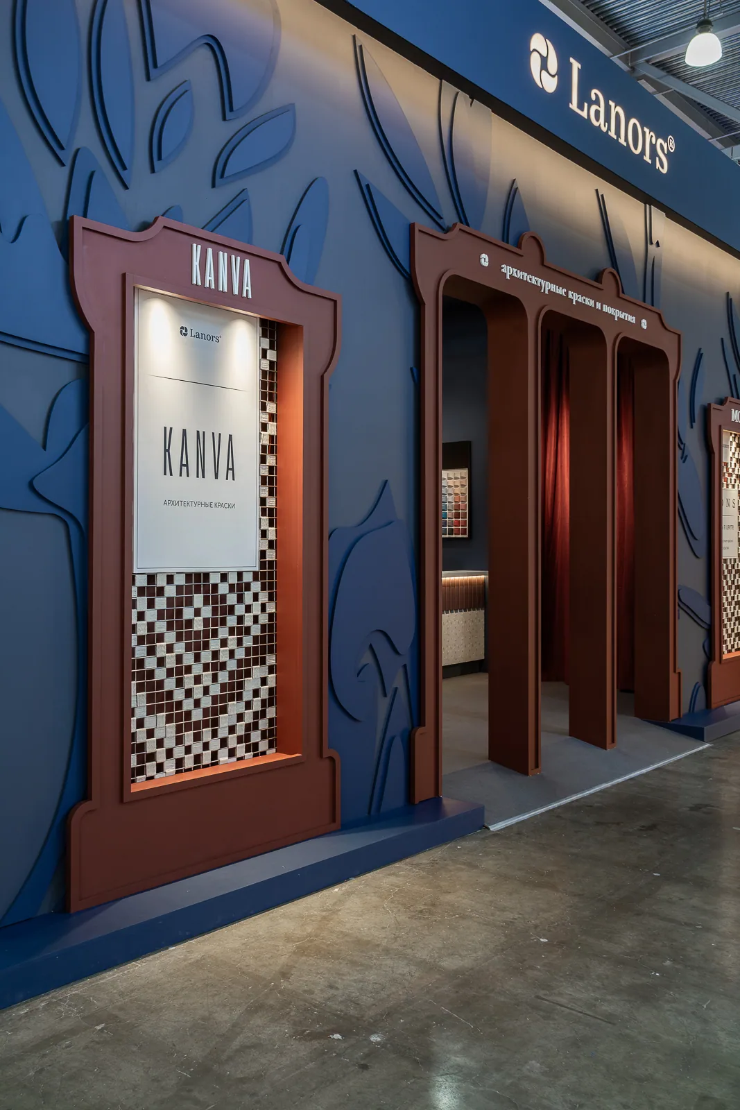
Paper House — a stand for the Majestic brand by Lacos and the “Oboi №1” showroom at MosBuild 2024.
Main character
Majestic — a premium interior paint brand.
Setting
MosBuild 2024, Moscow. The largest international exhibition for construction, finishes and design in Russia.
Paper House Majestic at MosBuild 2024
Objective
To create an expressive spatial installation that conveys Majestic’s brand concept as a creator of environments through colour and form. At the centre is the architectural palette, developed in collaboration with leading architects.
Conceptual scenario
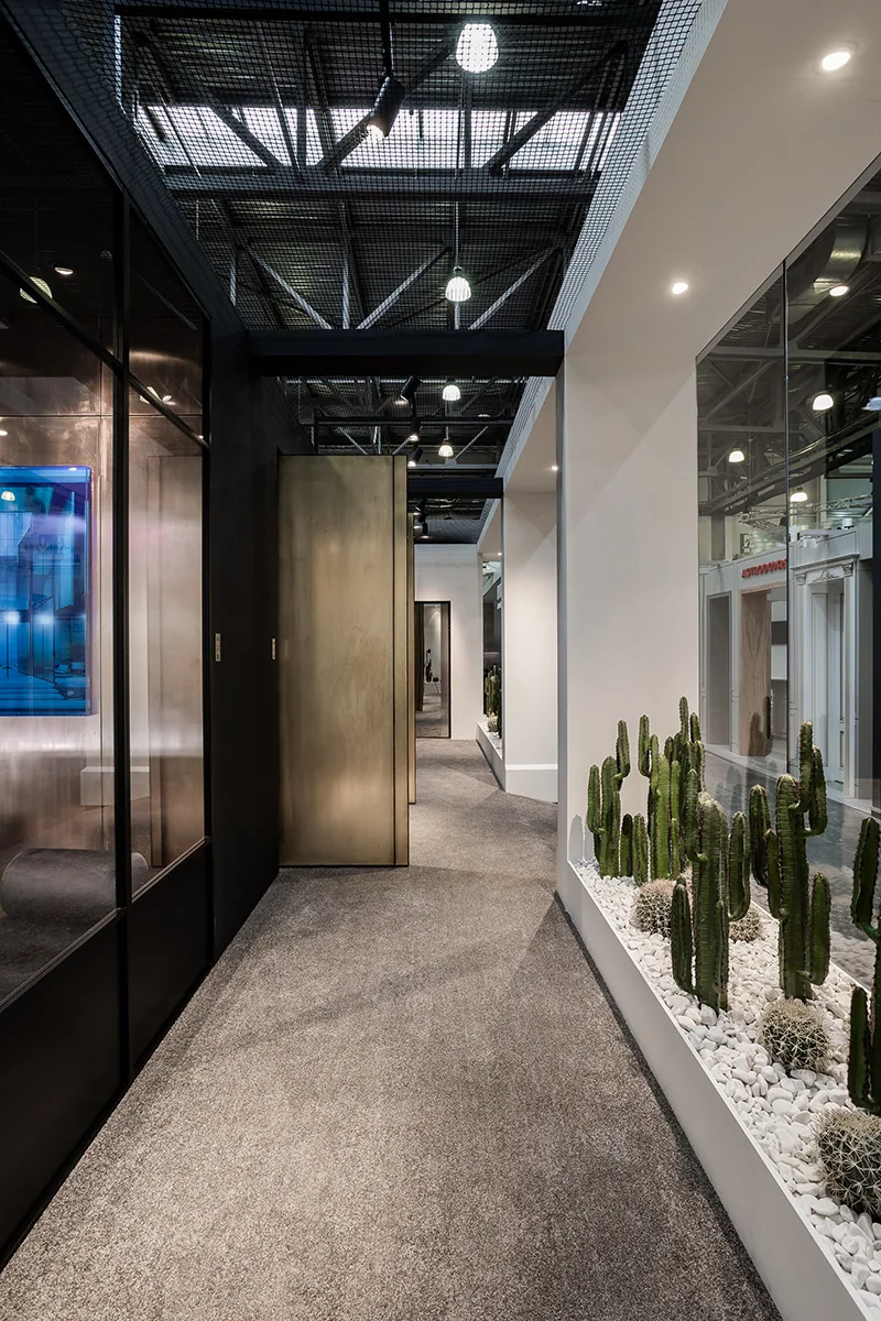
The image of a paper house served as the point of departure. Paper as a symbol of freedom — a blank page where new forms and meanings emerge. The spatial composition resembled a hand-folded model: sharply cut edges, breaks, lines of light. Particular attention was given to the displays — their form and function were developed from scratch for both the exhibition and showrooms.
Client’s role in the project
The “Oboi №1” showroom and the Majestic brand were actively involved throughout — from concept approval to the fabrication of custom elements. Some technical solutions were implemented by the client’s own team. This collaboration ensured flexibility and depth.


Image 1 of 13
Architecture of the idea
The stand’s structure unfolds the idea of the home as a paper model — flexible, pristine, expressive. Colour becomes a tool not of decoration, but of atmosphere design. The architectural palette is arranged as an artistic system: it affects perception of volume, sets the mood, structures the space.
Some colours of the palette were developed with the participation of Zariza Art. This added authorship to the installation and embedded internal logic into the composition.
On site
Assembly followed an intense schedule: five days from the first structures on site to final decor.
Details and meanings
- The architectural palette was created by architects including Boris Uborevich, Alexandra Fedorova, Artem and Lia Babayants, Ekaterina Zabegina, Lesya Pechenkina, Alexander Batenkov, Anna Modzharro, Asya Nikolova, Sergey Tregubov;
- The palette is based on colours that were missing — not a collection of shades, but a method of thought;
- Paper is not the theme but the method: a prototype of form, its language and conceptual framework.
Final result
Despite its modest size, the stand became a point of attraction. It resonated both in the professional community and on social media. Publications, visual impact and heartfelt feedback proved that the idea worked — not just formally, but on the level of feeling.


Image 1 of 6