 РУ
РУ EN
EN
Name of the project
Grand Orac Hotel — Orac stand at the MosBuild 2023 exhibition.
Main character
Orac — an international brand of decorative profiles and architectural solutions that combines aesthetics, technology, and environmental responsibility.
Setting
MosBuild 2023, Moscow — Russia’s largest exhibition of architecture, construction, and interior finishes.
Grand Orac Hotel at MosBuild 2023
Objective
To rethink the decorative potential of Orac products through an artistic metaphor — creating a booth where classical elements gain cinematic presence and ornamentation becomes a narrative device.
Conceptual scenario
The concept was inspired by Wes Anderson’s film The Grand Budapest Hotel. The goal was to convey its refined eccentricity, graphic precision, and playful manipulation of scale.
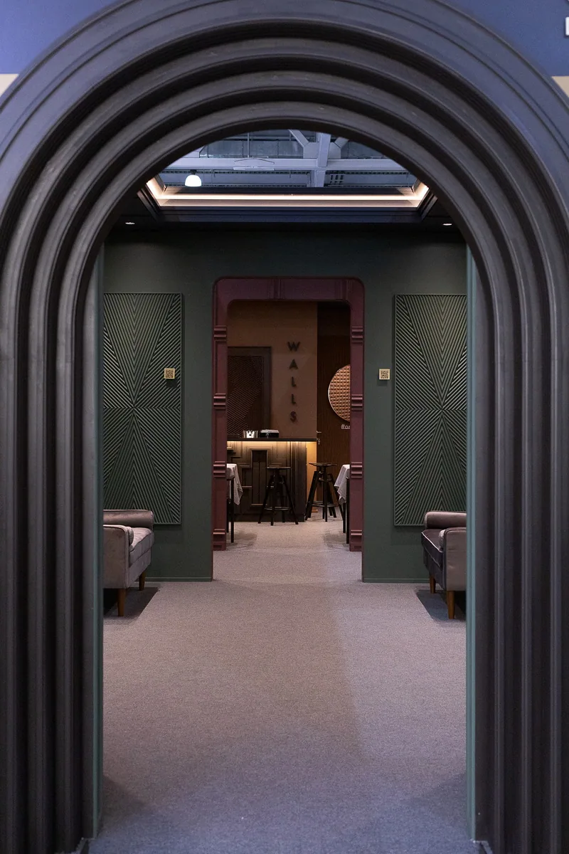
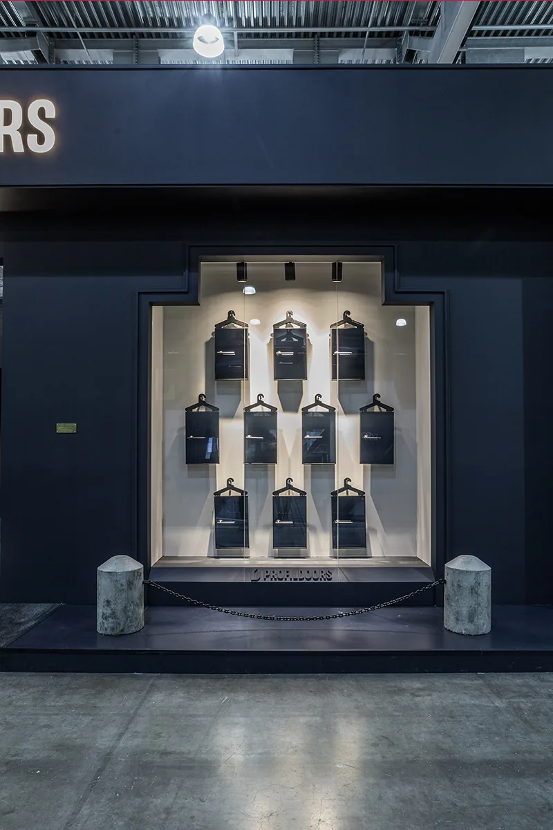
The main façade took on familiar contours, lightened and reimagined through monochrome, pure lines, and a touch of architectural grotesque. The interior was composed cinematically: each area a scene, bound together by rhythm and narrative.
The visual centerpiece was a reinterpretation of the painting Boy with Apple, created from 3D panels and flex mouldings — a focal point deepening the storyline of the space.
Client’s role in the project
The Orac team was closely involved throughout the entire process — from logistics to technical support during installation. Their commitment and the quality of signature materials guaranteed a precise and refined result.


Image 1 of 7
Architecture of the idea
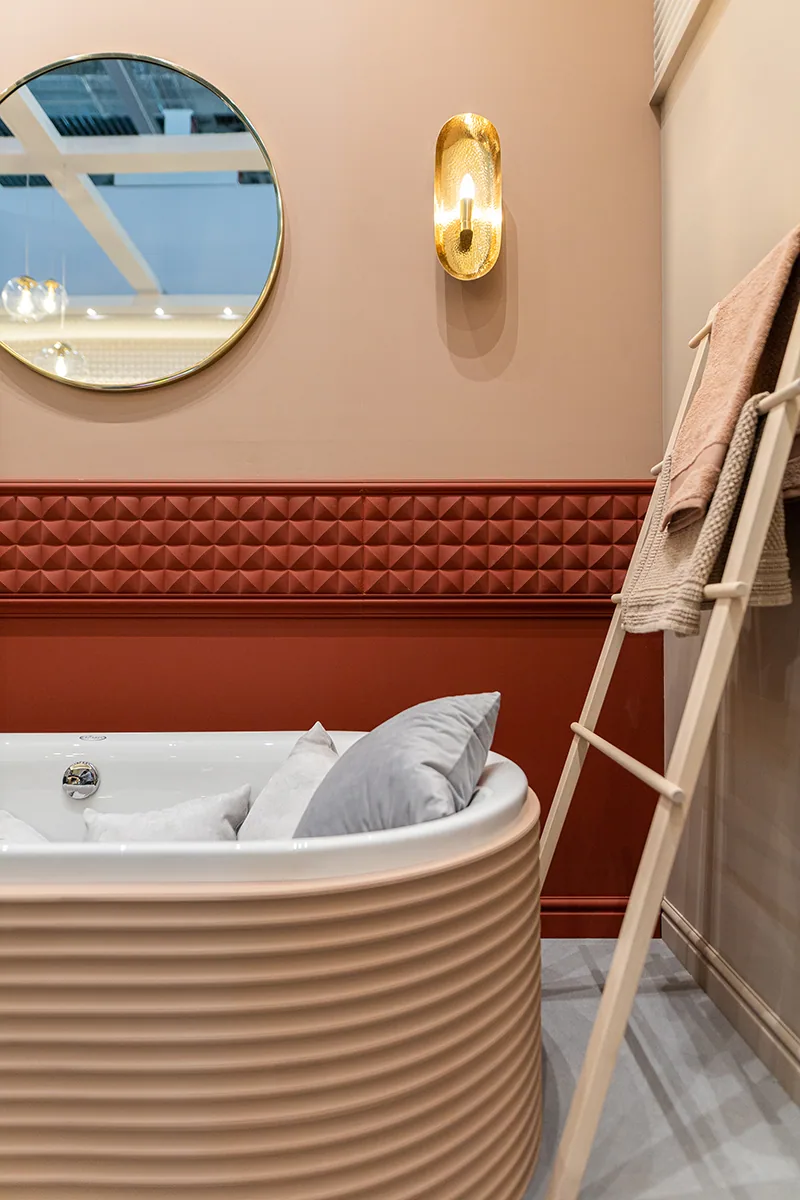
The booth interprets cinema as a tool for spatial storytelling: - A deliberately scaled-down “dollhouse” effect. - Vertical rhythms and sculptural contrast of light and shadow. - A carefully curated color palette, echoing cinematic tones.
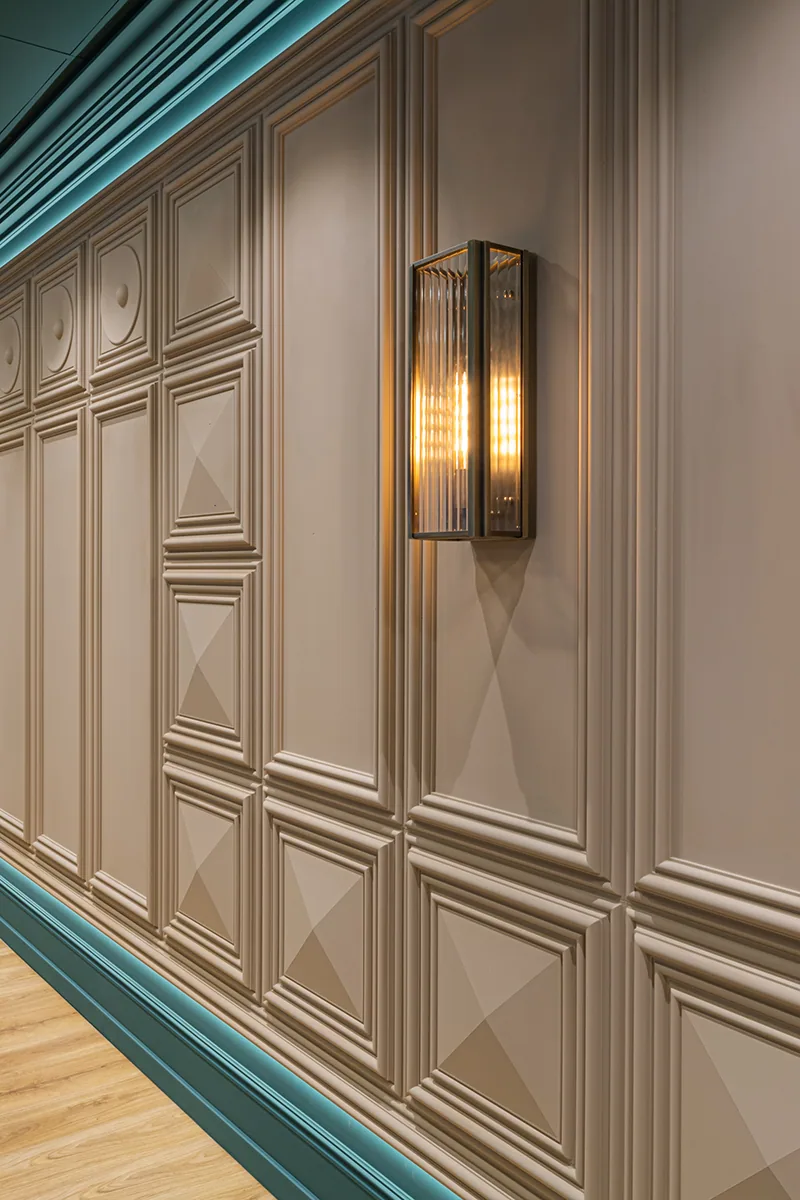
Architectural elements reference classical forms yet speak a modern language. The “hotel” became a living set, where ornamentation conveys meaning beyond decoration.
On site
The project went from concept to completion in just over three months. Assembly was rapid and meticulous, involving lighting calibration, color matching, and precise installation of panels and decorative elements.
Details and meanings
- Approx. 100 m² of panels and 1000 linear meters of mouldings used.
- All colors custom-matched; key tones were revised multiple times.
- Two vintage Soviet armchairs restored and integrated.
- Core elements like the Boy with Apple panel were repurposed for Orac’s interiors.
The reception desk echoed the iconic red elevator from the film.


Image 1 of 10
Final result
The stand became not just a striking visual reference but a resonant artistic statement. It sparked enthusiastic response from visitors and partners, capturing Orac’s strategy: blending cultural nuance, ecological awareness, and bold artistic thinking. The project affirmed that architectural décor can do more than embellish — it can shape atmosphere, provoke emotion, and leave a lasting impression.