 РУ
РУ EN
EN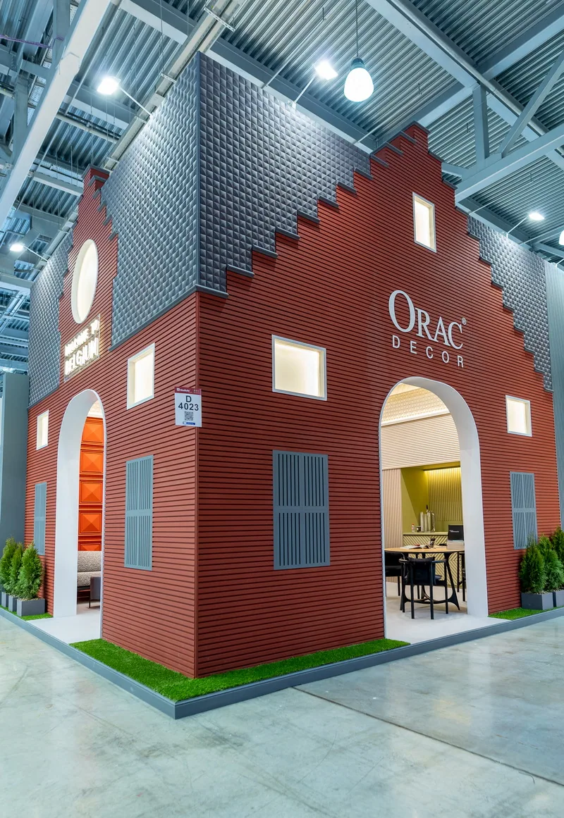
Name of the project
Belgium House, 2021
Main character
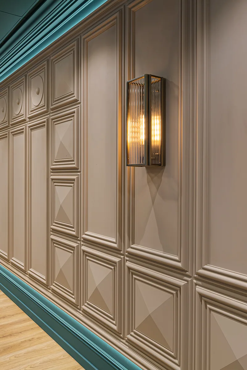
Orac Decor — a Belgian brand of architectural mouldings that blends aesthetics, high material culture, and the ability to flexibly transform space.
Setting
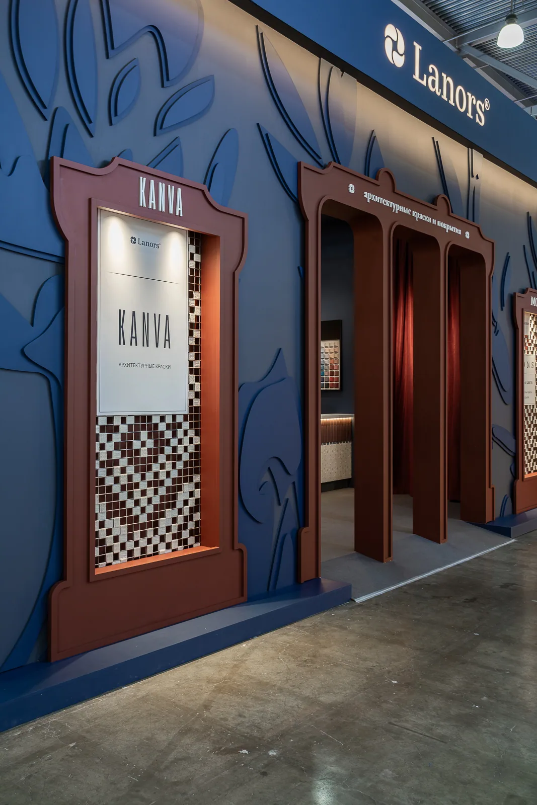
MosBuild 2021, Crocus Expo International Exhibition Center, Moscow — the largest interior design exhibition of international scale in Russia.
Belgium House by Orac at MosBuild 2021
Objective
To create an exhibition that transforms the traditional stand format into a scene of personal experience — inviting visitors into a world of comfort, tactility, warmth, and architectural softness.
Conceptual scenario
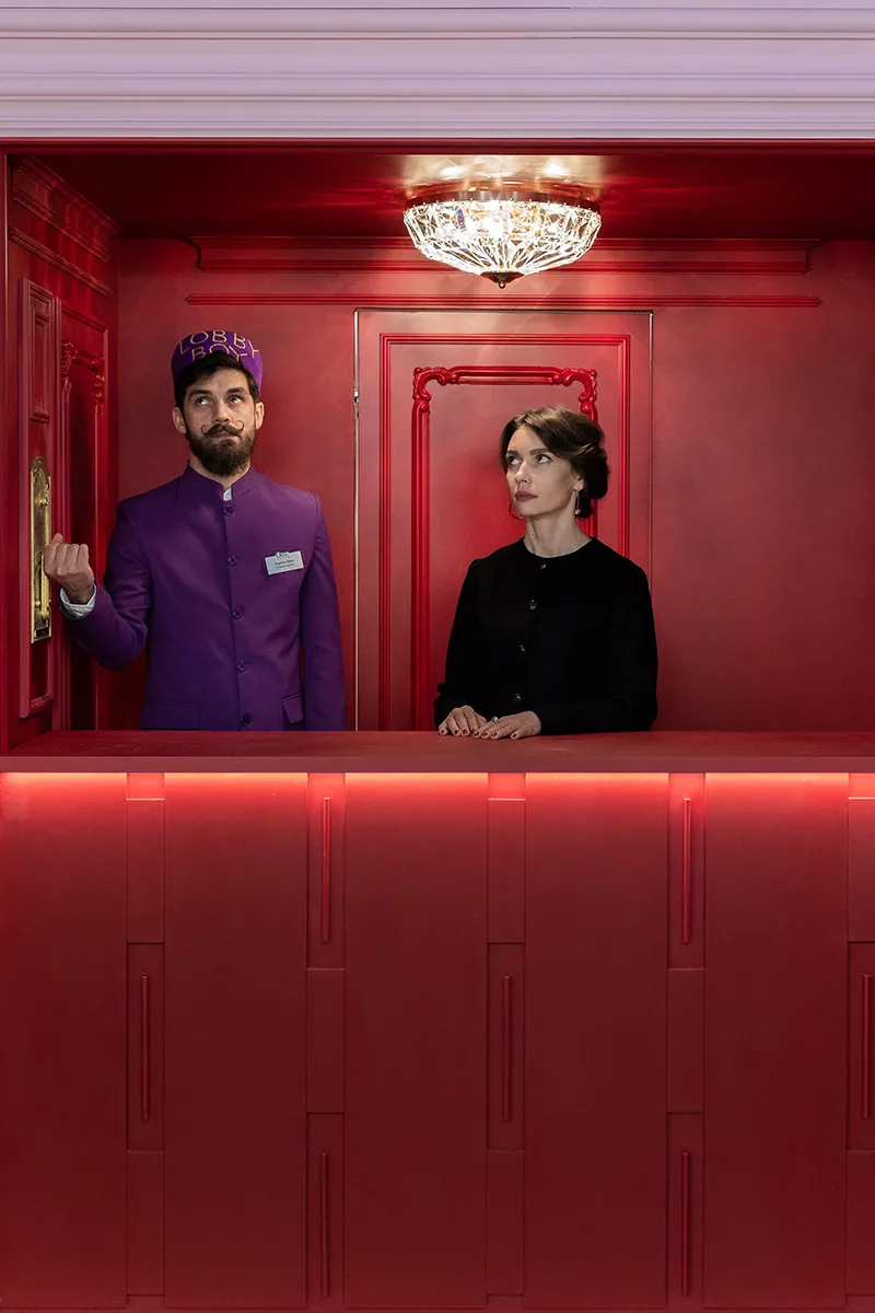
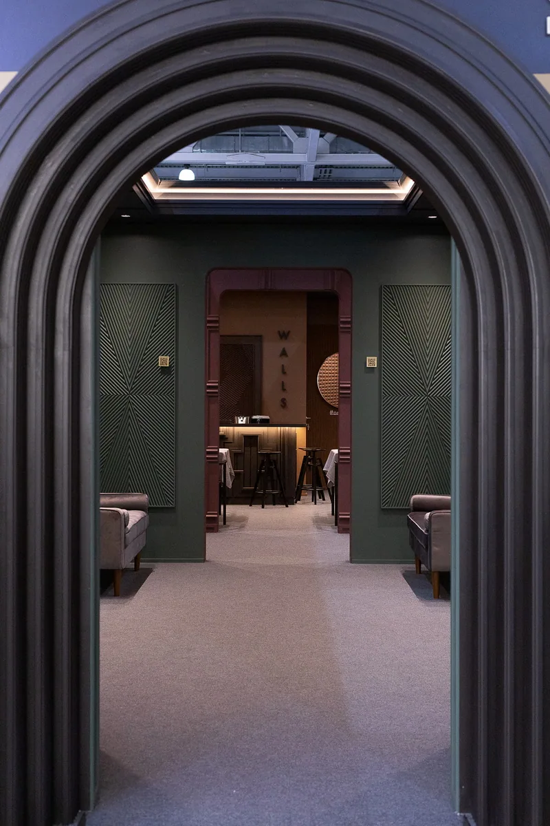
The project was envisioned as an invitation into a collective image of a Belgian home. Archetypal elements — arches, textures, and deep tones — shaped a space one didn’t just want to examine, but to feel. The living room, kitchen, library, and bathroom formed a unified module, each composed as an act within theatrical scenography. At the center stood a round bar — a focal point that changed perception with the slightest shift in view. The space became one of metamorphosis: any surface could turn into a wall, a floor, or a ceiling depending on rhythm, color, and light.
Client’s role in the project
Orac provided a general direction but entrusted Zariza Art with full interpretive freedom. This decision allowed the team to move beyond a literal brief and develop an original concept with its own architectural language — a trust that shaped the final result.
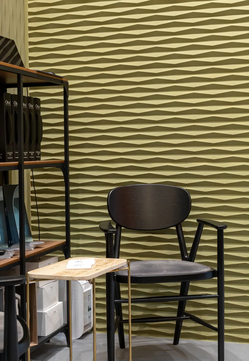
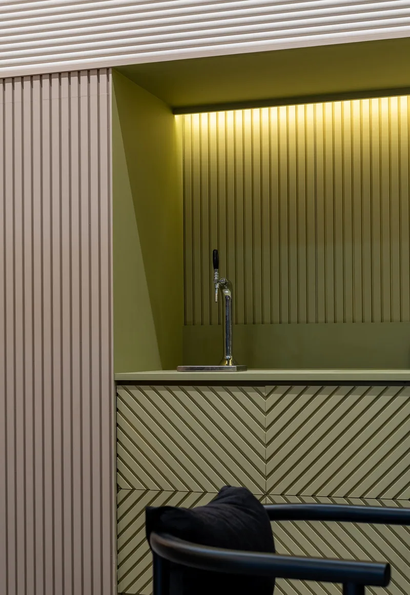
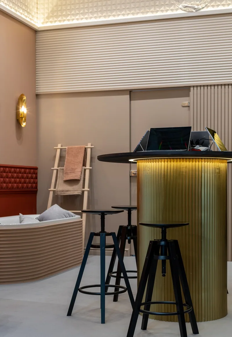
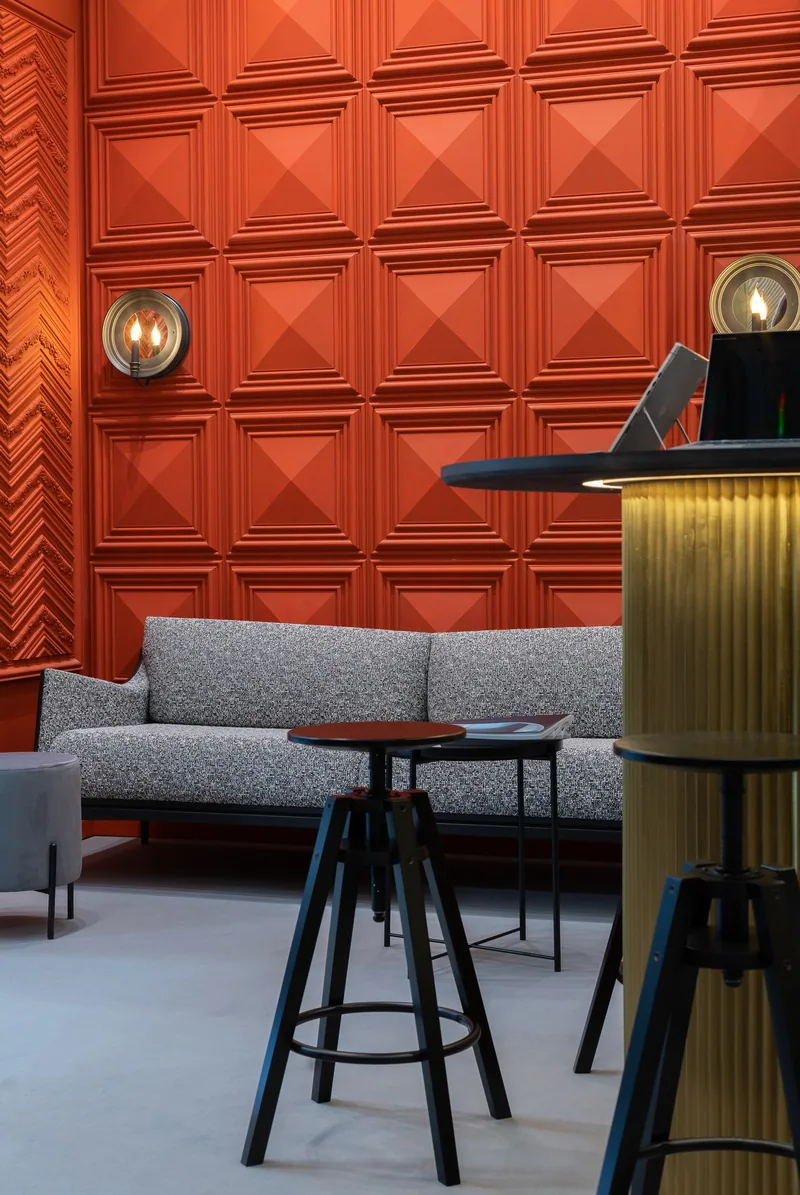
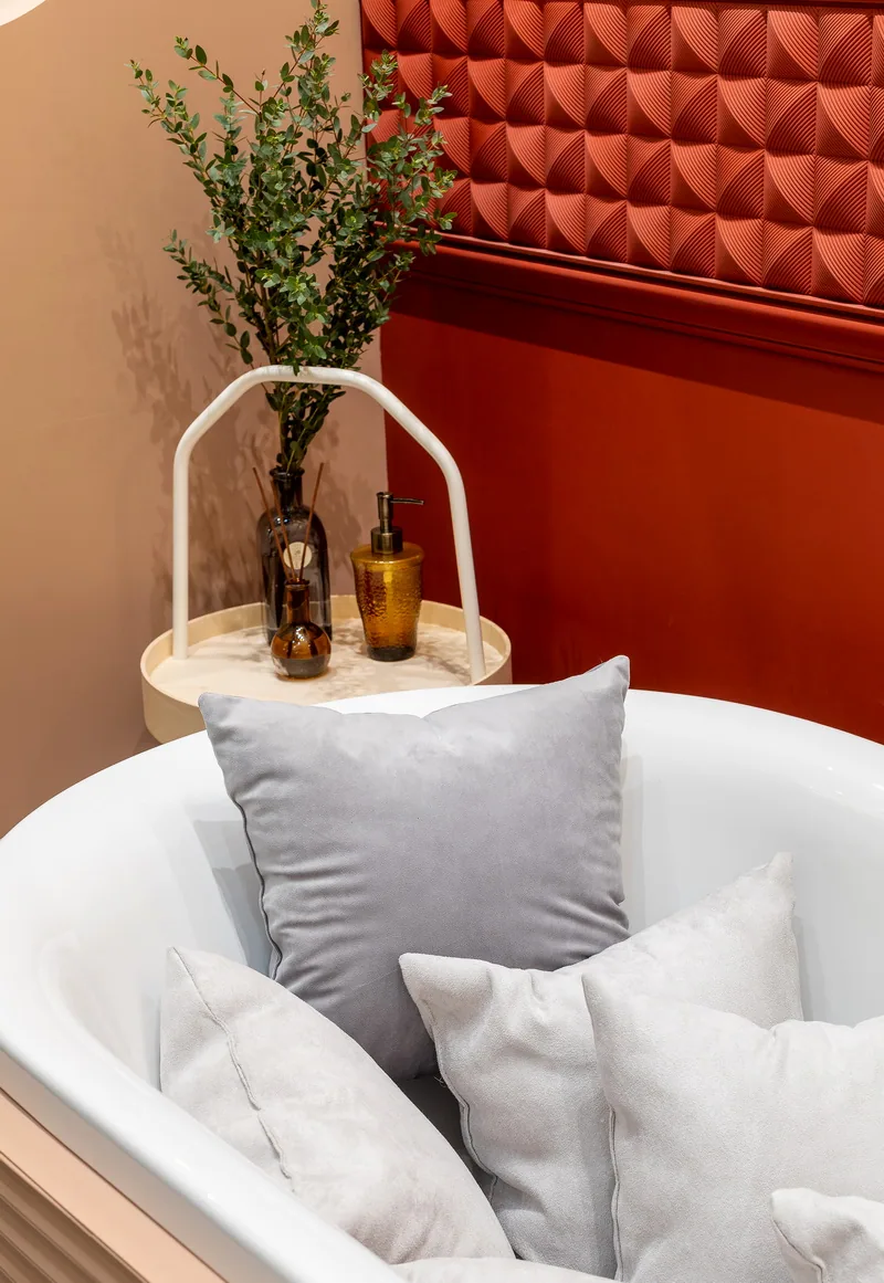
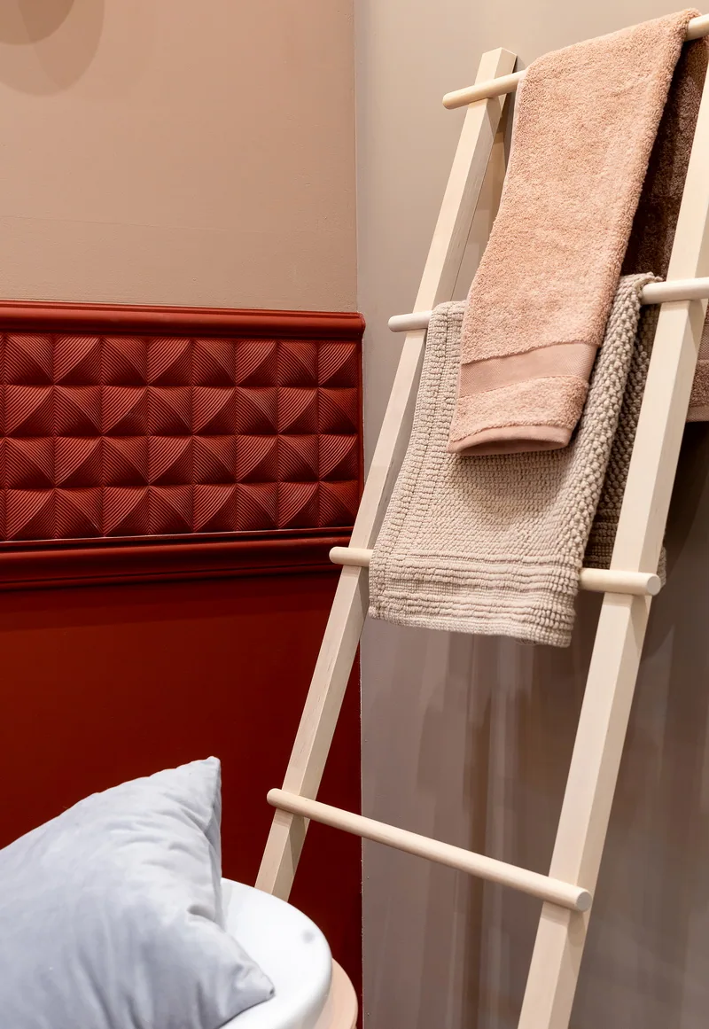
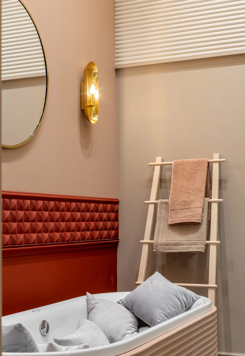
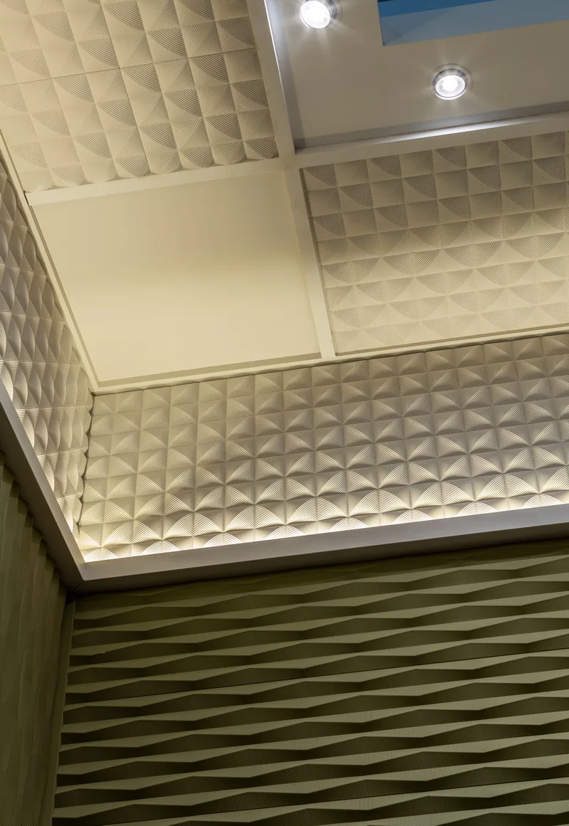
Image 1 of 9
Architecture of the idea
The project drew from the restrained decor and domestic intimacy of Bruges — its arches, layered tones, and quiet elegance. This was a home you could glimpse through faux windows — but only truly enter if you felt it. Spatial turns, zoning, soft lighting, and the dialogue between planes became tools to build emotion. The goal wasn’t to showcase the product but to construct an architectural intonation.
On site
Technically complex, the stand was assembled in four days. Most components were pre-fabricated and delivered in modules. Since paint spraying was prohibited at Crocus Expo, all panels were pre-painted in production — with careful planning for future junctions and hand finishing.
French Argile paints were used. The lighting system was developed specifically for this space: quality LEDs, cross-lighting, anti-flicker protection, and balanced color exposure. Faux windows with frosted glass were lit from within using LED strips and foil-lined niches for diffusion.
Details and meanings
- The round bar formed the compositional center — a perceptual shift space.
- Planes (floor, walls, ceiling) were reinterpreted as equal architectural elements.
- The initial brief was rethought and approved for conceptual reinterpretation.
- Lighting was calibrated for photo capture — especially smartphone cameras — to ensure faithful color reproduction.
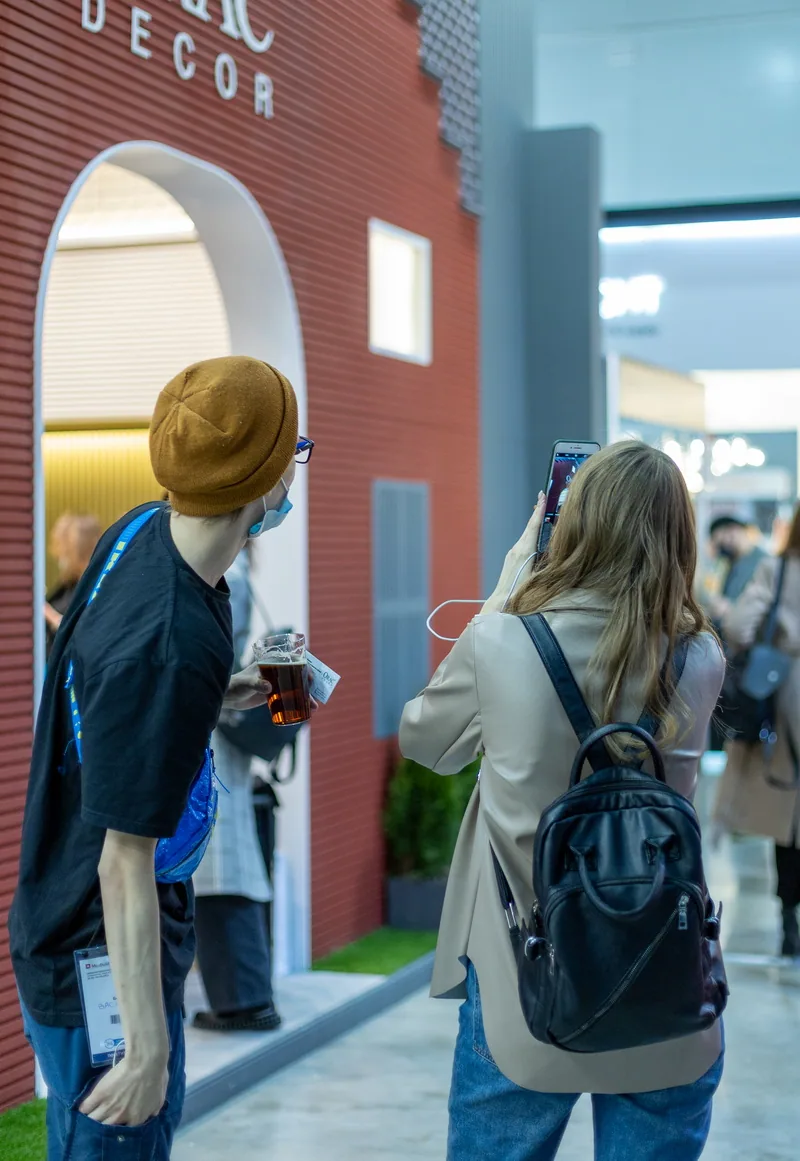
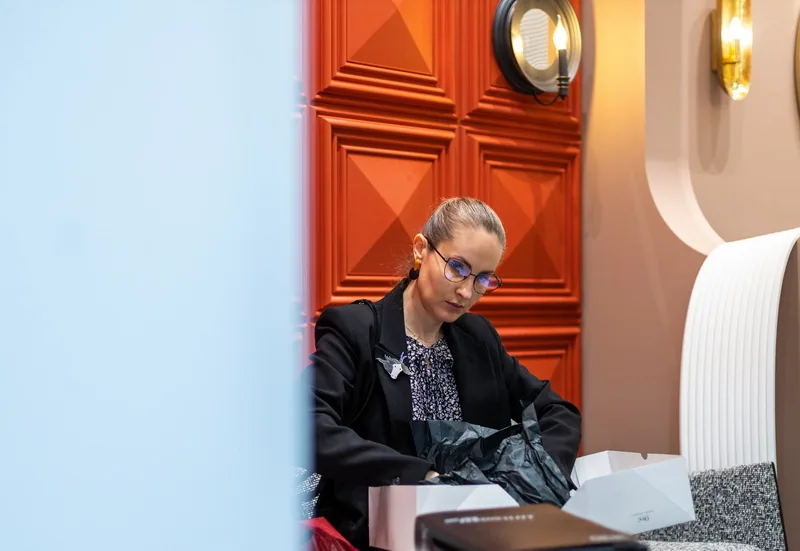
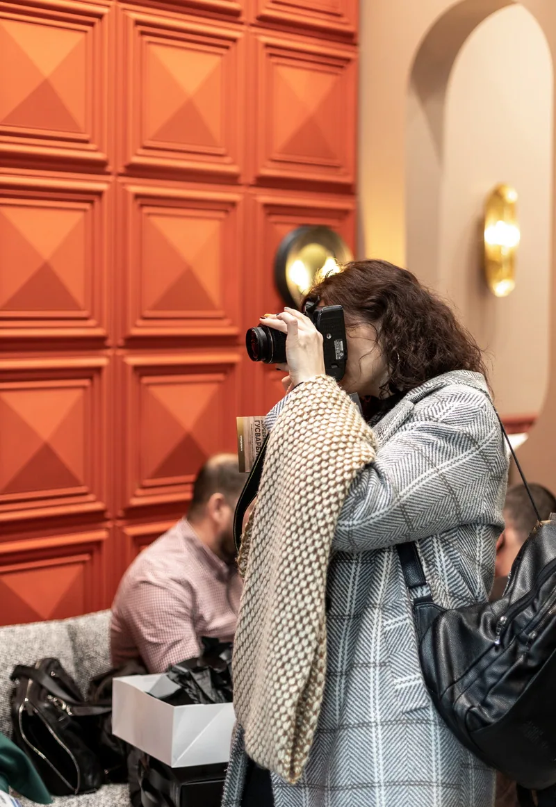
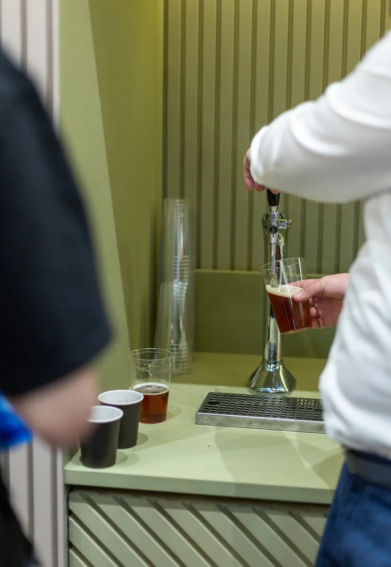
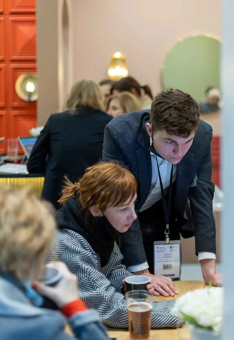
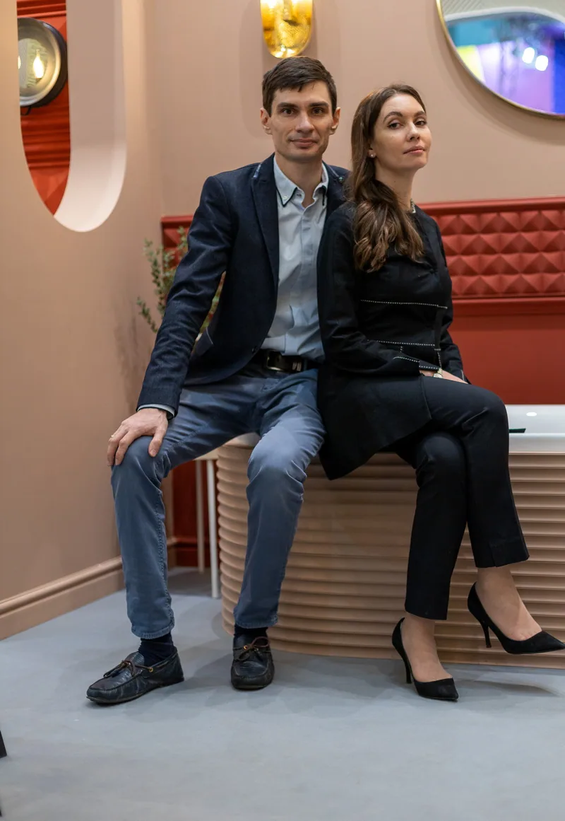
Image 1 of 6
Final result
The stand became a home-like environment where every corner offered not just an exhibit but a stage for personal engagement. Visitors no longer observed — they entered a story. Architecture, light, color, and material formed a seamless narrative. Beyond praise from the professional community, the project sparked spontaneous responses from strangers — sharing their impressions and experiences. These are the projects that go beyond display — they become places where the brand finds its voice, and the visitor finds recognition.