 РУ
РУ EN
EN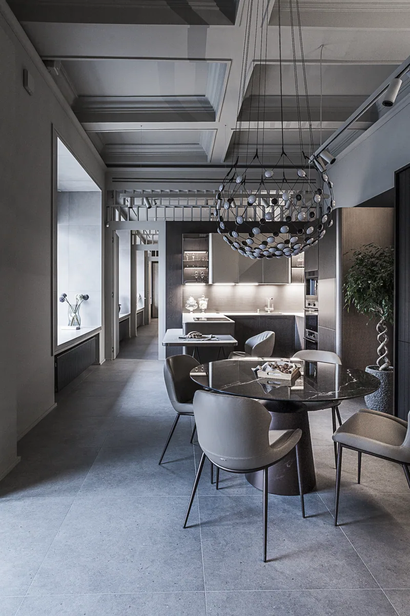
Name of the project
Coffer & Enfilade — DEROSSI interior boutique redesign.
Main character
DEROSSI — an interior boutique. A multibrand edit of high-end European and Russian furniture.
Setting
Volgograd, 10 Kommunisticheskaya Street — a historic residential building (1939) known as “Dom Prosveshchentsov”, designed by architect Anatoly Ivanov; listed as a regional cultural-heritage site. The building was restored after the war.
Coffer & Enfilade — DEROSSI interior boutique.
Objective
Update the operating showroom without a “museum” effect: bring back daylight, rework the layout, use the street-facing display windows as a media front, improve lighting and indoor climate, preserve the historic fabric, and create a neutral base for future rotations.
Conceptual scenario
First step — open the display windows. Previously, several openings were blocked to squeeze in more exhibits. We brought back daylight and made the windows the face of the boutique: by day — clear through-views; by night — warm light that reads as a quiet, high-calibre marquee.
Second step — the enfilade. Spaces are tied into a single axis along the windows: kitchen, living room, dining, bedroom. Long sightlines consolidate scale, and light guides the visitor without losing focus.
Third step — circular circulation. A looped route with no dead ends heightens continuity and engagement.


Image 1 of 6
Client’s role in the project
The client managed construction and contractors on site; our design oversight was remote and focused, with targeted work on lighting and finishes. Finishes and colour palette were selected jointly; key decisions were taken during site visits.


Image 1 of 3
Architecture of the idea
The historic coffered ceiling was uncovered during demolition, opened, carefully restored and lit — it became the nucleus of the main hall.
Partitions between functional zones were lightened with continuous transoms featuring a regular perforated insert: boundaries read clearly, while the space remains unified.
The interior base is neutral and tactile: calm planes, honest materials, and light that accents the furniture’s textures. Building services are integrated without ostentation: the engineering works, but never competes with the display.


Image 1 of 5
On site
Approx. 220 m². Demolition, restoration of the coffers, new planning logic, installation of slot diffusers for supply–extract ventilation and ducted air-conditioning, commissioning of DALI-addressed lighting scenes. Works carried out in compliance with heritage-protection requirements.
Details and meanings
- Display windows reopened: daylight in; by night, a quiet street-side marquee.
- Enfilade along the window axis: kitchen, living room, dining, bedroom.
- Looped route with no dead ends — engagement without retracing the same path.
- The 1939 coffered ceiling — uncovered, restored, and lit.
- Full-length transoms with regular perforation — clear boundaries, space remains airy.
- Lighting: accent / general / decorative; beam control to work the textures.
- Building services: slot diffusers, ducted air-conditioning; quiet integration.


Image 1 of 5
Final result
The showroom gained a clear base for rotating displays: an architectural “frame” neutral in colour yet expressive in light and geometry.
Display windows now operate as a street-side medium for pedestrians and passing traffic; the enfilade and looped circulation establish a natural rhythm of movement. The space stays alive and renews itself without structural overhauls — in step with rotating collections.


Image 1 of 10