 РУ
РУ EN
EN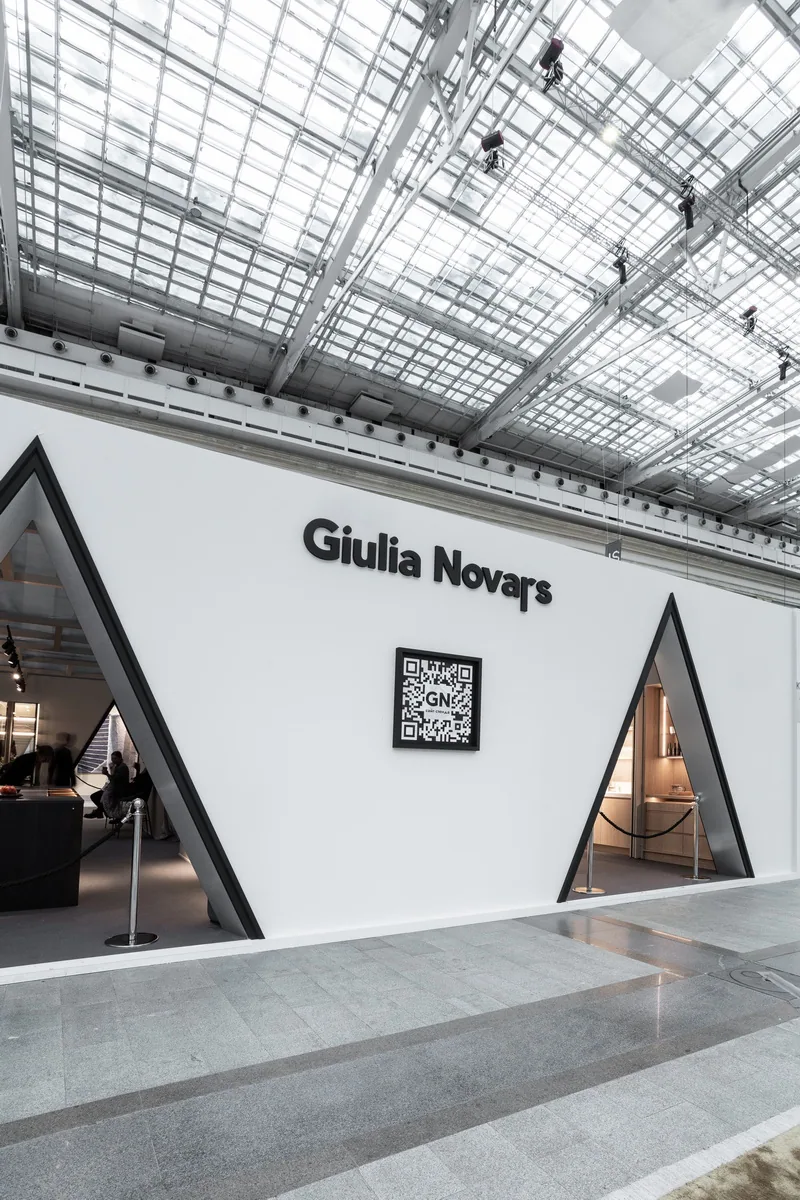
Name of the project
Russian Seasons — exhibition stand for Giulia Novars at ARTDOM 2024
Main character
Giulia Novars — a Russian manufacturer of premium furniture.
Setting
ARTDOM, Moscow, Gostiny Dvor — a premium interior exhibition held in the historical center of the capital Giulia Novars at ARTDOM 2024.
Giulia Novars at ARTDOM 2024
Objective
To design a display that reveals the strength of Giulia Novars furniture through scenographic composition — enhancing product perception via theatrical imagery, cultural references, and architectural expressiveness.
Conceptual scenario
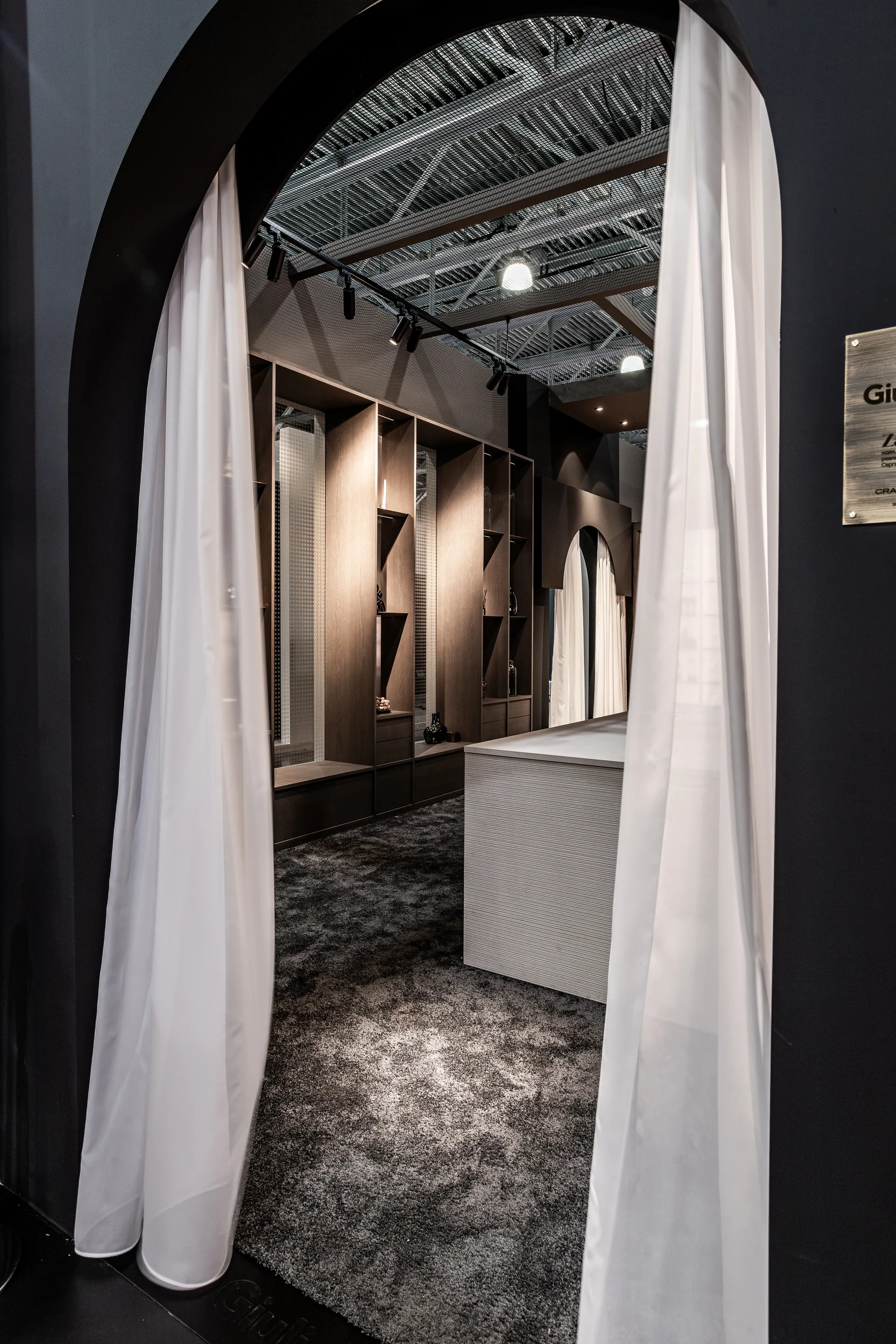
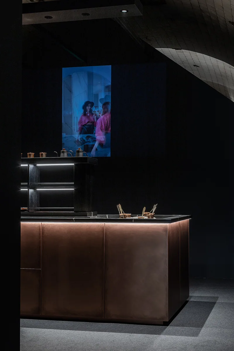
The chosen concept — “Russian Seasons” — is a visual paraphrase of Diaghilev’s legendary ballet tour. Ballet associations emerged during the very first creative meetings. The stand was conceived as a stage composition: architecture, volumes, furniture, decor, video, and sound converged into a performance, with the brand’s factory cast as the principal troupe.
The central visual motif was inspired by Benois’s sketch for Petrushka — with carnival tents and unusual triangular arches forming the architectural backbone of the stand.
Client’s role in the project
The stand was the result of a coordinated effort between the Giulia Novars showroom on Smolenskaya (under the direction of Irina Stepanova), the factory, and the build team.


Image 1 of 18
Architecture of the idea
The form echoed a theatrical pavilion: triangular arches, tent-like volumes, and sharp light-shadow contrasts. The entire space functioned as a stage — the furniture emerging like performers in individual roles. Behind the refined aesthetics lay precise engineering — from lighting setups beneath a translucent ceiling to seamlessly integrated systems.
On site
Over four days, the structures were built, seven furniture compositions were installed, lighting fixtures were mounted, and a lighting script was fine-tuned. The stand was dismantled in just one day — the pace and rhythm of the process reminiscent of rehearsals before an opening night.
Details and meanings
- Some pieces of furniture were custom-designed for this stand;
- Lighting was calculated: 88 fixtures, light-transmitting ceiling;
- The ballerina shoot for the video lasted four hours;
- A dedicated website and the film Russian Seasons were created for the project.


Image 1 of 8
Final result
The stand became more than a showcase — it became a statement about the power of concept, the synergy of teamwork, and the brand’s ability to be both expressive and profound. A space remembered visually, emotionally, and professionally. We thank our client for their boldness and collaboration — together we created something beyond interior. We created art.


Image 1 of 11