 РУ
РУ EN
EN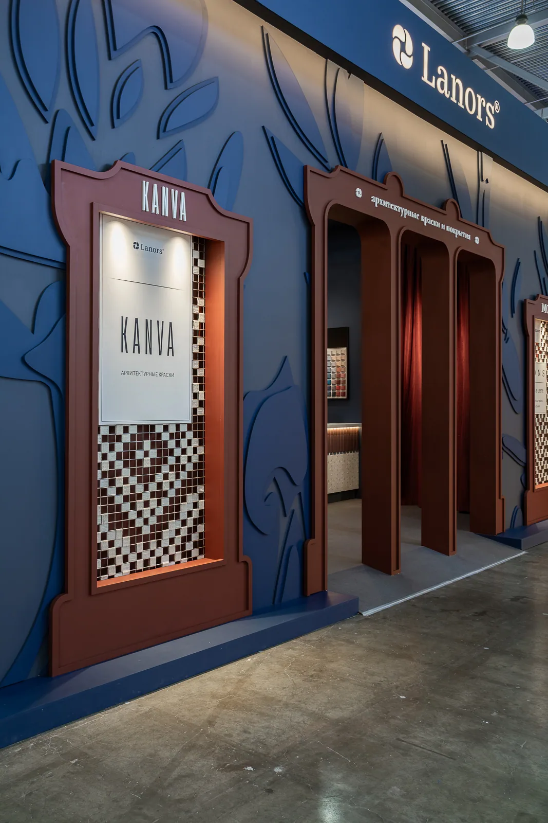
Name of the project
The Canon — the Lanors stand at MosBuild 2026
Main character
Lanors, a Russian manufacturer of architectural paints, decorative finishes, and wallpaper.
Setting
MosBuild 2026, Crocus Expo, Moscow, 31 March–3 April 2026 — Russia’s largest building and interiors exhibition.
The Lanors Canon at MosBuild 2026
Stand concept
The Lanors stand is an architectural environment in which the brand’s materials become a system of exacting standards. The concept centres on one word: canon. It stands for quality, precision, professional discipline, and a carefully measured approach to material.
The stand takes the form of a pavilion with two expressive façades. Its architecture is organised around a large triple opening with a sculpted frame. More than an entrance, it acts as a lens: even from the aisle, visitors can see the stand’s depth, inner composition, and product accents. One façade foregrounds KANVA and the central artwork; the other focuses on the MONS line. Each viewpoint reveals a different reading while retaining one architectural logic.
Our role
We developed the stand’s concept and design, connecting its architecture, Lanors materials, and principal product lines within one system. A distinct part of the commission was the KANVA display unit, enlarged within the stand to become an independent focal point for the collection. The bureau also produced a presentation film for KANVA and carried out photography and video of both the build process and completed exhibition.
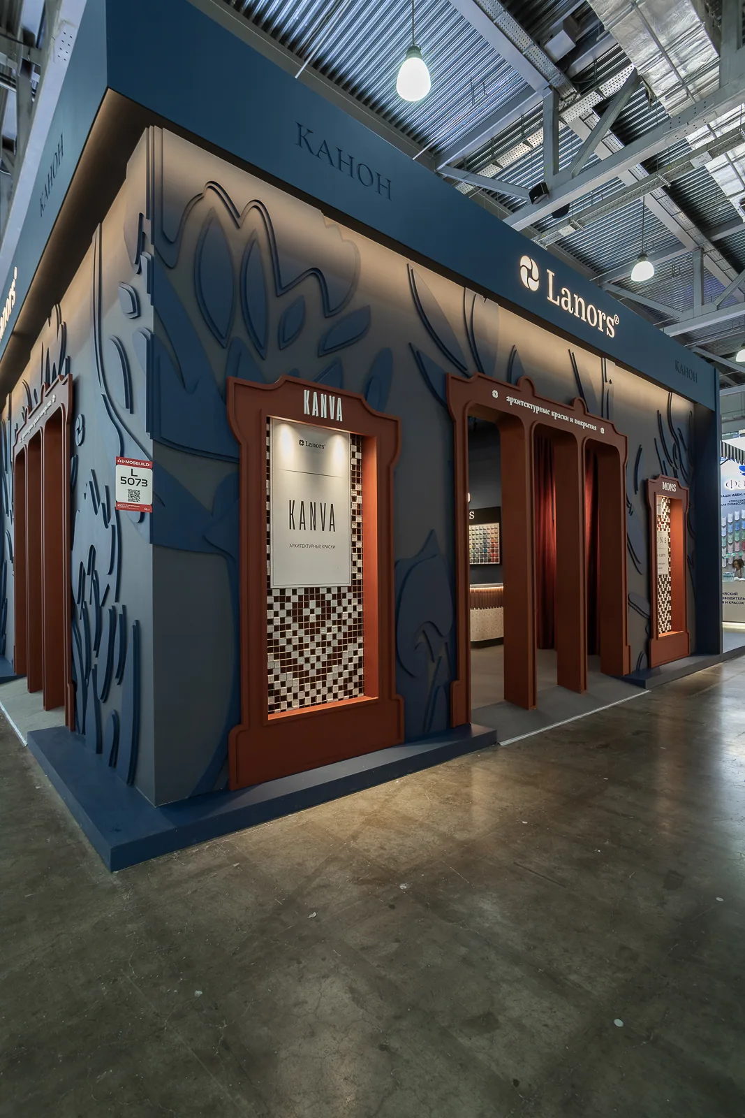
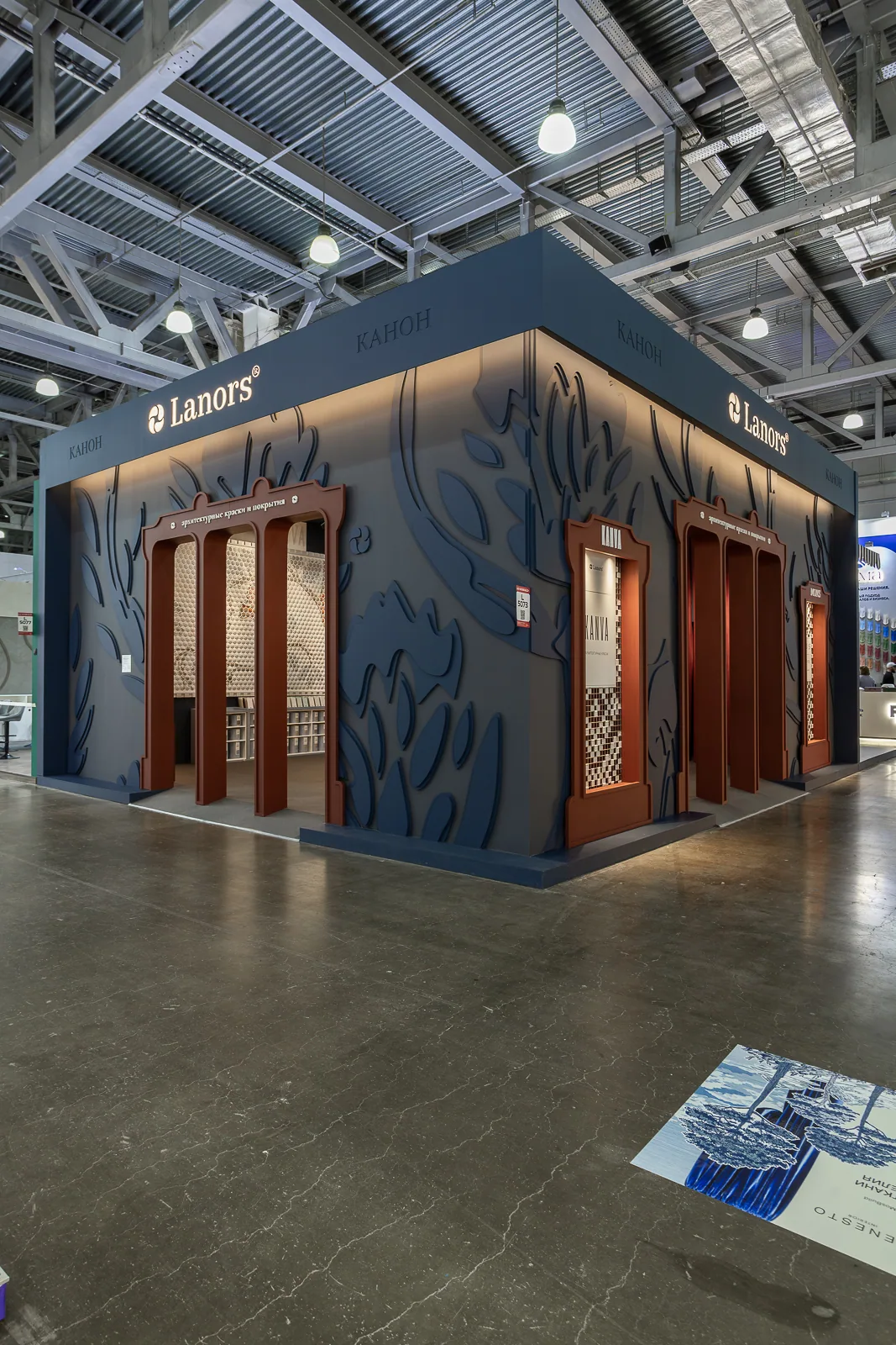
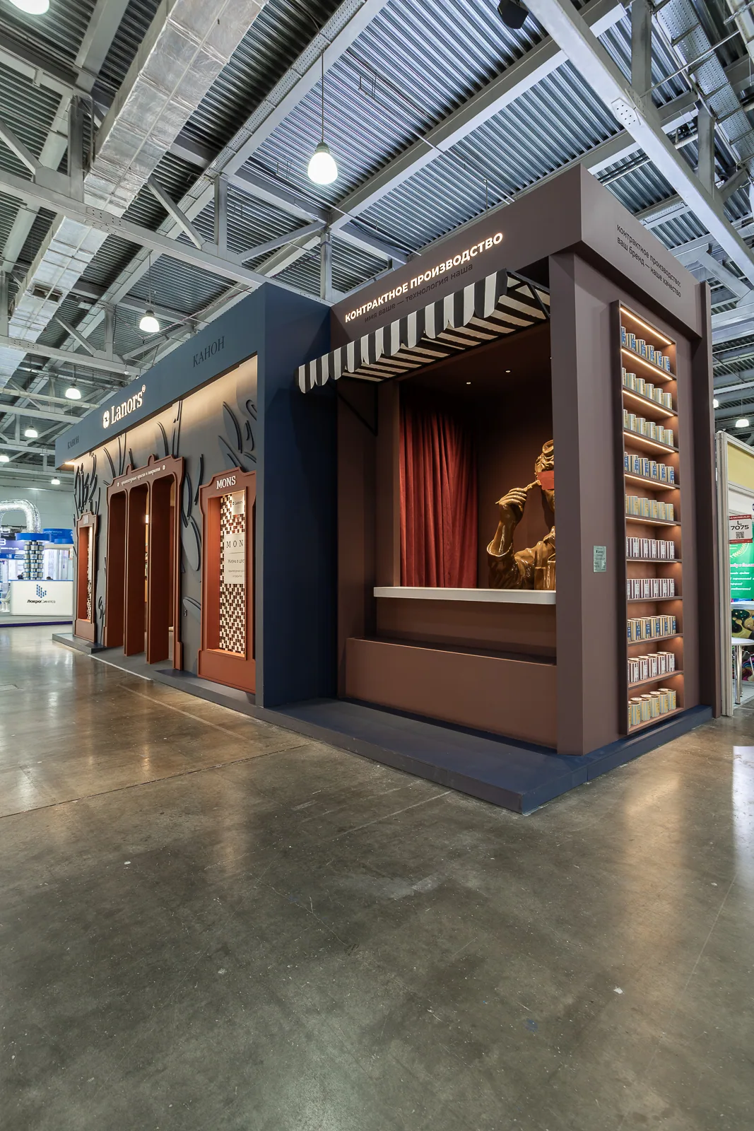
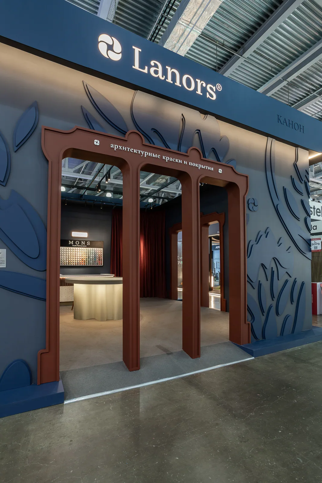
Image 1 of 4
Façades
The façades are finished in deep blue and carry a large relief ornament derived from a Lanors designer wallpaper pattern. Enlarged from an interior motif to an architectural scale, it becomes part of the pavilion’s spatial composition.
The palette combines muted depth with saturated warm accents. Dark blue unifies the pavilion, while ripe cherry, cream, and wine tones create an expressive and immersive atmosphere.
Niche displays
Two recessed showcases flank the central opening of the main façade: KANVA on the left and MONS on the right. Each contains a stainless-steel grid with 5 × 5 cm cells. Thick thread fills selected cells to form an ornament that repeats the pattern used on the packaging of the corresponding range.
The gesture makes the visual and conceptual connection tangible: a flat pattern gains relief, packaging becomes architecture, and brand graphics become craft. The showcases translate the product into architectural language, revealing KANVA as a ground for images, a field of construction, and the material from which a future image can emerge. Header plates carrying the range names complete the displays as stylised product portals.
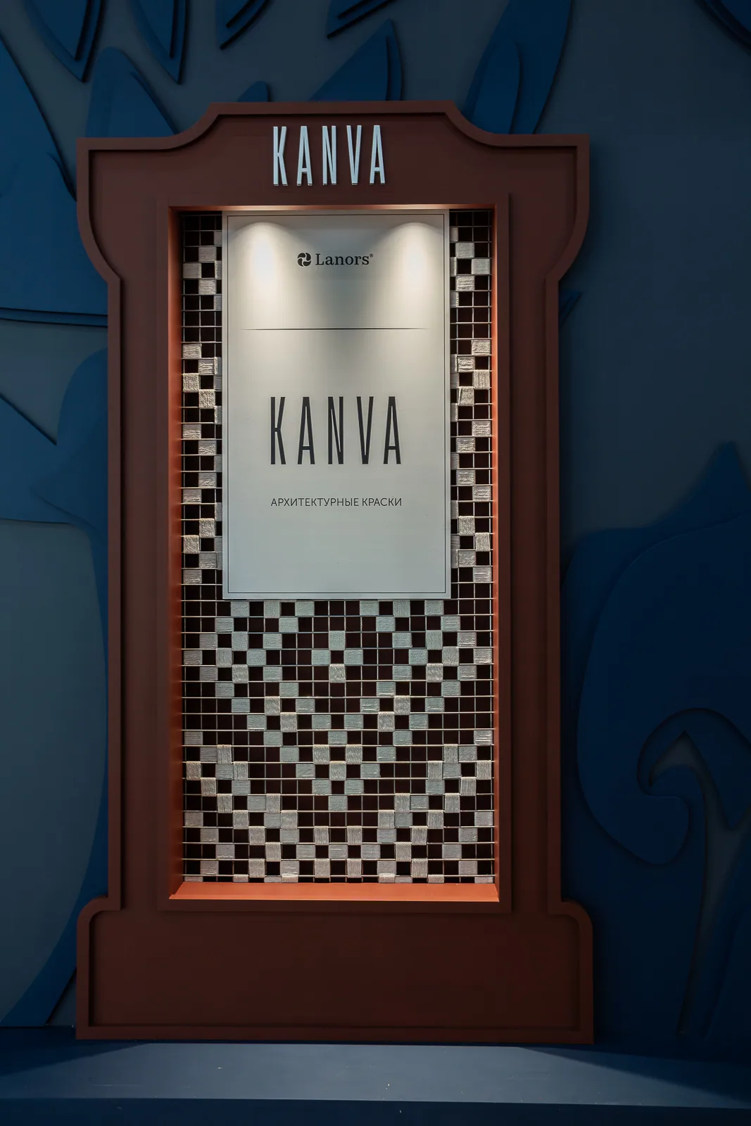
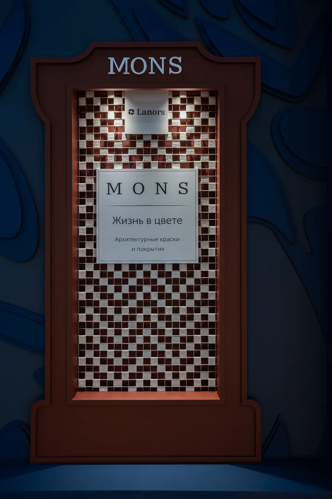
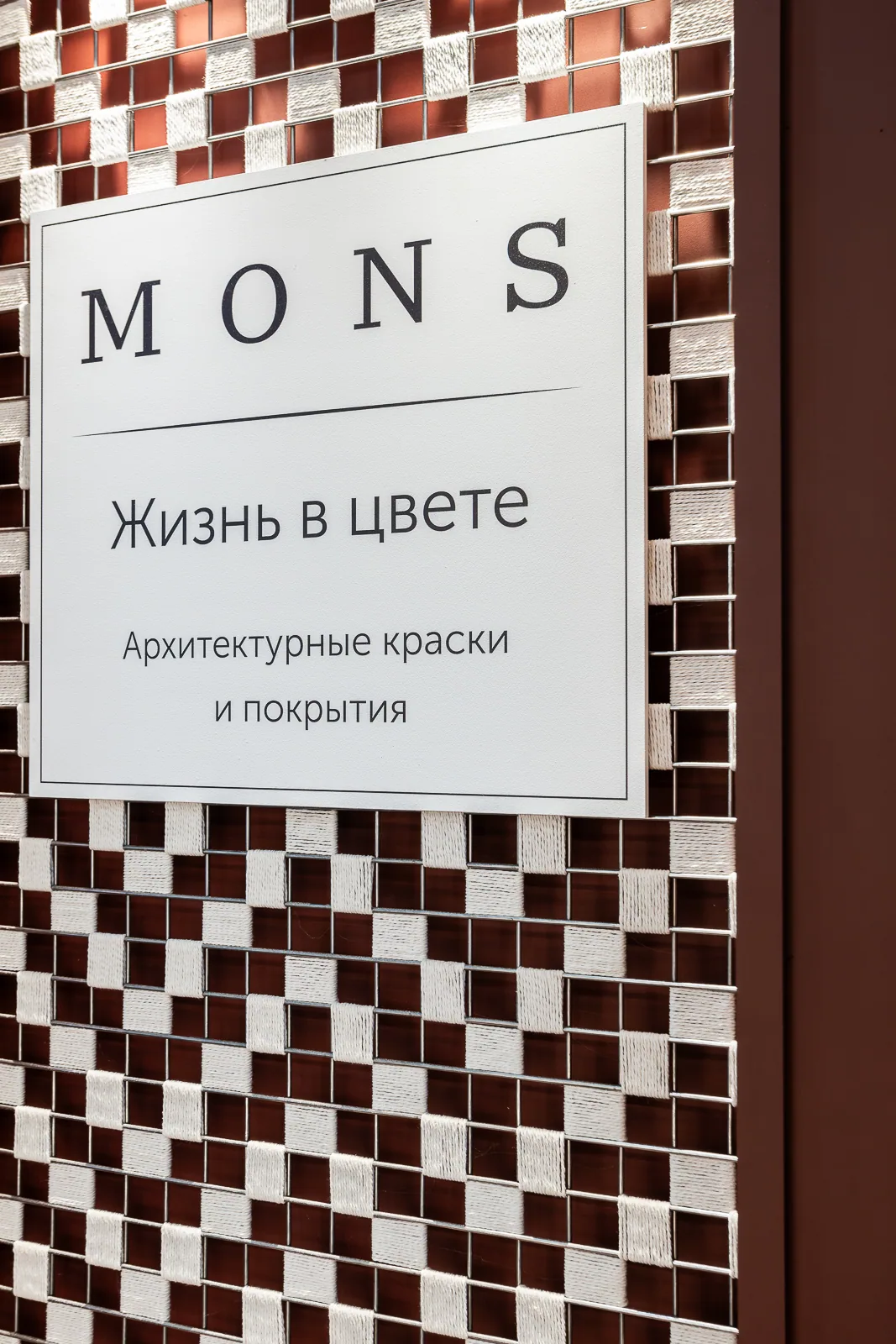
Image 1 of 3
Central stage and KANVA artwork
A monumental KANVA artwork at the rear of the stand is the main focus of the interior. Built from numerous hexagonal elements, it recalls a childhood mosaic in which an image appears gradually, fragment by fragment.
The artwork draws on the branches, birds, and natural graphics of Lanors designer wallpapers. It connects architectural paints, decorative finishes, and wallpaper while allowing each product line to retain its own identity.
The KANVA range
The new KANVA range is one of the stand’s defining subjects. Its meaning develops from the idea of a ground: canvas as a field for an image, a woven or structured base, a surface upon which a pattern appears. This idea connects the spatial treatment of the display niches, the logic of the central artwork, and the assembly of an image from individual elements.
In KANVA, colour is more than a set of shades; it reflects conditions found in nature — air, light, rock, water, and relief.
The Crimea palette brings together the limestone brightness of White Rock, the depth of Blue Bay, the lush green of the Khapkhal Gorge, and the graphic silhouette of Swallow’s Nest. Soft southern light, sun-bleached stone, muted ochre, mineral white, and green-blue reflections form a delicate atmosphere, like the breath of warmth, rock, and midday air.
The Caucasus appears through scale, verticality, and the tension of form: Mount Elbrus, the slopes of Sulak Canyon, the valley of the Honey Waterfalls, and the cliffs of Eagle’s Ledge. Its colours feel more composed and architectural — the gold of rock, the cold of snow, the depth of water, and light that defines a silhouette rather than dissolving it. It is a palette of spaces with pronounced form, rhythm, and inner height.
Kamchatka reveals another state of colour: primal and tectonic. The Valley of Geysers, Klyuchevskaya Sopka, the pale tuff formations of Kutkhiny Baty, and Khalaktyrsky Beach combine ash, basalt, steam, volcanic heat, and cold ocean air. Colour becomes an energy rising from depth, a meeting of forces, restrained yet powerful.
KANVA is not simply a collection of shades, but a way of reading colour as a system within the landscape. A geography of sensations, a relief of tones, and coordinates of colour come together in the new Lanors range.
Our bureau produced this video presentation of the KANVA collection.
* Some archival photographs and videos made before 1 March 2026 may contain non-Russian inscriptions. Translations are provided in the descriptions; altering the original material without distortion is technically impossible under Federal Law No. 168-FZ of 24 June 2025.
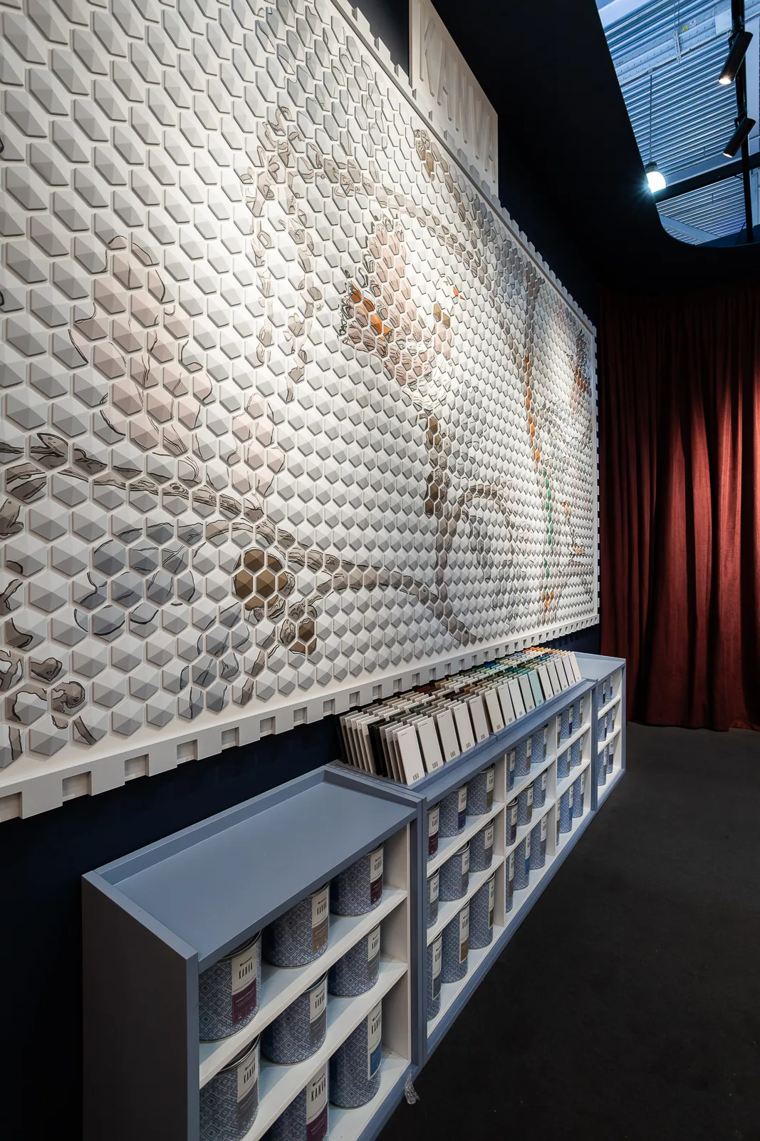
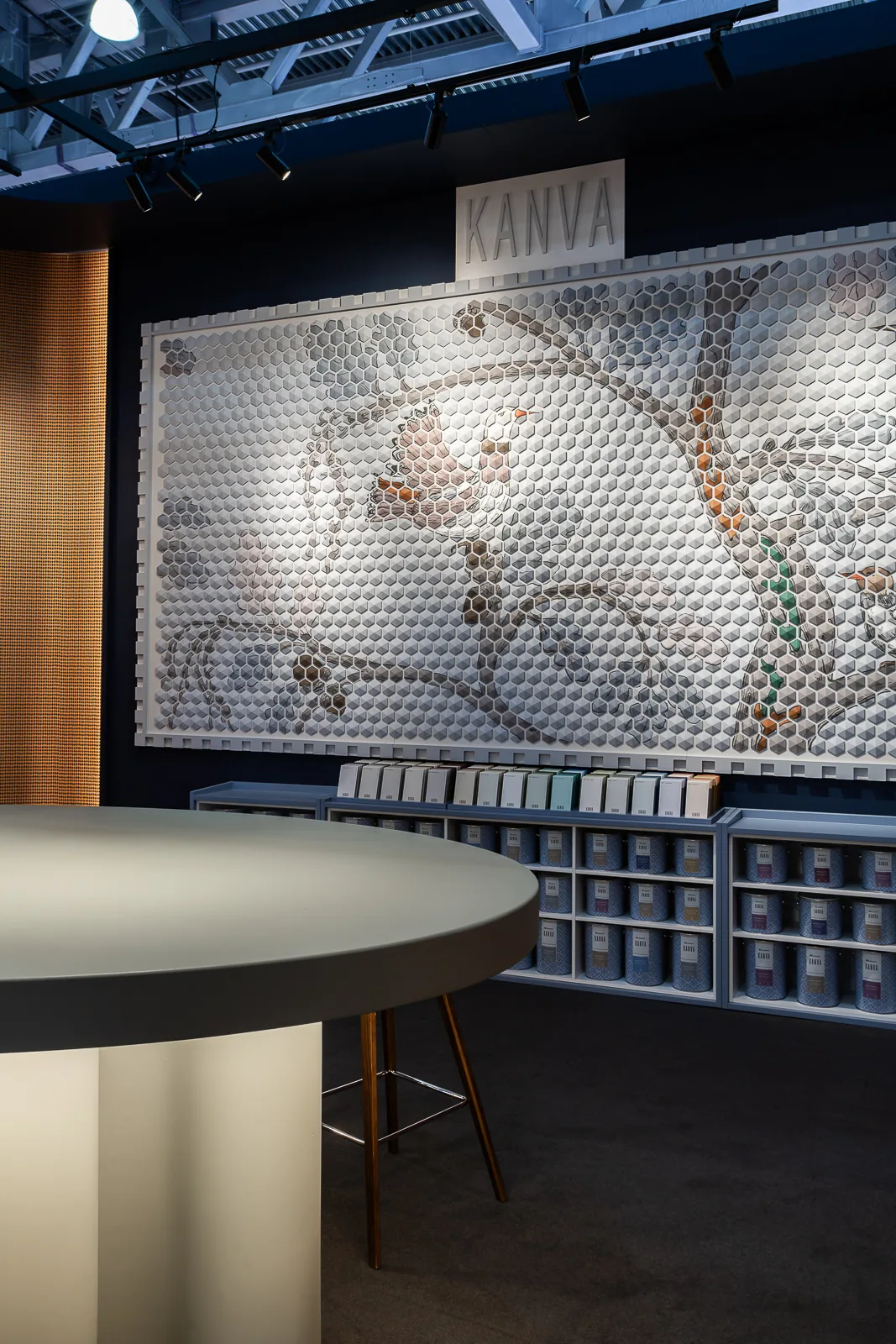
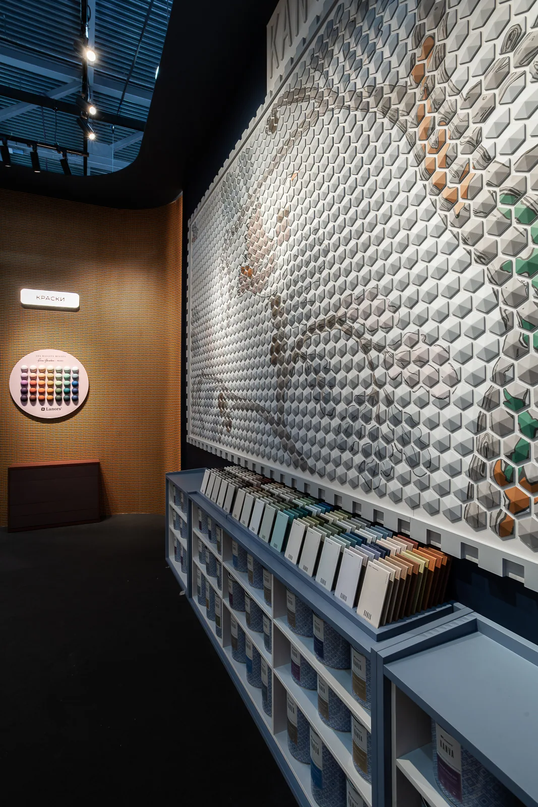
Image 1 of 3
The team image and the idea of mastery
The team’s appearance continues the stand concept. A white shirt, a branded Lanors apron, a brush tucked into the belt, and a ribbon carrying the word “canon” form the image of a master working with material. The emphasis is not on the workshop as a setting, but on mastery itself: professional work grounded in precision, skill, and high quality.
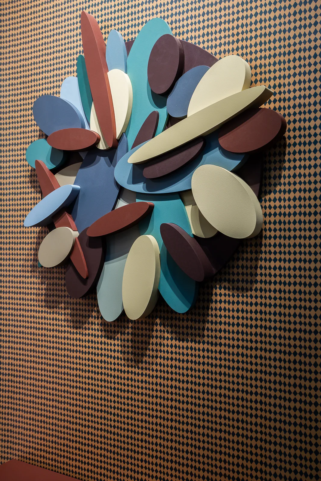
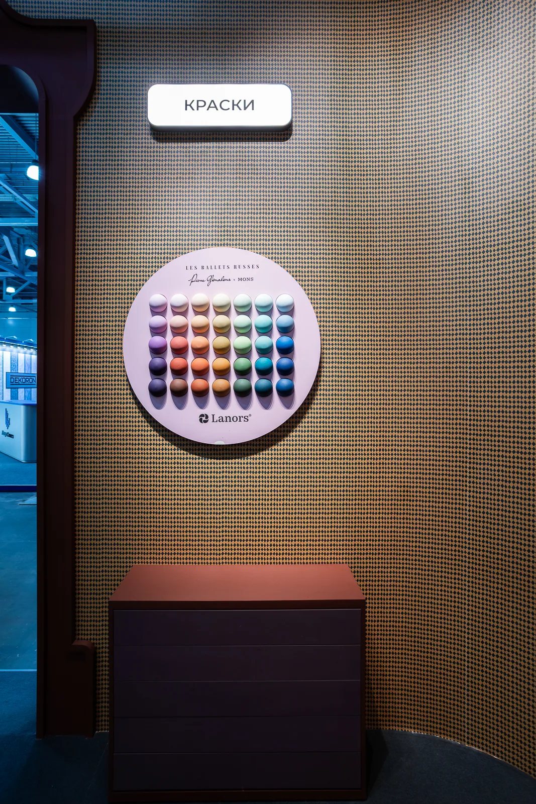
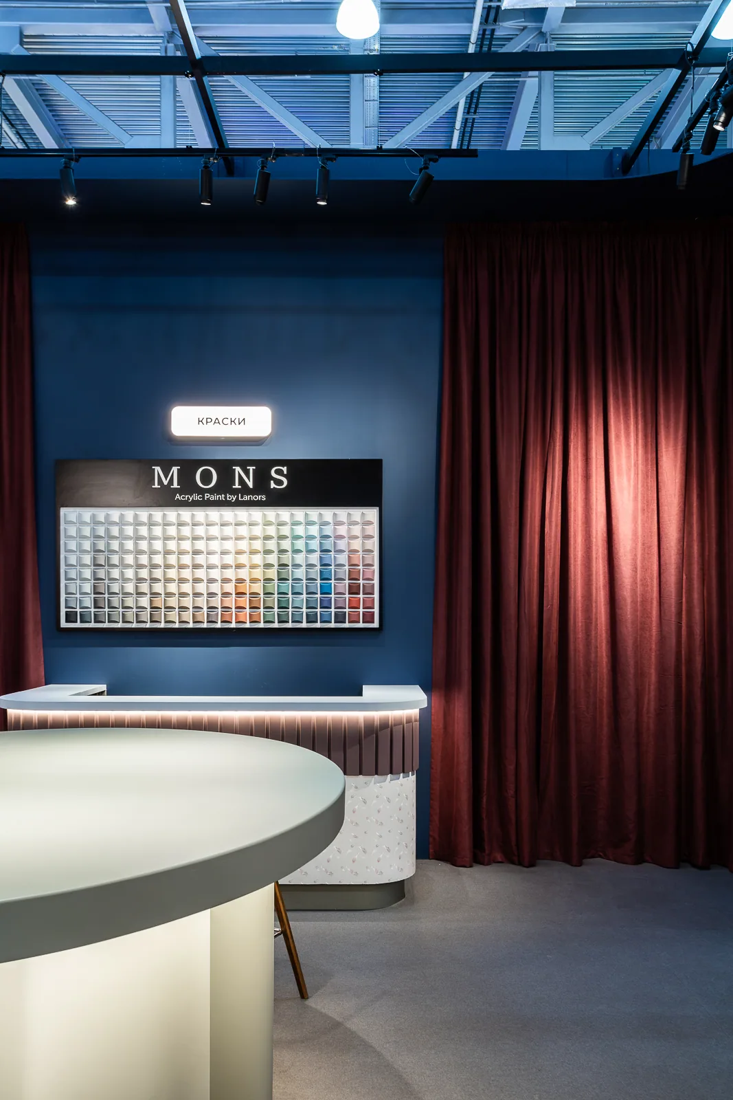
Image 1 of 4
Contract Manufacturing Pavilion
A separate part of the stand is dedicated to contract manufacturing. While the main pavilion presents Lanors’ own ranges, this module demonstrates another important capability: providing a high-quality production foundation for partner brands, retail networks, and showrooms.
The pavilion makes clear that Lanors offers not only its own products, but a system into which another brand can be integrated.
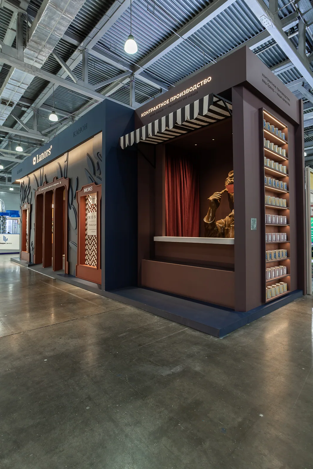
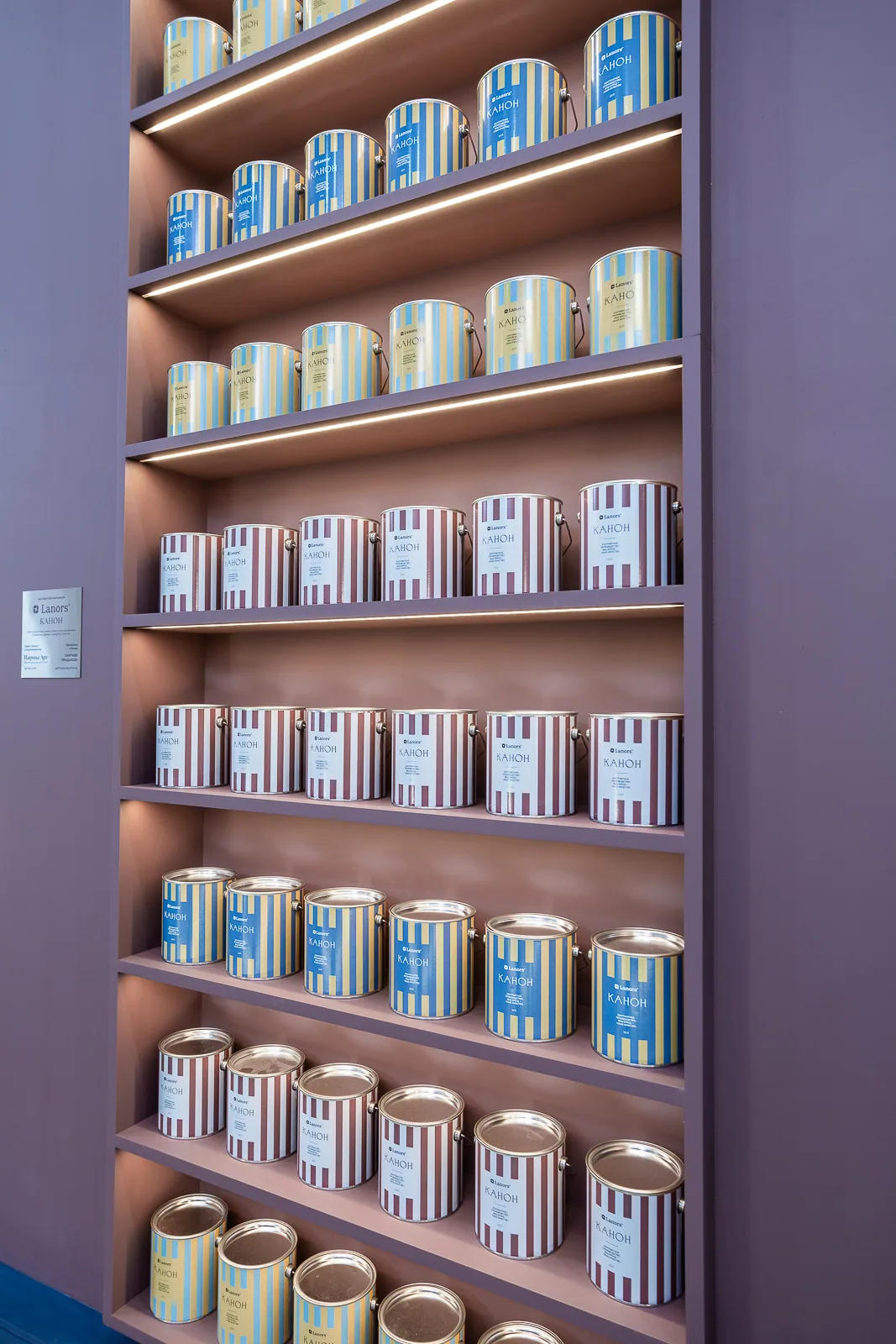
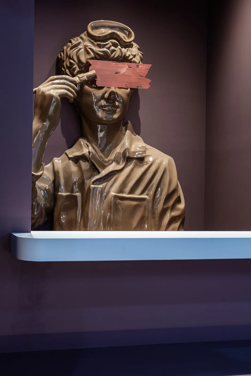
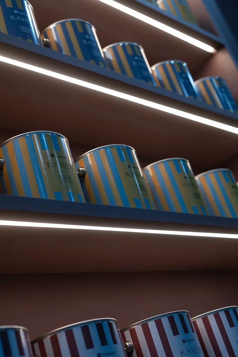
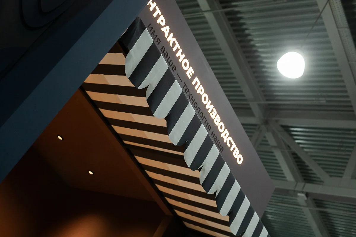
Image 1 of 5
Classical figure
A classical sculptural figure stands at the centre of the Contract Manufacturing Pavilion. It represents the canon in its artistic sense: a model, a measure, proportion, and a form tested over time.
The figure’s face is crossed by a broad painted stroke applied by the character’s own hand. The gesture becomes a metaphor for contract manufacturing: identity at the surface may change, while the foundation, geometry, quality of execution, and underlying form remain constant.
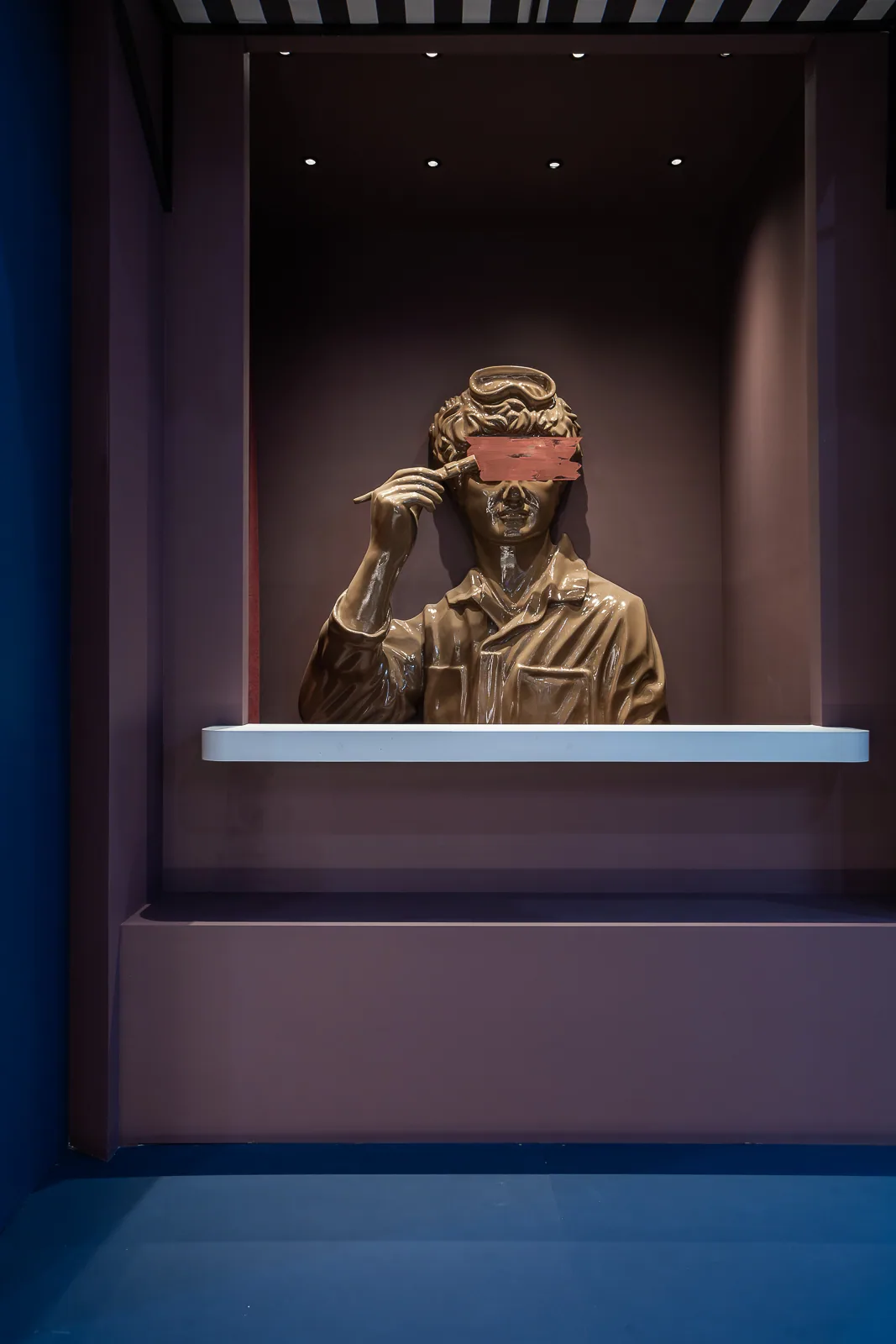
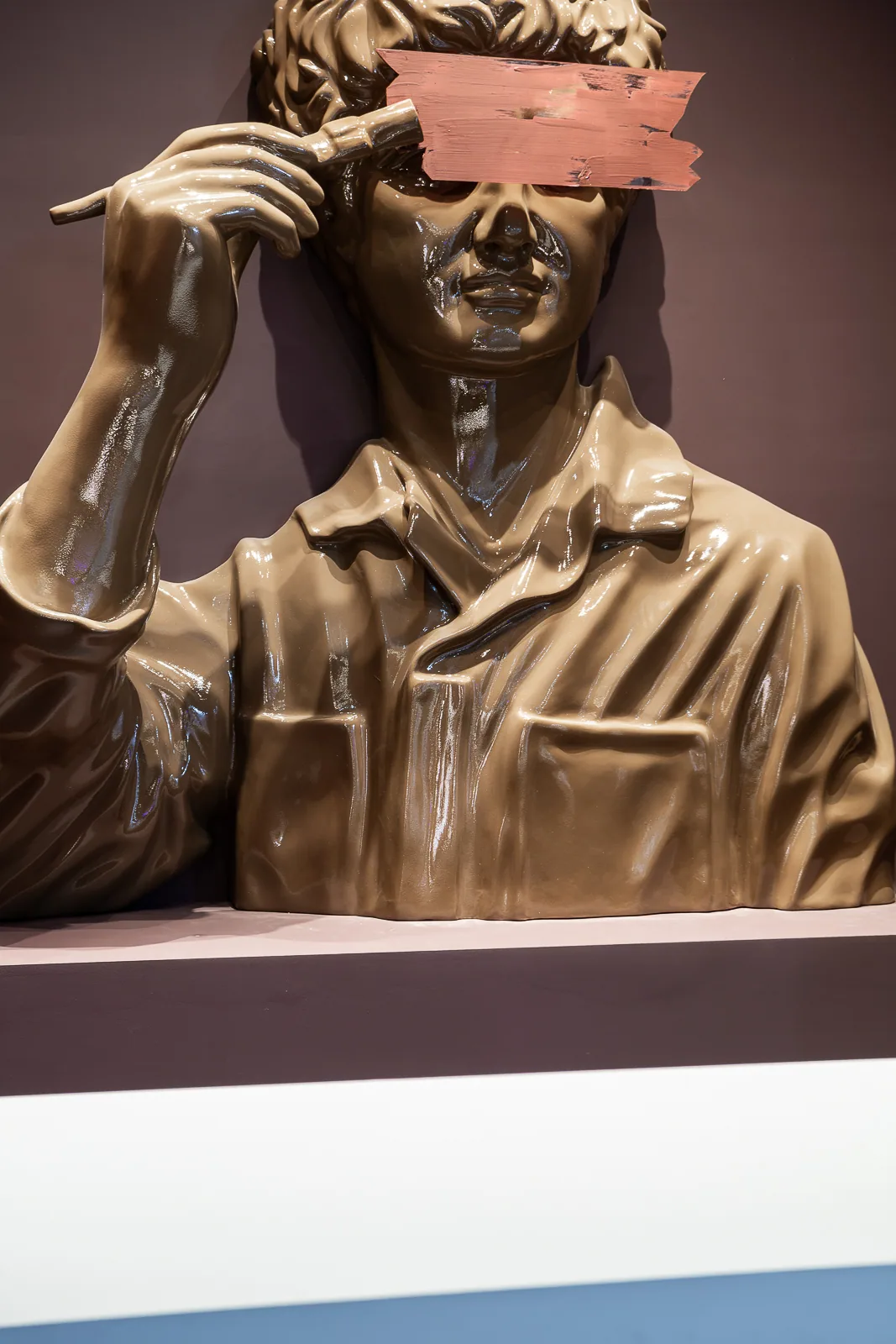
Image 1 of 4
Conclusion
The Lanors stand and its new KANVA range attracted strong attention from the exhibition’s professional audience. Visitors responded to the architecture, the character of the display, and the visual language and presentation of the new collection. The stand became more than an exhibition platform: it formed a complete statement about the brand, its products, and its approach to working with material.