 РУ
РУ EN
EN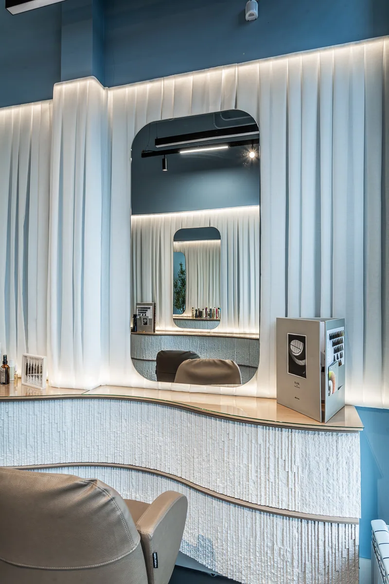
Name of the project
Centrale — the Makeup Avenue space
Main character
A destination in Orenburg where a niche cosmetics and fragrance boutique meets a service studio for manicures, pedicures, haircuts, colour, brows, and hair care.
Setting
23 Severny Proyezd, Orenburg
Centrale: life in motion
Objective
Create a distinctive space that combines a niche cosmetics and fragrance boutique with a service studio. Develop a coherent concept that turns every visit into a memorable experience, where each stage — from choosing a service to seeing the result — belongs to one harmonious and logical route.
Design scenario
The project draws on the operating logic of a terminal. The client’s journey begins at the entrance and continues at a choice desk, where they decide on a service, product, and format for the visit. Platforms then lead towards the treatment rooms, while the cloakroom becomes a baggage zone. A dedicated portal marks the beginning of the journey through the boutique.
Milan’s Centrale station and its idea of “Life in Motion” provided the design reference. In the interior, this principle appears through a considered sequence of openings, rounded forms, intuitive navigation, and lightweight structures that preserve spatial clarity.
Back-of-house facilities, including the kitchen and staff rooms, are contained within a curved central volume. Its form unifies the service areas and creates a rhythmic sequence of entrances to the treatment rooms, giving the whole space coherence.
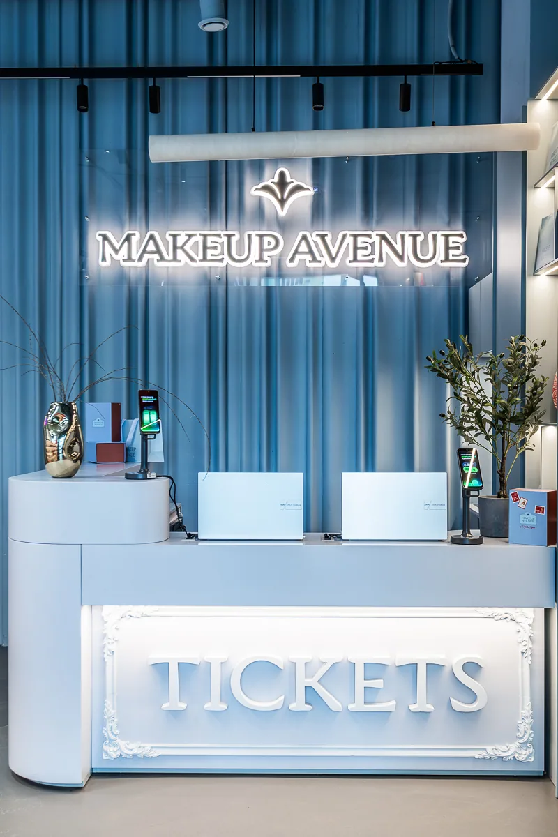
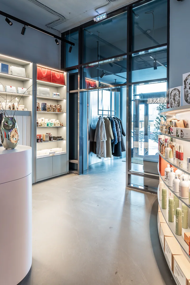
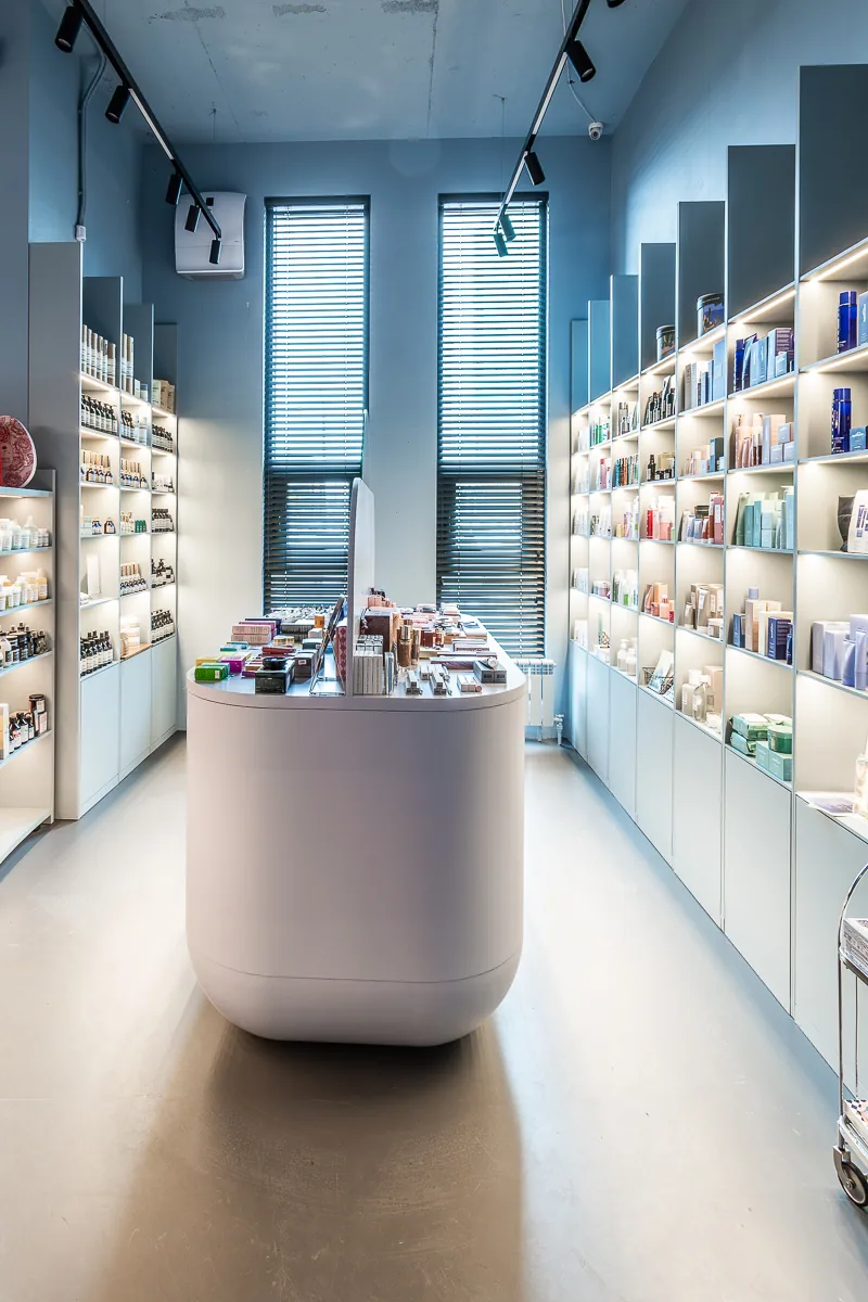
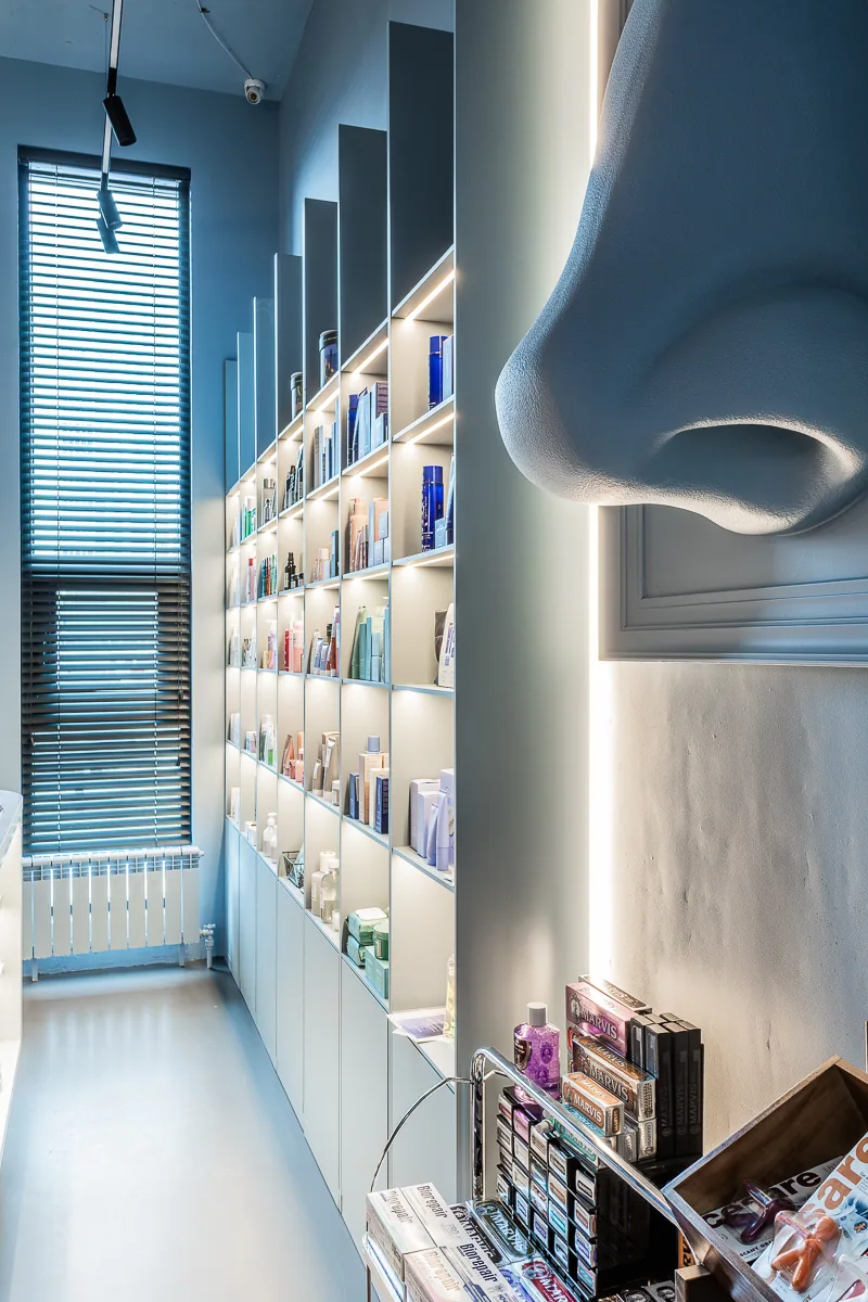
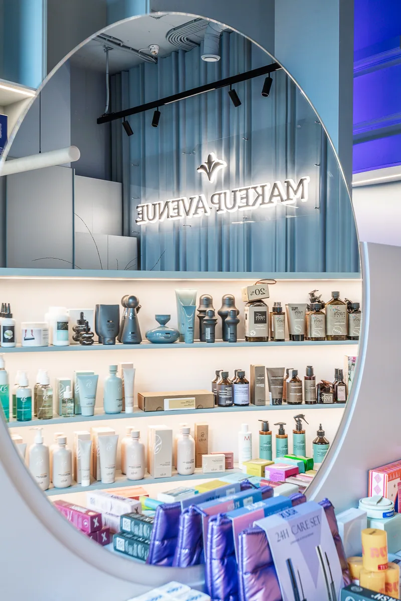
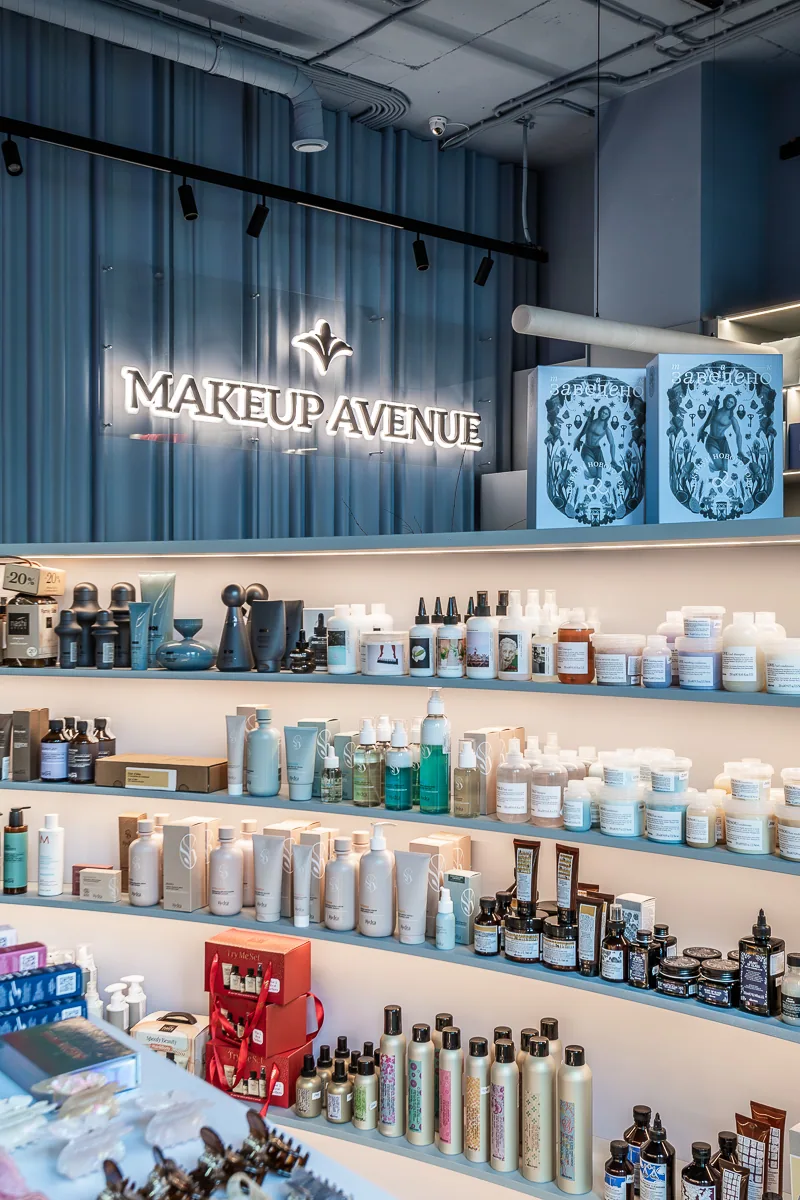
Image 1 of 6
Architecture of the idea
The project is built around movement. A curved wall is the interior’s defining element: it organises the plan, conceals support spaces, and establishes the principal spatial gesture.
Half-columns and a rhythmic sequence of openings arrange the treatment rooms into a legible progression.
The palette is restrained yet expressive. Monochrome blue creates a sense of lightness and calm; polished steel in the furniture and navigation adds precision and lustre; textiles in the work areas and photo zone bring warmth and soften the architecture. Together, these materials balance a clearly structured route with comfort for every visitor.
On site
The composition had to accommodate a complex plan and existing structural elements. Service infrastructure occupies the central volume, while treatment rooms, work zones, and the visitor route are arranged around it.
The openings, navigation, furniture, and materials operate as one coordinated system, preserving the integrity of the space throughout the journey.
Objects and details
- The curved wall performs two roles: concealing the service core and creating a strong sculptural accent.
- Half-columns and rhythmic entrances connect the treatment rooms into one ordered sequence.
- The ticket counter, platforms, and baggage navigation are integrated into the architecture rather than applied as signage.
- The portal acts as a visual marker for the point of transition and the beginning of each guest’s individual route.
- A palette of blue, polished steel, and textiles creates a balanced, refined, and restrained atmosphere.
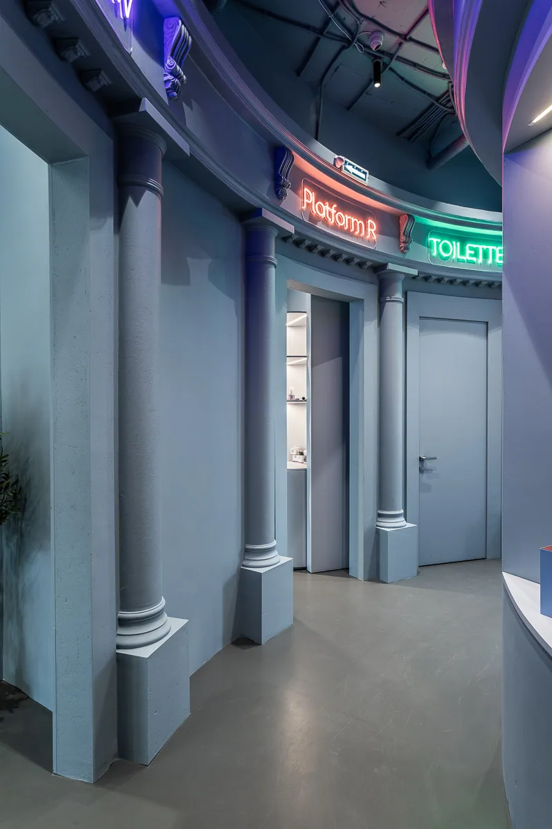
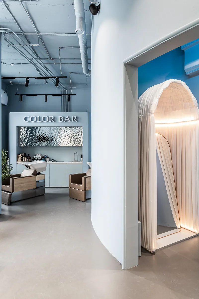
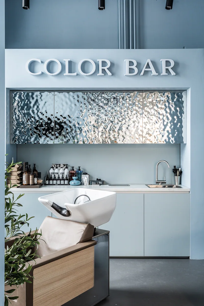
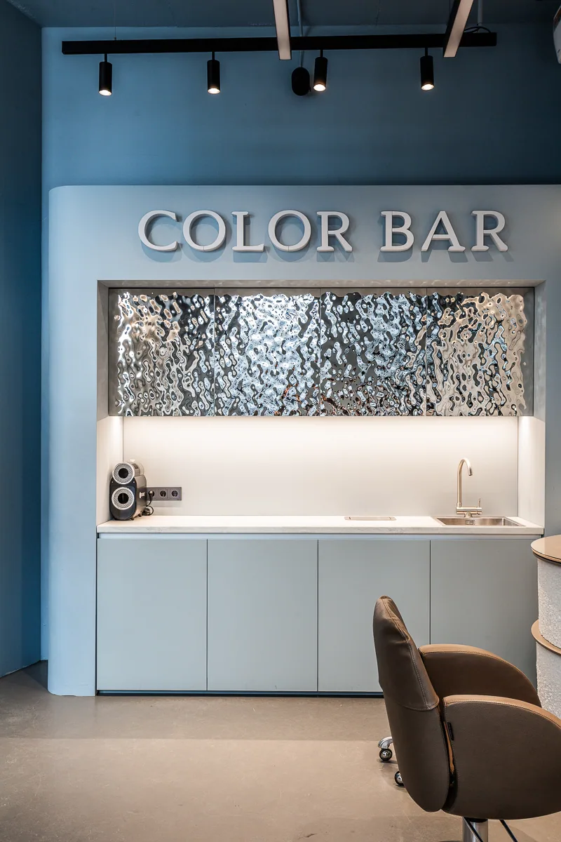
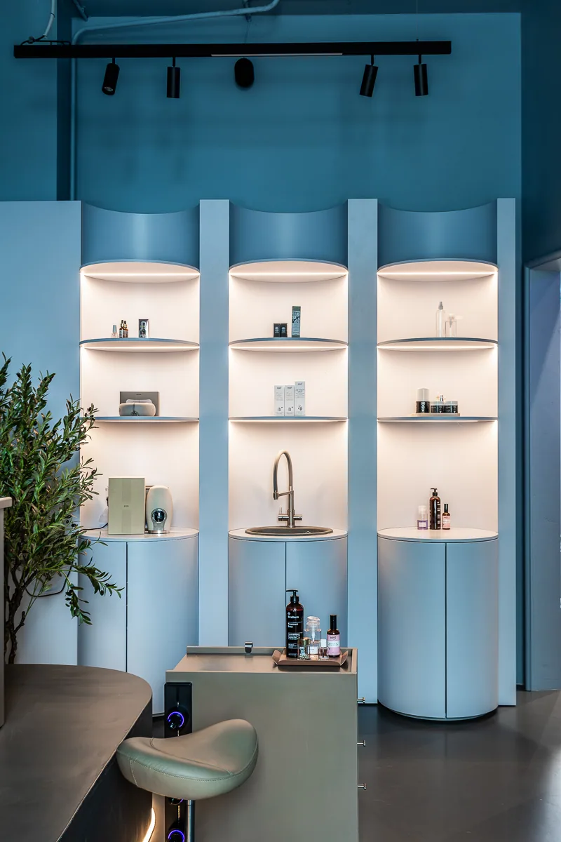
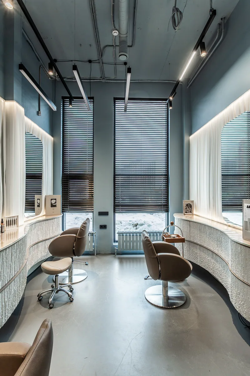
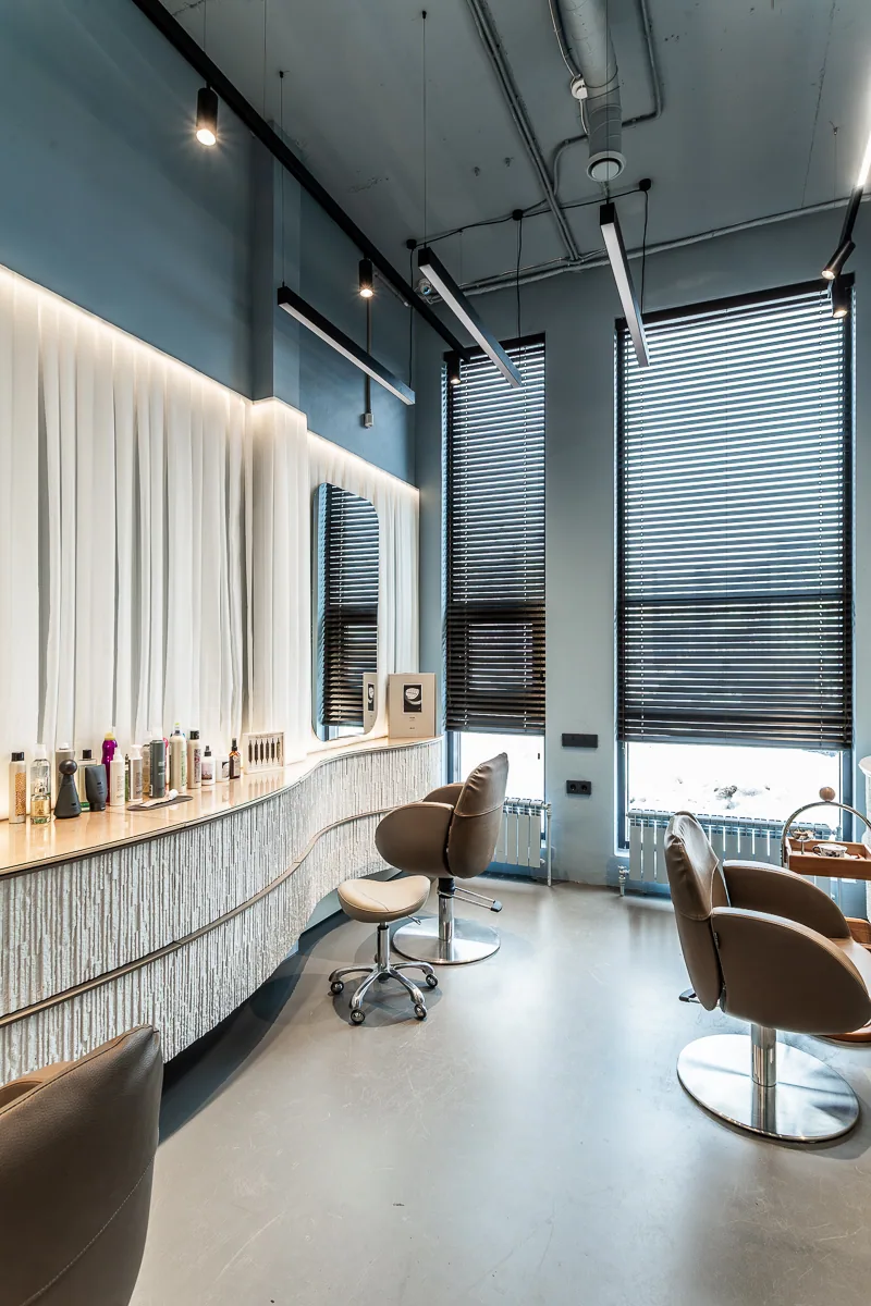
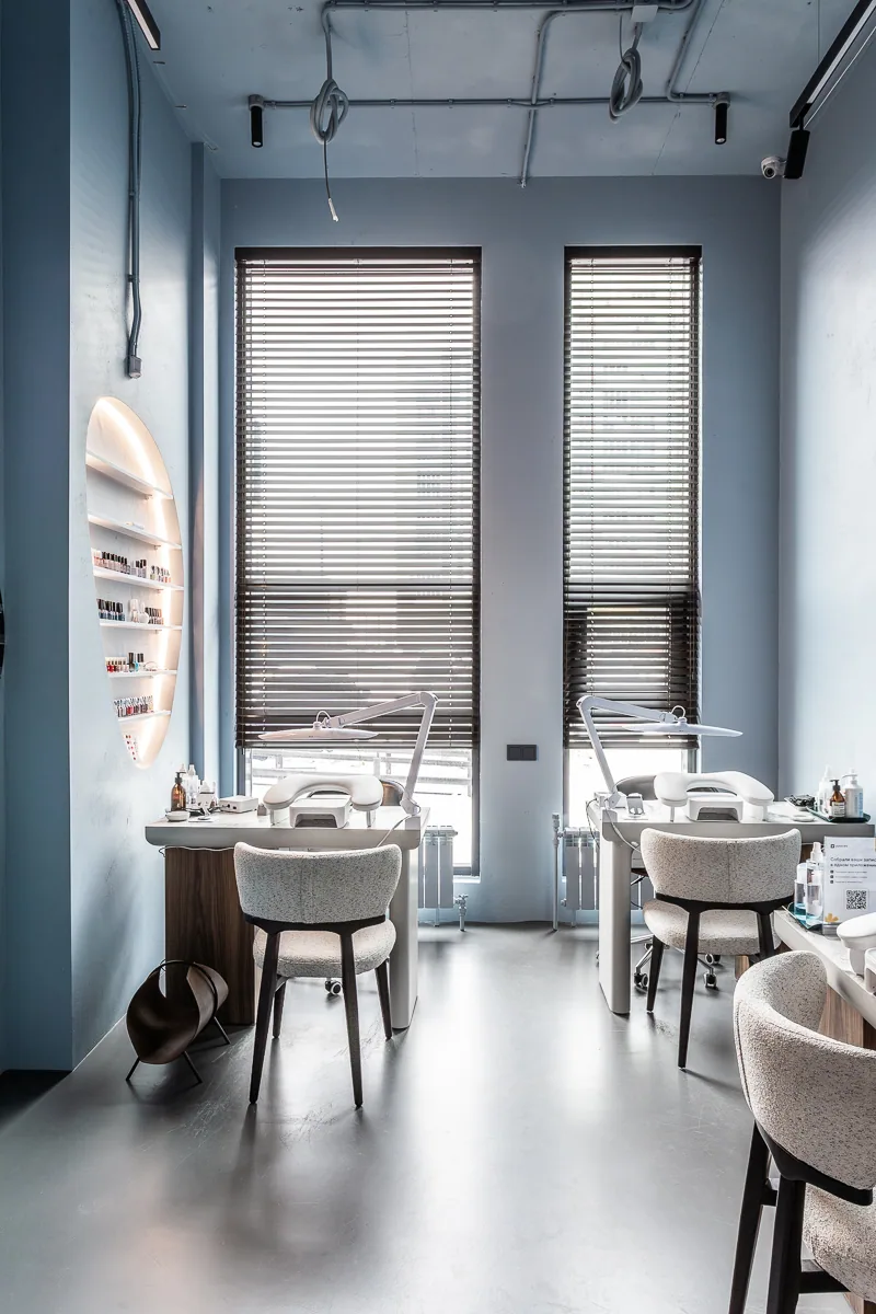
Image 1 of 9
Result
Centrale brings boutique retail and beauty services together within one coherent space governed by a clear logic of movement. Each guest follows a considered route: choosing a direction, moving through the sequence, and arriving at the desired result. The forms, navigation, lighting, and carefully selected materials all reinforce this concept, creating an interior that is both integrated and comfortable.